The United States Postal Service (USPS) is an independent corporation of the executive branch of the U.S federal government charged with providing postal services within the United States. The agency is also known Postal Service, Post Office, or U.S. Mail.
The USPS traces its origin to the Second Continental Congress of 1775. In 1792, the Post Office Department was created following the passage into law of the Postal Service Act. The agency was formally recognized as an independent entity in 1970 by the Postal Reorganization Act.
About the USPS Logo and Font
The USPS logo features a stylized white silhouette of the American eagle set on a blue background. The eagle’s beak is pointed at a 180-degrees angle in respect to its mouth.

Beneath the emblem is the name “United States Postal Service” written in ALL-CAPS. The first two words are separated from the last two by a red horizontal bar.
Like many brands, the USPS has undertaken numerous upgrades to its logo over the agency’s nearly-200-year history.
The original USPS seal showcased Mercury. This simple icon portrayed the agency as a messenger – mercury is considered the messenger of the gods in ancient Rome mythology.
In 1837, the mercury sign in the original USPS seal was replaced by a horse and rider. This modification was likely intended to evoke earlier memories of the United States mail delivery system, where horse transportation was common.
In 1970, the passage of the Postal Reorganization Act led to the establishment of the United States Postal Service from the Post Office Department. Following these developments, the USPS adopted a new brand identity that included an eagle, the same which it has maintained to date.
The company’s adoption of the eagle emblem portrayed it as a reliable messenger and patriotic organization. Note that the eagle is the state symbol of the United States.

However, it’s worth noting that the USPS eagle used in the company’s logo in 1970 is quite different from the one we know today. The original eagle, popularly known as the Standing Eagle, featured the side view of the bird set in blue and white.
Beneath the logo was the lettering “U.S. Mail” nestled between two horizontal red bars. There was also the writing “United States Postal Service” bordering the eagle on both sides as well as above it.
Besides the emblem and color scheme, another exciting element of the USPS logo is the font used.
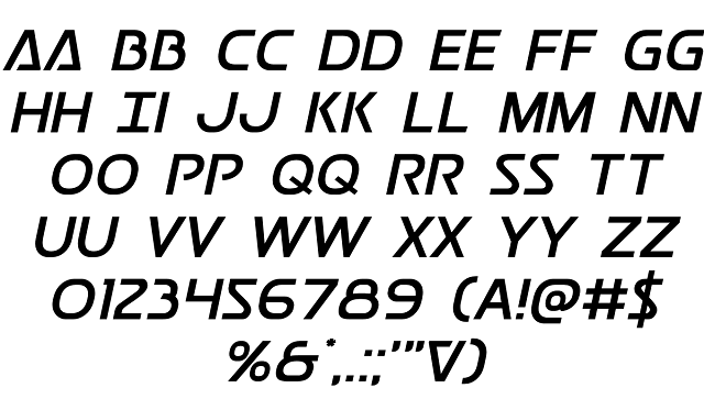
Now, the USPS logo is designed in a unique font with no exact matches. However, there’s one font known as Postmaster, which looks a lot like the font appearing on original USPS logos.
Postmaster was designed in 2015 by Iconian Fonts. Although initially available only in the regular weight, this typeface now comes in several other styles. They include;
• Postmaster Gradient Regular
• Postmaster Halftone Regular
• Postmaster Laser Regular
• Postmaster Bold
• Postmaster Condensed
• Postmaster Expanded
• Postmaster Italic Italic
Where to Download the Postmaster Font

The Postmaster font is available for download from the 1001 Free Fonts and Font Space. You can also access Postmaster by checking out the Font Meme and Fonts Free websites.
Like most proprietary fonts, Postmaster is only free for personal use. The font is marketed as donationware, which means that you’ll need to make some donations before using the font for commercial purposes.
Visit Iconian Fonts for more information on Postmaster’s commercial usage.

