Last Updated on November 20, 2023
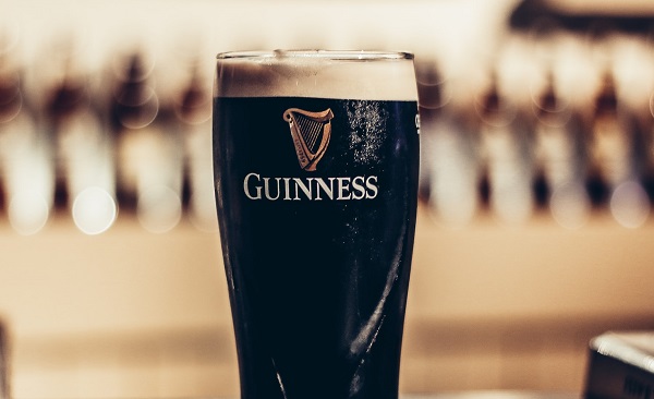
Guinness is an Irish dry stout that originated in Arthur Guinness’ brewery located at St. James’s Gate in Dublin, Ireland.
Guinness is one of the world’s oldest alcoholic companies, with a history dating back to 1759. It’s also one of the most commercially successful alcoholic brands on the planet, with breweries spread across 50 countries and sold in over 120.
Although originally established in Ireland, Guinness moved its headquarters to London at the onset of the Anglo-Irish Trade War in 1932. The brand has achieved tremendous growth since then and still registers astronomical annual sales despite a decline in consumption since 2001.
Guinness Font

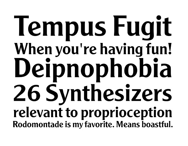
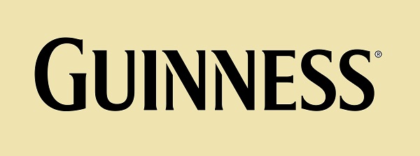
Guinness uses a custom font that was designed exclusively for the beer brand. The closest font similar to the one currently used on the Guinness logo is a typeface known as Agenda URW Light. It’s a light version of Agenda, a typeface designed and published by URW.
Agenda contains 264 glyphs with 1000 units per EM. The typeface also boasts a maximum advance width of 1043 and a maximum advance height of 1140. It has no kerning or fixed width but comes with incredible scalability.
The Agenda typeface is available in several styles and weights. In addition to the Agenda Light version that resembles the custom font used on the Guinness logo, other popular fonts in the Agenda family include: Agenda Italic, Agenda Medium Condensed, Agenda Bold, Agenda Black, and Agenda Light Ultra-condensed, to name a few.

It’s worth noting that Guinness hasn’t always used a custom typeface for its logo. The beer brand experimented with several fonts before settling on its current typeface which looks similar to Agenda Light.
The Guinness logo had its first official typeface in the early-1960s, more than two centuries after the brand was established. The initial typeface was developed by an artist known as Bruce Hobbs, who was then working at Guinness’ advertising agency – S.H. Benson Limited. This font was officially launched in 1963 and christened The ‘Hobbs’ typeface.
The Hobbs typeface initially appeared on Guinness posters only, where it was usually accompanied by red lettering set on a cream background. In 1968, the font was slightly modified and began to be used on Guinness bottle labels too. Thereafter, Guinness began using the Hobbs font on its other branding materials.

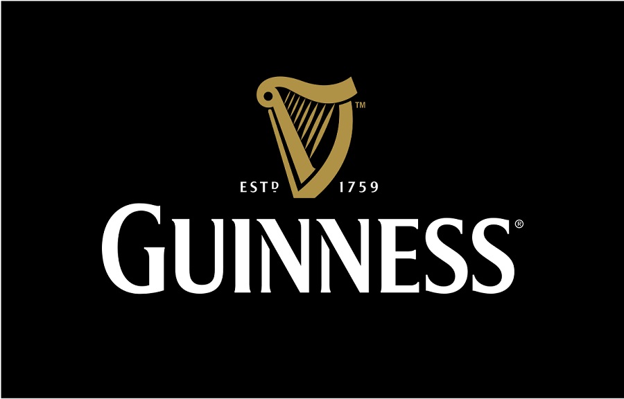
In 1991, the Hobbs font underwent further modifications that resulted in its name changing to ‘Design Group Hobbs.’ The font was modified again in 1997 to a new typeface known as ‘Unified Hobbsian.’ The 1997 upgrades also included color changes, replacing the original red and cream color palette with gold and black.
The final upgrade to the original Hobbs typeface took place in 2005. It’s then that Guinness dropped its latest iteration of the Hobbs font for a custom typeface, the same that looks like Agenda Light.
Where to Download Agenda Light
Agenda Light and other Agenda styles are available on various websites, such as Free Fonts, Online Web Fonts, and Font Haus. You can use it free for personal projects but not necessarily on commercial design projects.

