Last Updated on June 14, 2023
Ford Motor Company, commonly known simply as Ford, is an American automobile manufacturer founded on June 16, 1903, by Henry Ford. The company is presently headquartered in Dearborn, Michigan.
Ford owns the luxury automobile brand, Lincoln. The company also owns stakes in several other car manufacturers, including China’s Jiangling Motors, United Kingdom’s Aston Martin, and Brazilian Troller.
In this post, we put our focus on the brand’s identity by examining the appearance, meaning, and symbolism of the Ford logo.
Ford Logo Appearance
Logo Shape
“Is it Henry Ford’s handwriting?”

This is one of the most commonly asked questions with regard to the Ford logo. Well, the answer is yes, but it depends. Ford’s original logo was not designed by Henry Ford himself. Instead, the emblem was created by Ford’s first chief engineer/designer Childe Harold Wills.
As with any new company, Ford started off without a logo. However, there came a time when the automobile manufacturer needed an emblem as an official representation of its brand identity.
When Henry Ford began looking for a logo for his cars, he turned to his friend Wills, who was then involved in the design and printing of business cards. Wills designed Ford’s logo based on calligraphies from his very own business cards. He only made a few tweaks to the letters in a bid to create a stunning and unique emblem.

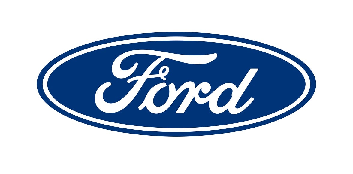
Interestingly, Childe Wills’ original Ford logo is a far cry from the emblem’s later versions. The current Ford logo is a flattened oval figure with the company’s name placed right at the center. This iconic design is christened the ‘Centennial Blue Oval,’ as it was released in 2003 to coincide with the company’s 100th birthday.
Besides its execution inside a flattened oval, Ford’s logotype is also noted for its elegant letterforms. The letter “F” particularly stands out for the swirly shape of its arms and leg.
Also, the letter “F” appears to be placed slightly above the wordmark’s baseline while the other letters seem to slope gently, creating a somewhat diagonal inclination. The blue oval is surrounded by a blue frame, separated by a white border.
Logo Colors

Ford’s logo uses various shades of blue and white colors.
White is used for the wordmark and for the boundary that separates the oval shape from its outer frame. Blue is used for the oval logo and its outer frame. The entire oval design is commonly executed on a white or transparent background.
Logo Fonts

Ford uses a unique font for its logotype. Like many successful brands, Ford’s typeface was developed for use exclusively by the automobile manufacturer. However, there are several close matches, such as FordScript.
FordScript is a lesser-known typeface that contains many characters visible on Ford’s logotype. The font is marketed as free for both personal and commercial design projects. Note that besides the name similarities, FordScript isn’t Ford’s proprietary font.
Also, while Ford’s logo is known as the ‘Centennial Blue Oval,’ the font used for the wordmark has little connection to the Bell Centennial typeface. Bell Centennial is a sans-serif typeface designed by Mathew Carter between 1975 and 1978, while working for Mergenthaler Linotype Company. The font is currently licensed by Linotype.
Ford Logo Symbolism
Symbolism of the Oval Frame

Ford’s Centennial Blue Oval conveys a sense of community, friendliness, and connectedness. It underscores Ford’s desire to foster friendly connections with its clients worldwide.
An oval also symbolizes the globe. Ford might have used this symbol to represent its commitment in availing its automobiles to all regions worldwide.
Lastly, an oval stands for infinite power, strength, and speed. These happen to be some of the core attributes associated with Ford’s automobiles.
Symbolism of the Wordmark

Ford is among the many automobile manufacturers that use their full logotypes on their official emblems.
The wordmark helps to further accentuate the Ford brand. In cases where the Centennial Blue Oval may not immediately ring a bell, the inclusion of the wordmark shines more light on the company behind the emblem.
Also, the utilization of Ford’s full brand name was a special tribute to its founder. The wordmark helps to immortalize Henry Ford years after his death.
Symbolism of the Colors

Blue is primarily associated with peace, serenity, stability, and inspiration. The color also stands for wisdom and health.
White mainly represents innocence, purity, and balance. Both colors symbolize the power, strength, and elegance of Ford cars. They also work synergistically to give the logo its stunning aesthetics.
Ford Logo History
Ford’s original logo debuted in 1903, reportedly just a few months after the company was founded. The emblem was developed by Childe Harold Wills. This particular design was made of a black circle with an ornate white border.
Inside the black circle were several inscriptions, all in white. The most visible one was the phrase “FORD MOTOR CO.,” executed in wavy serifs. This phrase was split in two – ‘FORD MOTOR’ and ‘CO’ – and set in two levels. The word ‘CO’ appeared right below ‘MOTOR,’ and underneath it were the words “DETROIT –MICH.-“, also set in two levels.
Ford used this logo from 1903 to 1906.
1906 – 1909

The first upgrade to Ford’s logo was more like an overhaul of the original design. The company’s wordmark now appeared inside a triple-framed rhombus.
On the upper part of the wordmark were the inscriptions ‘FOR QUALITY, ‘HALL MARK,’ and ‘AND ECONOMY,’ whereas on the lower side of the wordmark were the words ‘EVERY CAR,’ ‘GUARANTEED,’ and ‘TWELVE MONTHS.’ The entire logo was a monochrome.
1909 – 1911

Ford’s logo became simpler in 1909. The company abandoned its previous complex emblems for a simple wordmark based on Henry Ford’s signature. The logo stood out for its elongated tail of the letter “d.”
However, this logo was still executed in monochrome.
1911 – 1912

Ford’s wordmark-based logo became more complex again. The signature now appeared enclosed in a double-framed horizontal oval. On the upper part of the oval was the inscription “THE FAMOUS” while on the lower part was the inscription “MOTOR CARS.” The color remained monochrome.
1912 – 1917

1912 marked the introduction of Ford’s colored logo. The emblem featured the same handwriting.
But it now appeared on a blue badge that looked like a stylized bird. The logotype was in white, and underneath it was the tagline “THE UNIVERSAL CAR,” also in white.
1917 – 1927

This version of Ford’s logo looked a lot like the 1911 iteration, except that it was simpler. The signature was placed inside a white oval shape with a thin frame. Both the wordmark and the frame were in black.
1927 – 1957

In 1927, Ford conducted only two major changes to its previous logo. The white oval changed to blue and the oval was double-framed. This emblem became the prototype of Ford’s current logo.
1957 – 1961

During this period, Ford’s oval was extended and the letters became bolder. The blue color used for the background also changed to a duller shade.
1961 – 1976

The company reverted to its 1927-1957 logo, only making subtle changes. The colors and wordmark became bolder, while the oval gained an additional blue frame.
1976 – 2003

In 1976, Ford’s blue oval became smaller. The extra frame in the previous logo changed from blue to a thick, silvery color.
2003 – Present

The thick, silvery frame on Ford’s blue oval disappeared, leaving a single blue frame. Also, the logo became larger and the colors got bolder.

