Dark Souls is a 2011 third-person action role-playing game set in a large and progressive open-world environment.
The game was developed by FromSoftware and is considered a spiritual successor to Demon’s Souls and the second instalment in FromSoftware’s Souls game series. It’s published by Namco Bandai Games.
Dark Souls takes place in Lordran Kingdom. Players assume the role of jinxed undead characters who set out on a pilgrimage to establish the fate of their kind.
The game was released in September 2011 in Japan for Xbox 360 and PlayStation 3. In August 2012, FromSoftware released a port for Microsoft Windows, which includes content not included in previous versions.
Dark Souls Font
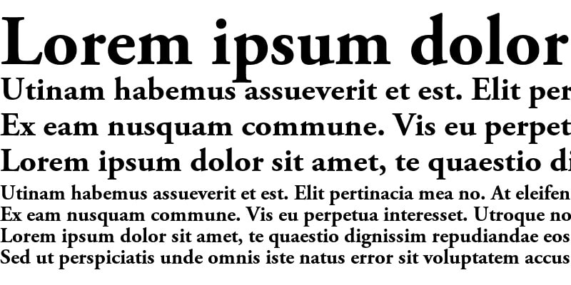
Dark Souls is designed in Adobe Garamond Bold. Adobe Garamond Bold is a stunning version of the popular Garamond typeface.

Garamond is a large family of many serif typefaces named after 16th-century Parisian engraver Claude Garamond, who also happens to be one of the font’s designers. Other designers include Robert Granjon and Jean Jannon. The font is published by Adobe.
Garamond typefaces have garnered immense popularity over the years. These fonts are particularly used for book covers as well as in body text. You can also apply them on various other design projects. Examples include movie posters, video game covers, apparel branding, invitation cards, and campaign posters.
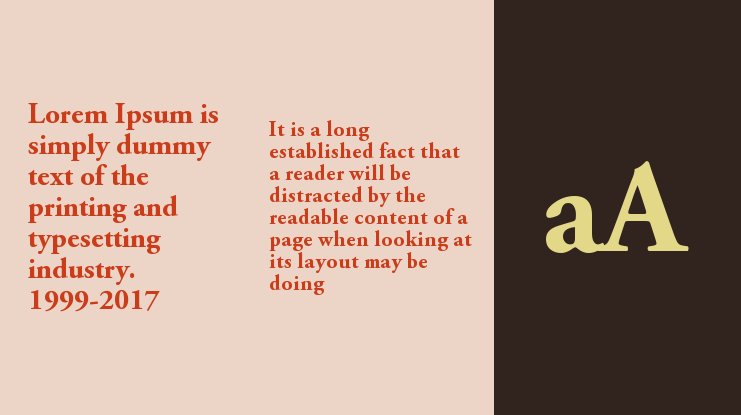
Although Adobe Garamond comes in numerous versions, several defining features set Garamond apart from other major typefaces. For instance, the small letter “e” in Garamond texts usually has a smaller eye than it appears on other fonts. Also, the bowl of the small letter “a” sports a prominent sharp turn at the top left.
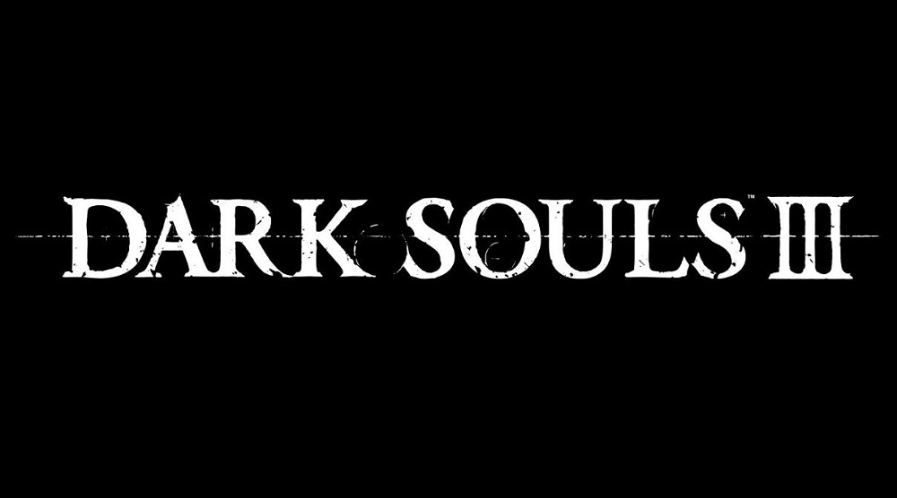
Another distinguishable feature of Garamond fonts is that all elements in the lettering tend to have sharp edges. This is clearly evident in the ‘Dark Souls’ logo.

When printed in CAPS, Garamond texts appear in Roman square capitals. The leg of the letter “R” extends outwards from the letter, sometimes touching the character to the right. Again, you can attest to this when you examine the ‘Dark Souls’ poster.
When texts in Adobe Garamond are written in both lowercase and UPPERCASE, the UPPERCASE letters appear visibly large. That’s because the height of lowercase letters (x-height) is relatively low even when such characters are printed in considerably large sizes.
Overall, Adobe Garamond is rich in texture and design. The Bold version is particularly bright and can go a long way in enhancing your brand’s visual identity.
Where to Download Adobe Garamond Bold

Adobe is unarguably one of the largest digital libraries for designers and creatives. However, most products by the company come with a reasonable price tag. That means you may have to pay some fee to use Adobe Garamond Bold on commercial projects.
But if planning to use this font for personal projects, then you’re in luck. DaFont Free is one place to download Adobe Garamond Bold. You can also get the font from the Fonts Geek website.

