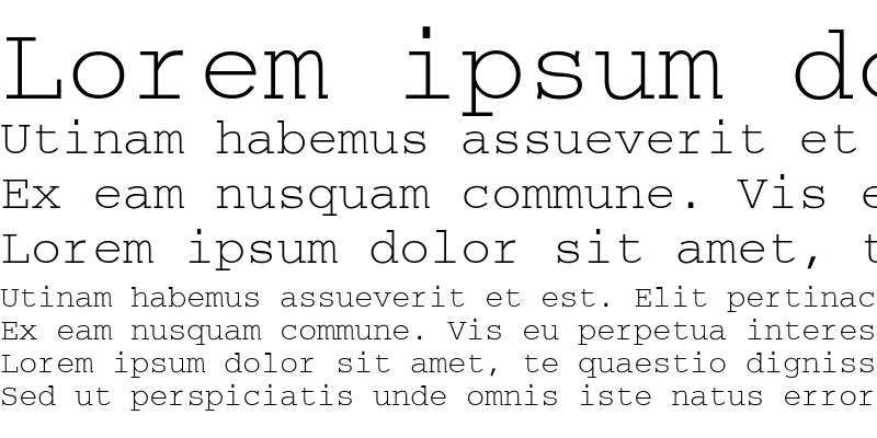
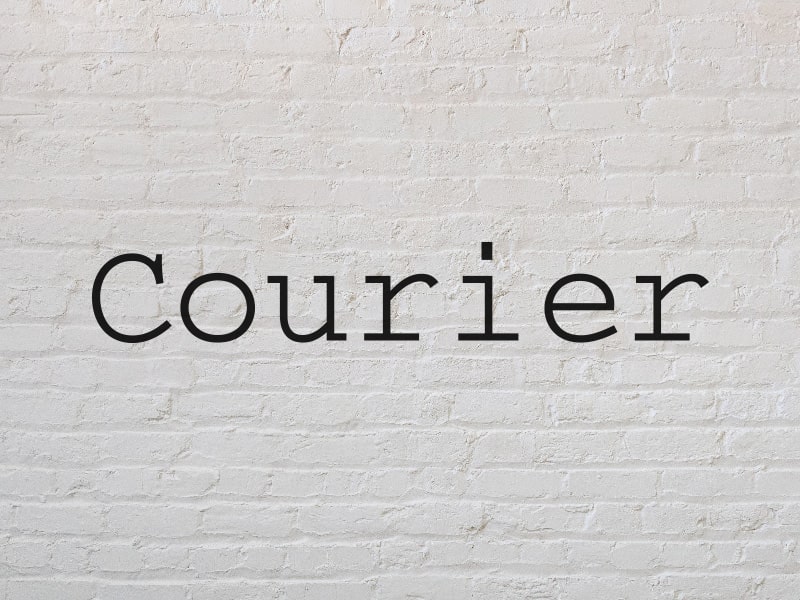
Howard “Bud” Kettler designed this typeface in the mid-1900s which was intended for IBM’s typewriters. The typeface was almost named Messenger, but Kettler disagreed quoting, “A letter can be just an ordinary messenger, or it can be the courier, which radiates dignity, prestige, and stability.”
He seemed right about that decision.
Courier Design
Its monospaced design was one of the typeface’s key features – a necessity given the technology’s limitations during the time it was made. IBM did not trademark the name, which made the typeface design and concept public-domain. This also led to the rise in variants of the typeface.
Courier was given another life in the electronic world when Adrian Frutiger reused Courier for IBM’s Selectric typewriters. Its second iteration, Courier New, sported a higher line space compared to the original font, as well as heavier dots and commas. Improvements in rendering gave the new version smooth edges when the letters are enlarged.
Courier Today

The font is legible on electronic screens while retaining its thinness. Alan Dague-Greene’s Courier Prime featured a wider range of unicode characters, and was available in sans-serif, semi-bold, medium, and code fonts. Courier Screenplay was developed for Fade in Professional Screenwriting Software with a format favored by screenwriters.
HP’s developed Dark Courier as one of their TrueType fonts, made for those who find Courier New too thin for their liking. Adobe has also created their version of the typeface in Courier Standard, which is included in Adobe Reader 6 and available in regular, bold, italic, and bold italic.
Vintage Courier Font

If you’re not happy with the Courier variant that you have in your existing apps, then you can download the version you want from MyFonts. In general, this typeface is available for royalty-free use. However, some variants may need to be purchased. For the free Courier Regular, visit Fonts Geek.

