Last Updated on July 5, 2023
Adventure Time is an American fantasy animated television series based on a 2007 short film that aired on Nicktoons. The series was originally created by Pendelton Ward for Cartoon Network and released on April 5, 2010. It features voices by Jeremy Shada, John DiMaggio, Hynden Walch, Niki Yang, and many other voice actors.
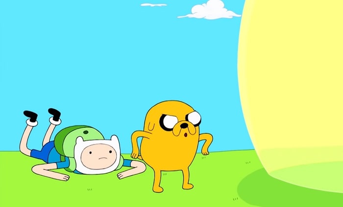
Set in a post-apocalyptic Land of Ooo, Adventure Time chronicles the adventures of a boy named Finn and his adoptive brother Jake. There’s also a dog endowed with magical shape- and size-shifting abilities.
Adventure Time Logo and Font
The official logo of the Adventure Time series was designed in 2008, a few months after releasing the series’ pilot. Shortly after releasing Adventure Time’s pilot, the show was paused for about two years. It would eventually be revived in 2010.
Interestingly, these hiccups did not cause major transformations in Adventure Time’s logo. The logo maintained its original concept. However, the design would undergo a few subtle changes over the years.
The original Adventure Time logo was made up of a dark red inscription that featured one graphical element. The show’s lettering was set in two levels and appeared in ALL-CAPS – the upper level was the word “ADVENTURE” while the lower level had the word “TIME.” Letter “A” in “ADVENTURE” was larger than the other letters in the word. However, all the characters in the word “TIME” were in the same size.
The word “TIME” had a silver sword piercing horizontally through the inscription. This sword cut right across the letter, with its tip creating the middle bar of the letter “E.” Besides its shiny blade, the sword was also noted for its brown and gold handle, which featured a glossy bluish gem in the middle.
Another exciting fact about Adventure Time’s logo was the color used. The design was set in a dark red color and black accent.
Adventure Time’s logo was redrawn in 2010. The new design featured refined lettering that looked more conspicuous due to their swashy contours and shapes.
Besides, the dark red color became lighter and glossier, enhancing the lettering’s three-dimensional appearance. The designer also complemented the initial black accents with thin and delicate ones, while adding a more vivid outline.
These new changes also affected the appearance of the sword. The new sword featured thinner lines and a new color palette, whereby the blade appeared light blue and yellow-gold whereas the handle was chocolate-brown.
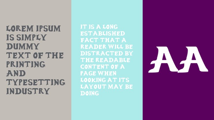
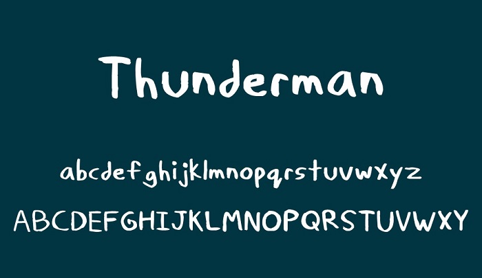
But despite the noticeable modifications in Adventure Time’s lettering and color palette, the logo’s font has largely remained unchanged. The actual typeface that appears on the logo of Adventure Time is known as Thunderman, a stylish font created by Tmanfan. This font is only available in the Regular format.
Where to Download the Adventure Time Font
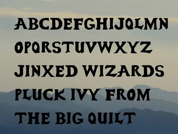
Thunderman is available for download from Mais Fontes and 1001 Free Fonts. The Adventure Time can be found at Font Meme.
Most of these websites avail the font in the Opentype and Truetype file formats. You only need to choose your preferred file format and proceed to download the font.
Thunderman is generally FREE for personal use. However, be sure to read the full license details before applying this font on any commercial design projects.

