Last Updated on March 14, 2023
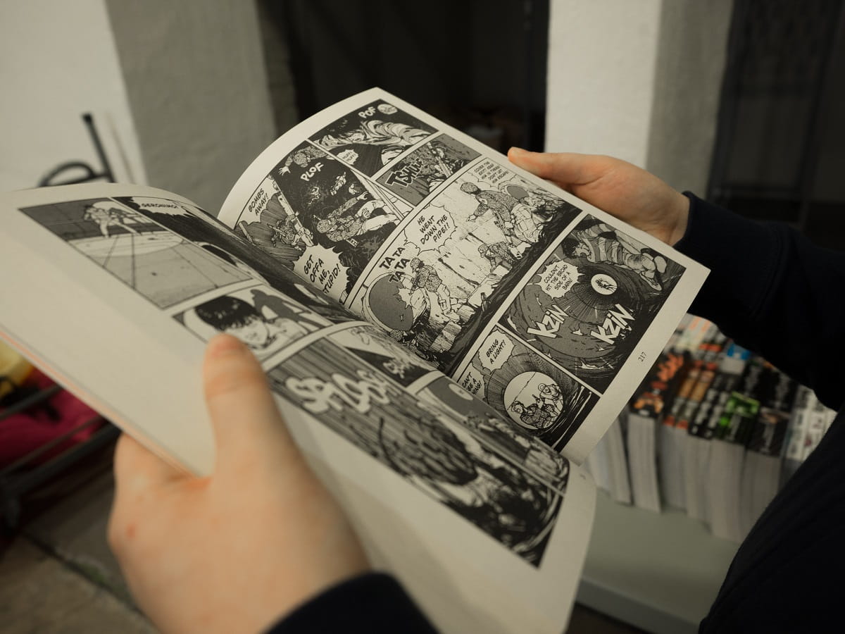
Even if you’re not a comic book fan, you’re probably familiar with the lettering used in them. These thick, even typefaces were obviously handwritten back in the day. Thanks to demand, these ‘fonts’ are still being used by modern comic book artists.
Of course, a lot has changed since then.
Why the comic book font is so familiar?
Vox’s Phil Edwards talks with letterer John Roshell in this video about comic book fonts. Here, they discuss about why comic books have the same, recognizable lettering that we’ve all come to know.
The style came from some of the earliest comics, most notably Little Nemo, which came out during the 1900s. Letterers used aims guide and speed ball nib pens or technical pens for their craft. The all-caps lettering style ensured legibility. You see, with lowercase, the ink would bleed onto the paper, making some words indecipherable.
Two of the most renowned letterers were Artie Simek and Sam Rosen. Thanks to their smooth, even handwriting, we can read Batman and Superman’s heroic words with no problems. Nowadays, typographers and comic book artists still peruse these popular fonts – albeit on glossy pages instead of cheap paper. They don’t write by hand anymore either. Now, they can simply download these fonts on software like Photoshop or Illustrator.
Comic book fonts not only look playful, they’re like a time capsule into the past. Can you imagine a world without Superman, Thor, or Wonder Woman? Neither can we. Whether you’re creating your own comic or you’re just searching for the perfect font for a personal project, here are 800+ FREE comic book fonts from 1001Fonts.
For the world’s greatest comic book fonts, created but none other than letterers Richard Starkings and John Roshell, check out Comicraft. Here you’ll find premium typefaces for your logos, titles, word balloons, and more. Now go save the world!

