Some logos leave an imprint on the memory – and Mastercard’s logo is definitely one of them. Idiosyncratic, somewhat ambiguous (the sort that makes you wonder), and entailing are the words that come to my mind when I think about the Mastercard logo.
Let’s briefly introduce the masterminds behind the creation of this unique branding style.
Mastercard History
Mastercard was founded in 1966 as an international financial corporation created by an allegiance of multiple bankcard associations such as Wells Fargo, Crocker National Bank, First Interstate Bank Corporation, and Bank of California.
However, history states that Mastercard’s origins date back to the late 1940s. This was when a group of banks started issuing a particular paper or small card to be used as a cash substitute.
From 1966-to 1969, the company was known as Interbank. It was rebranded in 1969 and acquired a new name: Master Charge. Master Charge lasted for a decade until it was yet again rebranded to the current-day Mastercard we know.
Mastercard is an American multinational company headquartered in New York and Missouri. It has made a whopping revenue of 23.63 billion in 2021 alone.
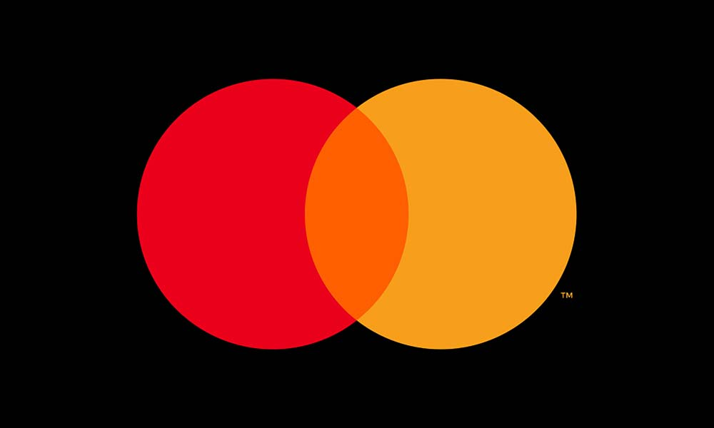
What does the Mastercard Logo mean?
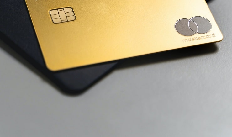
Photo by AltumCode on Unsplash
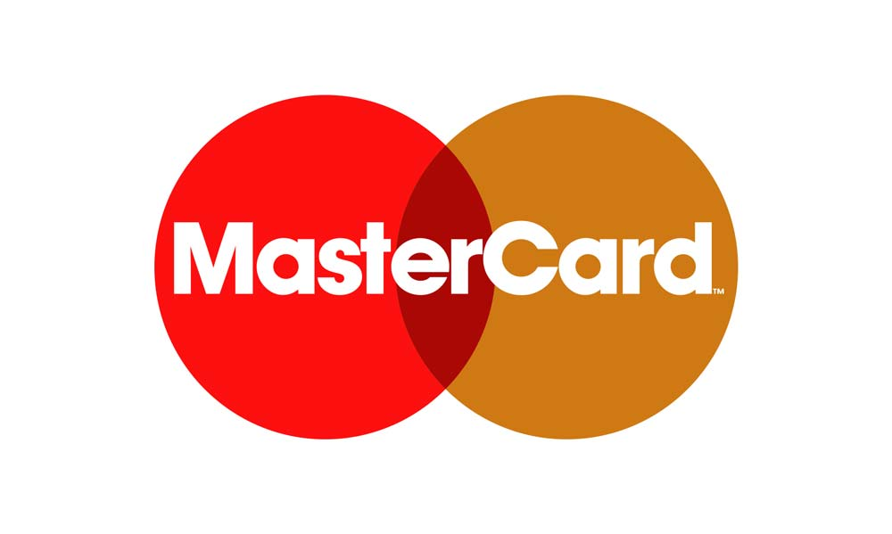
The Mastercard logo is an intersection of two circles, forming a Venn diagram. The red circle represents victory and prosperity, whereas the yellow (previously ochre or orange) illustrates aspects of happiness and richness.
The intersection of red and yellow constitutes a balance between the prospects each color carries. The intersected area represents passion, progression, and energy.
This Mastercard logo was created in 1977 by the father-son duo, Robert and Martin Leavelle. It is regarded as one of the most timeless and modern logos.
History of the Mastercard Logo
Unlike many brands, Mastercard has stuck to its logo since the beginning of its journey. No momentous change has been recorded in the logo itself, apart from the evolution of labels over time.
The changes that did make it through were the need of the hour. Mastercard modified them just enough to conform to electronic media and bankcard designs.
Let’s take a look at the timeline of changes the Mastercard logo went through.
1966
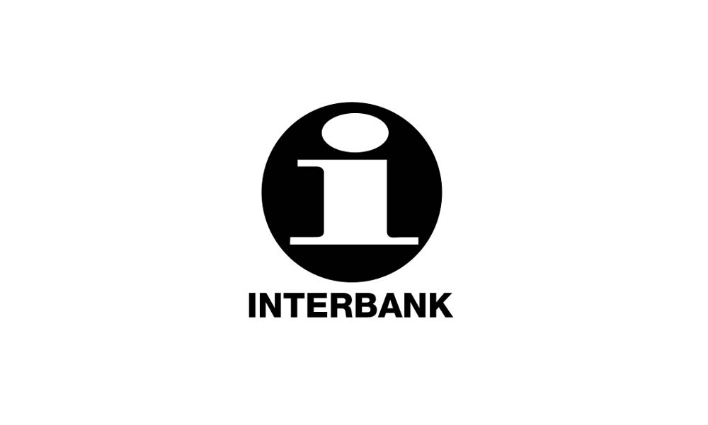
The very first Mastercard logo was a simple ‘i’ that represented members of the interbank. This financial corporation was first established to form a coalition of 17 bankers so that each institution’s credit card could gain wider acceptance and recognition.
Needless to say, Interbank (modern-day Mastercard) was not dominated by a single bank during the 1960s.
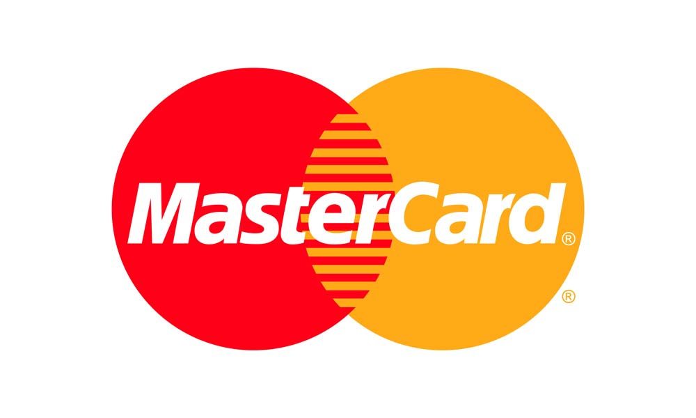
1968
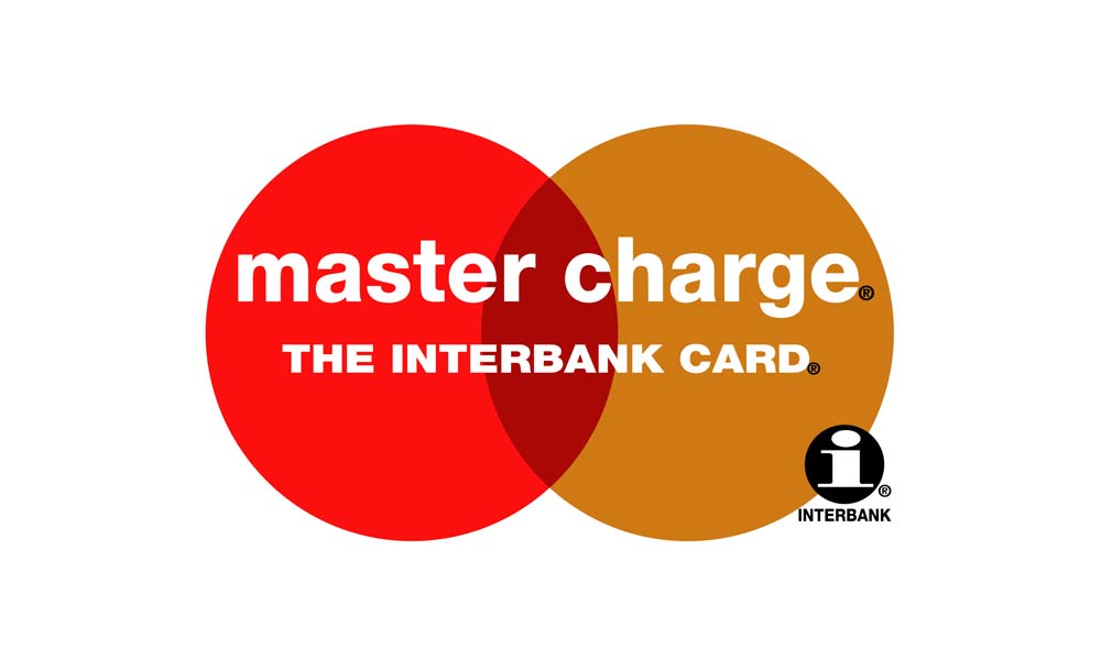
Just two years later, Interbank became Master Charge and boasted the timeless Venn diagram logo created by Robert and Martin Leavelle.
This logo is not far-fetched from the Mastercard symbol we witness today. The 1968 logo became the blueprint for this multinational company; henceforth, all modifications were not distant from the original idea.
1979
The logo was refined to look more sleek and sharp. This also included the name shift from master charge to Mastercard. The interbank logo and labels were also eliminated from the picture.
1990
A rather stylish version of the Mastercard logo made its breakthrough in 1990. 23 horizontal lines were displayed in the intersectional area. The colors were also enhanced to look more vibrant and appealing.
1996
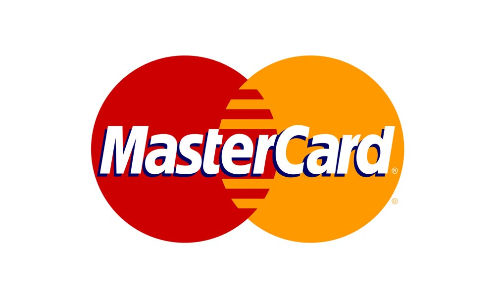
The colors were solidified, and the horizontal lines were reduced to give the logo more dimension.
2006
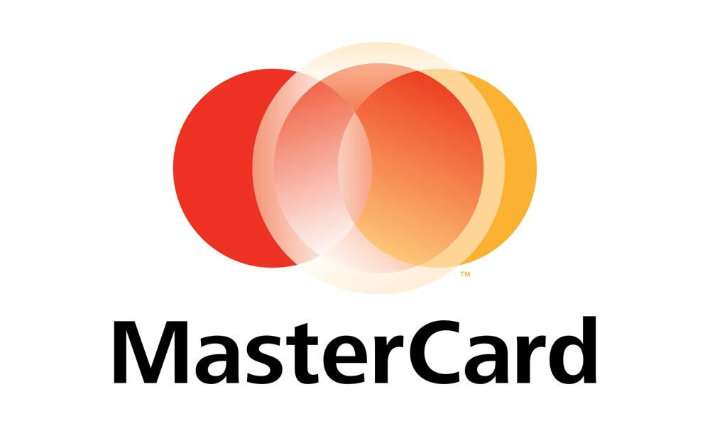
This year, Mastercard’s branding team made the biggest mistake in their marketing tenure. The original logo was far from original, and it became hard to recognize for Mastercard’s users.
Everything from the color gradient to the intersectional area was disturbed to look like something highly unprofessional.
Mastercard received its fair share of criticism from loyal users and critics in the industry, so they decided to sweep this experimental logo under the rug.
2016
A decade later, Mastercard decided to get rid of the horizontal bars in the intersectional area and resort to its simple yet impactful original logo. The Mastercard label was placed alongside the circles instead of the usual surface-top embossing.
Mastercard was back to its bold, edgy, and indigenous state. Notice how the ‘m’ and ‘c’ in the logo are de-capitalized.
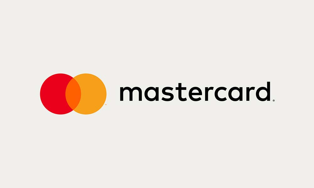
2019-Present
The modern-day Mastercard logo sticks to its primordial roots, representing growth, progression, and sleekness. The MasterCard lettering was eliminated, leaving the red and yellow circles to do all the talking.
Raja Rajamannar, the chief marketing and communications officer of Mastercard, explained the reason for this transformation. He stated that the brand had gained enough popularity to stand out on its own.
Mastercard now had a self-explanatory identity that no longer required the label for recognition.