Last Updated on September 28, 2023
Wonder Woman is a superheroine best known for her appearance in American comic books by DC Comics.
The character was created by American writer and psychologist William Moulton Marston in collaboration with artist Harry G. Peter. It made its debut appearance in All Star Comics #8, which was published on October 21, 1941.
Wonder Woman is portrayed as a heroine with superhuman powers. She comes from the mythical island nation of Themyscira, where she goes by the title Princes Diana of Themyscira. The character embodies some of the core feminine attributes. She can be strong and ruthless yet loving and caring.
In this post, we shift our focus to the official logo used for the Wonder Woman character.
Wonder Woman Logo Appearance
Logo Shape
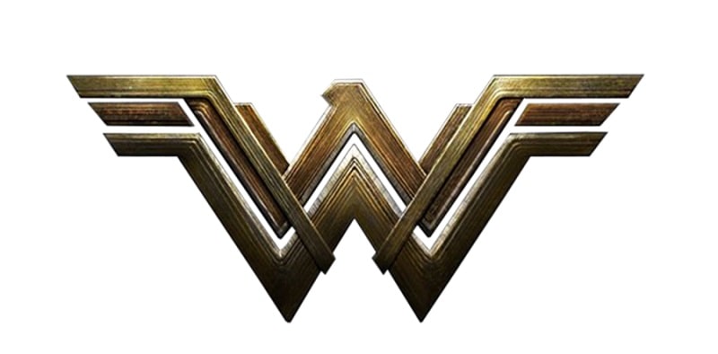
The Wonder Woman logo is made up of two letters W, where one letter sits on top of the other in a rather stylized fashion. The shadows of the letters are in yellow and each letter is outlined in black.
The two letters W appear in the UPPERCASE and are executed in a geometric typeface. Besides being set in UPPERCASE, the Ws are reasonably wide and come complete with large serifs.
If examined closely, the two letters W look a lot like a bird’s wings. An abstract beak can also be spotted on top of the icon. The wing-like design and abstract beak help the logo depict the ‘King of the Birds.’
However, note that the abstract beak isn’t very prominent in the latest Wonder Woman logo. The beak first emerged in the emblem’s 2016 iteration. But as you shall find, subsequent versions retained the wing but made the beak a lot more unrecognizable.
Another thing worth noting about the Wonder Woman logo is that it’s one of the many renowned icons that doesn’t come with the full lettering. Instead, the wordmark is aptly represented by the two letters W.
Logo Colors
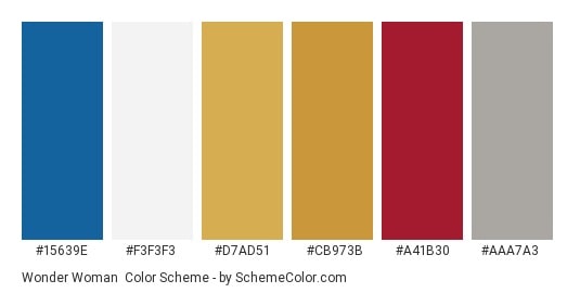
Bright yellow and black are the predominant Wonder Woman logo colors. Bright yellow is used for the shadows or inner spaces between the letters W, whereas black forms the letters’ outlines.
But like most logos, the Wonder Woman icon uses different color palettes depending on its context and display surface.
For instance, the bright yellow shadows usually appear dark golden in many of the logo’s versions. The shadows may also feature wooden colors, ranging from pale-brown to deep red-brown.
Other colors the Wonder Woman logo has previously appeared in include white, red, and gold.
Logo Font
The distinct letters W used on the Wonder Woman logo do not conform to any existing typefaces. These letters were likely created in a unique font developed exclusively for the Wonder Woman character.
Note that besides its official logo, the Wonder Woman character also uses different icons and fonts for its various projects. For instance, the font used on the posters of the 2017 superhero film looks nearly similar to Raleway Regular.
Raleway Regular is a regular version of Raleway, an elegant sans-serif typeface comprising nine weights. The font was initially created by Matt McInerney as a single thin weight but was subsequently expanded into nine weights in 2012 by Pablo Impallari and Rodrigo Fuenzalida.
It’s also important to note that the Wonder Woman font has been tweaked several times throughout the heroine’s history. Just like the icon’s other elements, designers have continually experimented with newer typefaces depending on the quality they intend the logo to evoke.
Symbolism about Wonder Woman Logo
The Two Letters W
The two letters W appearing on the Wonder Woman logo are simply the character’s initials. But besides initializing Wonder Woman, the two letters are rife in meaning and symbolism.
The Wonder Woman logo symbolizes strength, power, and bravery. Remember, she’s the world’s most celebrated mythical superheroine character.
The open wings created by the letters W symbolize Wonder Woman’s willingness to offer love and protection to those who need it. She may be ruthless in her dealings with the bad guys. But Wonder Woman is inherently endowed with positive feminine attributes, which include a desire to love, nurture, and protect.
The absence of the wordmark was intentional. It was purposely to draw attention to the wing-like design. And as we’ve already pointed out, the image of a beak and wings portray Wonder Woman as the indisputable ‘King of the Birds.’
All other design elements were primarily incorporated to make the logo stand out from whichever surface it appears on. Examples include the large shadows and outlines, UPPERCASED letters, and wide serifs.
Symbolism of the Colors
The Wonder Woman’s logo mostly appears in yellow and black. Yellow is the color of energy, happiness, optimism, and freshness. It symbolizes Wonder Woman’s mission of doling happiness and optimism in all her quests.
Yellow is also an attention-seeking color and was likely implemented to make the Wonder Woman logo more captivating.
Black is the color of royalty, power, elegance, mystery, and fear. Although this color is only used for the outlines, it still signifies Wonder Woman’s unparalleled power and might, as well as her mysterious nature. The black outlines also make the yellow shadows in the Ws stand out.
All other colors used in previous Wonder Woman logos had their respective meanings too. For instance, white was used to signify Wonder Woman’s humility and protection. It also helped to balance the black color that was used for the rest of the logo. Red was used to grab attention and also symbolize Wonder Woman’s courage and passion.
Wonder Woman Logo History
The original Wonder Woman logo first appeared in 1941. The icon featured an abstract-styled yellow bird set on a solid red frame.
The bird’s wings were rounded and outlined in black, making the emblem outstanding. Smooth curves and sloping contours gave the bird a feminine touch.
Wonder Woman used this logo until 1982.
1982 – 2006
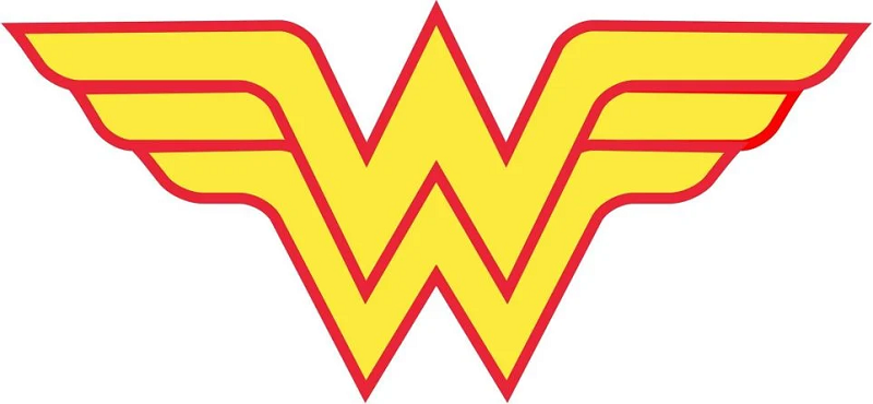
The first major upgrade to the original Wonder Woman logo happened in 1982. The new logo ditched the bird emblem in favor of a letter version, which comprised two letters W with one letter set above the other.
This logo was monochrome. White was used for the shadows of the two letters and black for the letters’ outlines. The ends of the two letters were elongated to give the emblem a wing-like appearance.
2006 – 2011
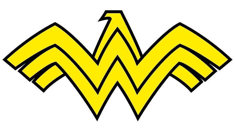
In the 2006 iteration of the Wonder Woman logo, the letters W appeared on a darker red frame. Unlike the logo’s previous versions, the new icon had a bird’s head with a beak on top.
The design also had a thick black outline, with the ends skewed downwards. Note that this logo has not been replaced entirely, even though subsequent versions have since emerged.
2011 – 2016
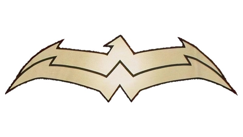
This logo was made up of twin letters W executed in a ‘flight’ design. The shadows of the two letters were set in light gold.
2016 – Present
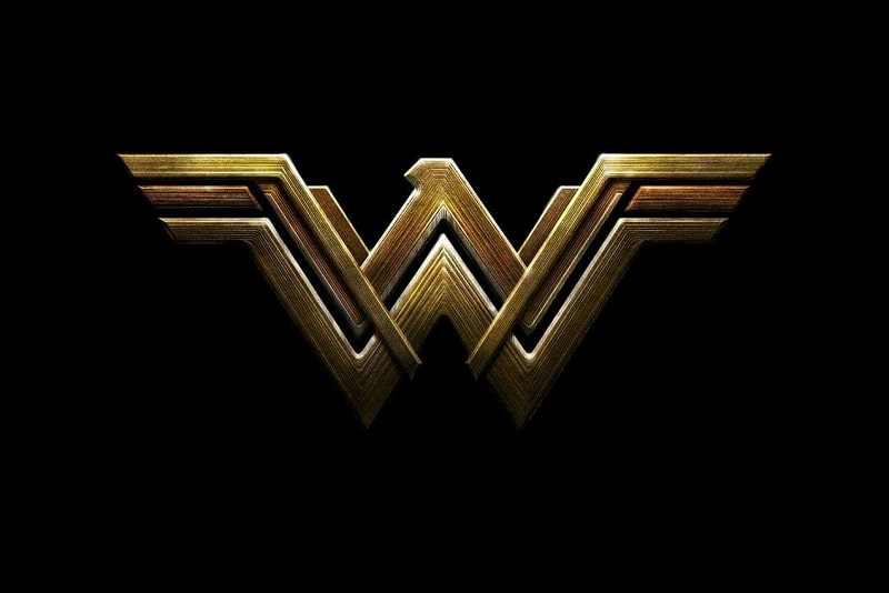
The main Wonder Woman logo currently used was designed in 2016. The logo borrows several features from the 2006 icon, only that the bird’s head and beak are rather diminished and virtually unrecognizable.
The Wonder Woman logo is one of the few icons that has lived up to its expectation. Although the logo has had several variations, it has retained its core attributes.

