You’ve probably always wondered why there’s such a thing as Wingdings. What is this ‘font’ used for? And who would use these weird-looking icons anyway?
What the Wingdings Font was All About
Phil Edwards of Vox explains in this video why the Wingdings font matters.
The history of Wingdings is as old as printing itself. Remember all those ornate books from the 16th to the 19th centuries? It took months of hard work and someone with very talented hands to finish them. When the printing press came about, the process wasn’t smooth sailing either. Each letter had to be carved out of wooden or metal blocks, then arranged to spell words and sentences.
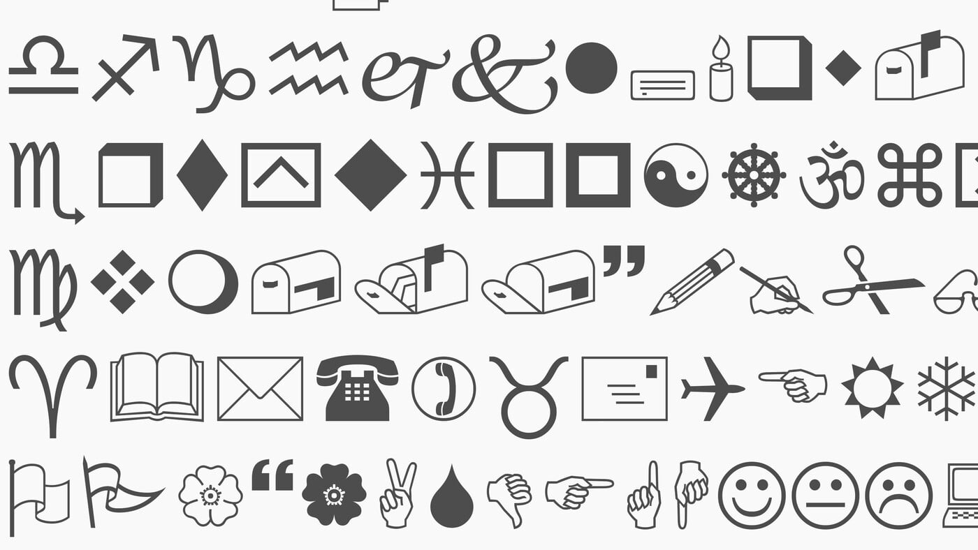
Additional flourishes, like decorative borders, were created thanks to dingbats. A dingbat is basically a character or ornament that printers used to make plain text more appealing. Nowadays, when you say a dingbat font, it means symbols and shapes in place of alphanumeric characters. One of the earlier versions of dingbats was made by gifted typographer, Herman Zapf. His Zapf dingbats were used extensively in the 70s.
Later on, his protégés Charles Bigelow and Kris Holmes created their own: these were the Lucida icons, stars, and arrows. Microsoft later bought them and renamed them into Wingdings. In a time when it was still difficult for computers to create pictures, Wingdings proved to be helpful.
With just a click on your keyboard, you can send a wave, astrological symbols, as well as smiley faces. You could say that Wingdings was the predecessor of the emoji.
You can find Wingdings pre-installed on common apps on your computer, such as Word or Adobe. For those who want to download them separately, you can go to Cufon Fonts to get them for free. For the Zapf version, check out Free Fonts for the ITC Zapf Dingbats.
Now go play!