Last Updated on August 17, 2023
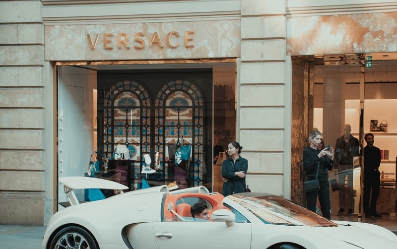
Gianni Versace S.r.l, commonly known simply as Versace, is an Italian luxury fashion company established in 1978 by Gianni Maria Versace. The company develops and manufactures ready-to-wear clothing and related accessories. It also produces haute couture pieces, mainly through the Atelier Versace brand.
Versace products stand out for their flashy prints and glowing colors. They’re also relatively more affordable than those of rival fashion powerhouses. And while the company is headquartered in Milan, Italy, its fashion accessories are available in multiple prestigious fashion outlets around the world.
Versace is also famous for its logo. The brand’s logo is inspired by Medusa, a Greek mythological figure who gained initial prominence for her beauty but eventually died a disgraced woman.
Versace Logo’s Appearance
Logo Shape
![]()
Versace uses the head of Medusa on its logo. Medusa is a Greek mythological figure famed for her seductive beauty. But what inspired the company to use Medusa’s head on its brand’s logo?
Besides the deeper symbolism (which we shall uncover in the next section), it’s reported that the Versace siblings first interacted with Medusa while playing as kids.
Apparently, the siblings came by several designs while playing on the floor of ruins in the area of Reggio Calabria. One of those designs was the head of Medusa. Not only were the kids awed by the design’s architectural ingenuity. They also found it mystically beautiful.
In addition to Medusa’s head, another notable element in Versace’s logo is the company’s wordmark. The lettering appears underneath Medusa’s head. It’s written in ALL-CAPS and set in black color.
Logo Color
![]()
Versace’s logo palette is monochrome. In other words, the logo features a combination of black and white.
However, note that the color palette can change significantly depending on the logo’s display surface. For instance, the logo may appear golden in some digital screens.
Logo Font
The word “VERSACE” appearing on the Versace official logo utilizes a commercial typeface known as Radiant RR Bold. Radiant RR Bold is a bold variant of the popular Radiant font.
Radiant is a sans-serif typeface designed by Robert Hunter Middleton and Steve Jackaman. The font was created between 1938 and 1941 for the Ludlow Typograph Company.
Radiant is popular for its minimalistic design. The typeface is especially suitable for digital display, such as television advertisements. It’s also perfect for use on non-body text.
Versace Logo Symbolism
Medusa’s Head
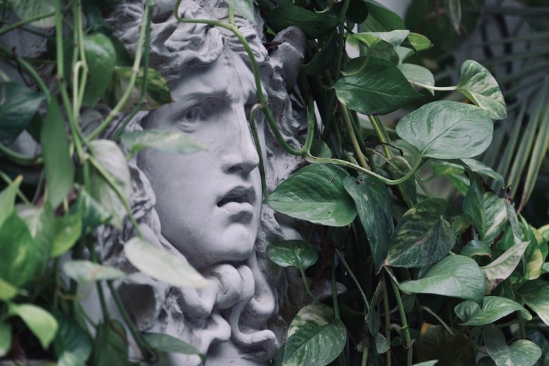
Medusa is a Greek mythological creature known for her sensual seduction.
According to Greek mythology, Medusa’s irresistible beauty caused her to be raped by Poseidon. Unfortunately, Poseidon’s wife, Athena, discovered that her husband was having an affair.
Athena became furious but instead of venting on her adulterous husband, she put a curse on Medusa. The curse turned Medusa’s beautiful hair strands into many living snakes. Medusa’s face also became so horrifyingly ugly that anyone who dared to look straight into her eyes would immediately turn into a stone.
That was one mighty fall for Medusa, coming from a glorious woman endowed with seductive beauty to a despicable monster who wreaked havoc whenever she went.
![]()
At first glance, it seems strange that a luxury brand would settle on the portrait of a monster as its primary logo. In any case, Medusa’s ugly face would be more of a turnoff than a delight to Versace’s customers. But the choice was not by accident at all.
Versace wanted a unique and memorable logo. Not only is Medusa’s head unique as portrayed on Versace’s graphic design. The story surrounding her fall from grace is itself mysterious.
Just as Medusa’s head turned onlookers into a stone, Versace’s products would equally captivate onlookers, almost as if they’d been frozen in space.
The “VERSACE” Wordmark
![]()
The simplest meaning of the “VERSACE” lettering is that it emphasizes the brand’s name. The choice of the wordmark was also a way of paying tribute to Gianni Versace.
The Color Palette
Black is a symbol of mystery, the same quality associated with Versace’s products. Black is also the mark of power, elegance, and royalty.
White, on the other hand, signifies purity and innocence. It’s unclear why Versace settled on this color, considering that Medusa was anything but pure and innocent.
Versace Logo History
The original Versace logo made its official debut in 1980. The emblem featured the word “GianniVersace,” set in Avant-Garde light font.
However, the fact that the two letters had no space between them reflected badly on readability. It was time for Versace to redesign the logo keeping in mind its poor legibility and other limitations.
1990 – 1993
![]()
Versace’s logo was first redesigned in 1990. The first of these modifications was changing the wordmark font from Avant-Garde to Radiant Medium. This alteration made the logo more legible.
The new wordmark featured uneven line thickness. It also had no serifs and included more angles. A space was introduced between the words “Gianni” and “Versace.”
By implementing a space between the two words, Versace’s logo could now appear with the words “Gianni” and “Versace” either in one line or on two levels.
1993 – 1997
![]()
1993 saw the adoption of Medusa’s face into Versace’s company logo.
1997
![]()
Versace’s logo underwent yet another design change in 1997. Most notable of these changes was the dropping of the “Gianni” portion of the word mark and retaining the “Versace” portion. The font also changed from Radiant Medium to Radiant RR Bold.
On July 15, 1997, Gianni Versace was fatally shot outside his Miami home by Andrew Cunnan. Although Cunnan’s motive was never really established, it emerged that he was particularly obsessed with Versace.
Gianni’s tragic death triggered dramatic changes to Versace’s logo. The deceased’s surname remained on the logo.
2008 – Present
![]()
The last and final upgrade to Versace’s logo happened in 2008. The logo’s designers experimented with several layouts.
In the first layout, the company’s wordmark appeared on top of Medusa’s head. But these changes were only short-lived. The logotype would eventually be written underneath Medusa’s head again, and that’s how it appears today.
Medusa’s head has been the main highlight of Versace’s logo since 1993. The story behind the symbol is as captivating as the products offered by Versace. That explains why the logo has undergone numerous changes but none of those changes has touched on the mysterious head.