Verizon Communications Inc., commonly known simply as Verizon, is an American multinational telecommunications conglomerate based in Midtown Manhattan, New York City. The company was formerly known as Bell Atlantic before changing its name to Verizon in 2000.
Verizon has registered an impressive growth rate over the years, much of which is attributable to mergers and acquisitions. Notable products owned by the conglomerate include cable television, digital television, landline, mobile phone, broadband, internet, digital media, telematics, and IPTV.
Verizon Brand Fonts
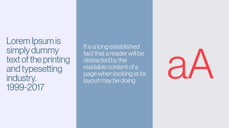
Verizon uses the Neue Haas Grotesk font. This is the typeface that appears on the official logo of all Verizon products.

Neue Haas Grotesk is a font in the family of the highly popular Helvetica. That’s a point worth stressing because several publications tend to view Neue Haas Grotesk as a distinct font from Helvetica. In fact, you’ll come across many blogs suggesting that Verizon uses Neue Haas Grotesk and not Helvetica, yet the two are fundamentally similar.
Helvetica, also known as BW Haas Grotesk, is a sans-serif, neo-grotesque typeface that emerged in 1957. The font was created by Max Miedinger and Eduard Hoffmann.
Many 20th-century typefaces were developed based on preexisting designs, and Helvetica is no exception. This font was inspired by German and Swiss type designs that predated it, particularly the Akzidenz-Grotesk typeface that enjoyed near-cult popularity in the 1890s.
Helvetica Design History

Helvetica was initially released by the Haas Type Foundry, also known as (Haas’sche Schriftgiesserei) of Münchenstein (Basel), Switzerland. A few years later, Mergenthaler Linotype Company licensed and reissued the typeface.
Shortly after reissuing Helvetica (in 1960), Linotype renamed the typeface Helvetica. It’s then that the font’s popularity began to increase.
Helvetica originally appeared only in the regular format. But as interest in the typeface increased, there was a need to develop additional styles and weights. Designers who came after Miedinger and Hoffmann also developed different Helvetica sizes and designs for compatibility with non-Latin alphabets.
Neue Haas Grotesk Features and Applications

Like other fonts in the Helvetica family, Neue Haas Grotesk comes with no serifs. That makes it suitable for official design projects, such as when creating your company’s wordmark. The apparent lack of serifs also makes the typeface appear neat and clean, thereby enhancing its legibility.
Fonts in the Helvetia family boast numerous other differences from many 20th-century fonts. Such as: relatively high x-height, unusually tight kerning (spacing between letters), two-storied letter ‘a’, and square-shaped letter ‘s’, to name a few.
Where to Download Neue Haas Grotesk
Coming from a wildly popular font family, there are tons of websites where you can download Neue Haas Grotesk. Examples include DaFont Free, CuFon Fonts, and Fonts Hub.
Neue Haas Grotesk is 100% free for personal and commercial use. However, it would be best to contact the font’s official publisher (Linotype) for a full commercial license.

