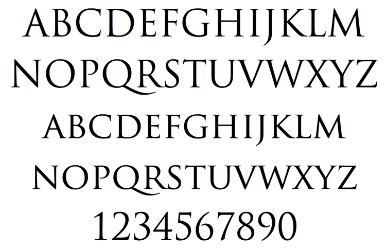
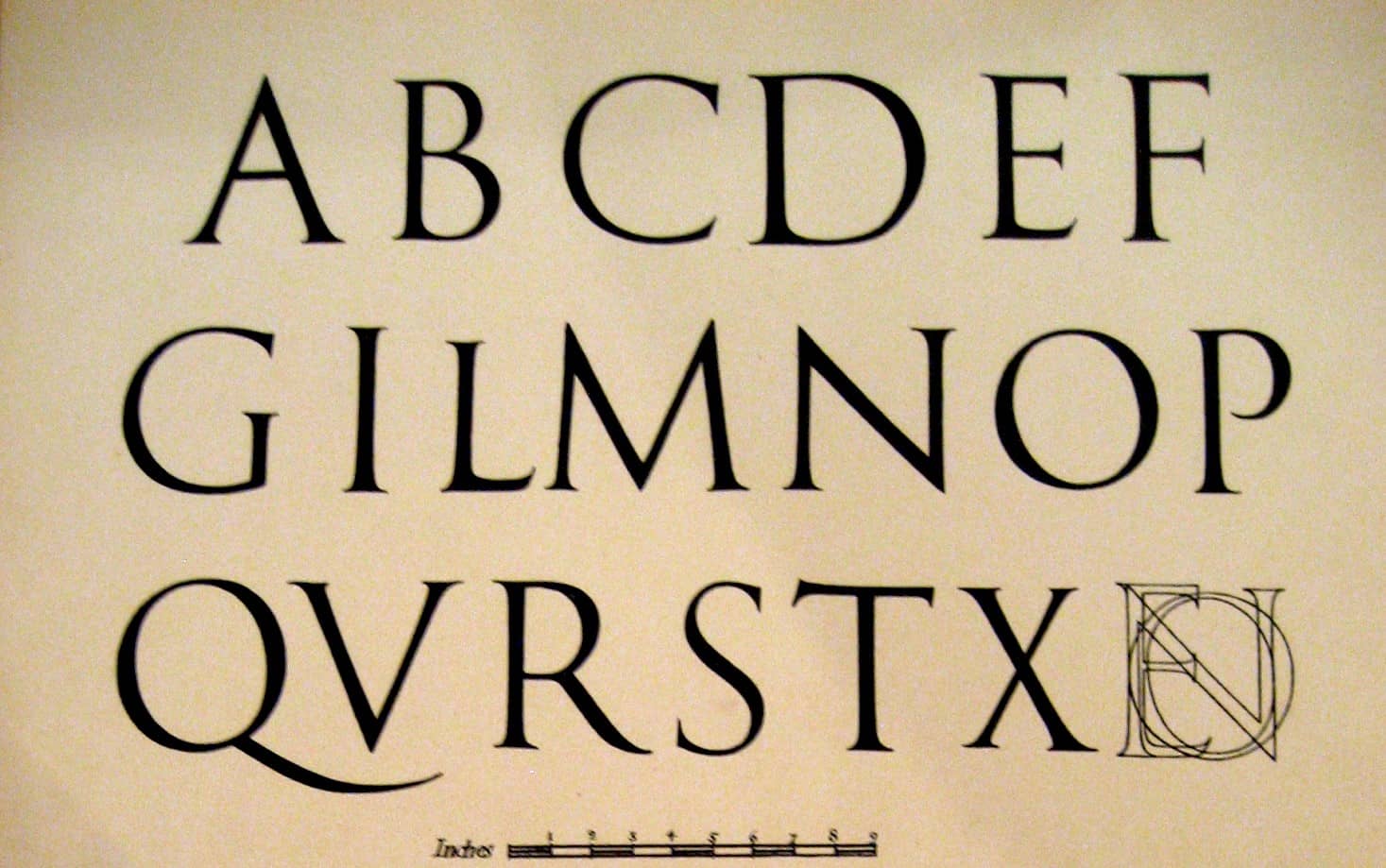
While corporations and startups shift their design to the more youthful sans serifs, there’s still something to be said for its nobler counterpart: the serifs. From the first letterpress to Roman inscriptions, serifs not only hold history, they tell it. No wonder they’re a typeface of choice for businesses that want to convey trust, longevity, and firmness.
The same can be said for films that became blockbuster hits.
Trajan: the Typeface of Movie Posters
A Beautiful Mind, Titanic, Stargate, Rogue One, Interview with the Vampire, Lord of the Rings, The Last Samurai, A Nightmare On Elm Street, and the list simply goes on. In this video, Vox production and [typo]graphic designer Yves Peters explains how the Trajan font eventually became THE typeface of choice by many movie posters in the past decades.
It wasn’t always this way though. Before the age of Photoshop, movie poster fonts needed to be hand-drawn. Thus, you’ll be hard-pressed to see two that look alike.
Designed by Carol Twombly in 1989 for Adobe, Trajan was just one of those fonts that came pre-installed with the software. The first ever movie poster with the Trajan font was At Play In The Fields Of The Lord, which came out in 1991. After that, it was on every movie that portrayed human trials and perseverance, such as The Bodyguard, The Joy Luck Club, and Trial By Jury.

In the last few years however, Trajan slowly fell off its high horse. Nowadays, it can be seen gracing the horror and straight-to-DVD genres. Perhaps it’s because more people are becoming keener on design. Either way, the age of unique movie posters seems to have had a comeback.
But hey, if you’re not put off and want the font for your own projects, you can download the set at Wfonts. And don’t forget to watch this entertaining video for expert insight on the matter. You can purchase Trajan for commercial use here: https://www.myfonts.com/fonts/adobe/trajan/

