Last Updated on August 17, 2023
Superman is a superhero character appearing in American comic books published by DC Comics. The character was created around the mid-30s by Jerry Siegel and Joe Shuster. However, it made its debut in 1938 in the comic book Action Comics #1.
Superman was born on a fictional planet known as Krypton. His birth name was Kal-El. To protect him from the imminent destruction of his native planet, Kal-El’s parents sent him to earth in a small spaceship.
The ship landed in the fictional American countryside town called Smallville. Superman was adopted by farmers Jonathan and Martha Kent, who named him Clark Kent.
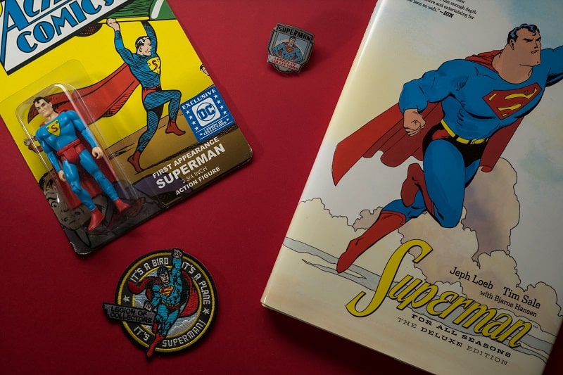
True to his name, Clark developed superhuman abilities. He regularly changed into a colorful costume to protect his personal life as well as fight crime.
Besides his appearance in DC Comics comic books, Superman has also made numerous appearances in novels, movies, television shows, and radio serials.
Superman Logo Appearance
The Superman logo is widely considered the world’s most recognized superhero symbol.
According to many film and logo pundits, Superman is the second-most recognized symbol in the world, coming only after the Christian cross. A truly remarkable feat for a symbol that is less than a century old.
Superman Logo Shape
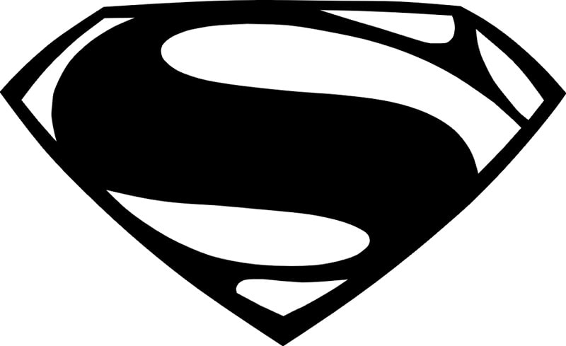
At first glance, the Superman logo looks more like a pentagon. But when you view it up-close, the logo is actually diamond in shape. It has a flat top and a pointed bottom.
On top of the logo is a wide line that comes complete with a short line on either side. The short lines connect to the two longer lines running along the bottom of the symbol.
But perhaps the most recognizable feature in the Superman logo is the “S” sign. The sign appears at the center of the logo. It’s set in a bold, red color and is slightly skewed such that it aptly fits within the outline of the emblem.
Logo Colors
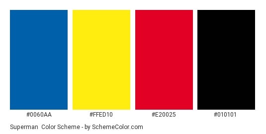
Red, black, and yellow are the predominant Superman colors. Red is mainly used for the “S” sign at the middle of the emblem as well as for the logo’s edges. Black outlines the edges of the logo, while bright yellow is used as the background color.
The Superman symbol appears in several versions. And while most versions use the red and yellow color palettes, these may differ in their intensity and brightness. In some versions, the colors appear brighter and seem to almost glow, while in others, the red and yellow color look duller and less energetic.
Superman Logo Font
Superman’s logo doesn’t use any official typeface. The letter “S” on the symbol was likely inspired by a custom font and designed exclusively for the Superman shield.
Superman Logo Symbolism
The meaning and symbolism of the Superman logo can be broken down into three parts – meaning of the letter “S,” symbolism of the diamond shape, and meaning of the colors used.
The Meaning of “S”
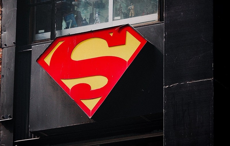
The most straightforward symbolism of the letter “S” appearing on the Superman chest shield is that it stands for “Superman.”
However, there are many other explanations based on various Superman creators and fanatics. One such explanation suggests that the S sign is a Kryptonian symbol representing his Kryptonian family. Proponents of this explanation argue that the symbol means “hope” in the Kryptonian culture.
There’s also a section of Superman fans that believe the letter “S” stands for ‘stronger together.’
But perhaps the most interesting explanation is one that says the letter is a stylized depiction of a coiled snake. The snake serves as a reminder that the beholder should never return to a bad time in Kryptonian history.
The Diamond Shape

The diamond in the superman logo simply represents a shield. Superheroes are known to wear shields as they go about their quests to save the world from villainous characters.
Meaning of the Colors
Red serves as a reminder of the red sun of the Krypton, Superman’s origin. Yellow represents the color of Sol (the sun). Therefore, the red and yellow color palette indicates that, although Superman’s powers mainly spring from the yellow sun on our planet, he still maintains touch with his native planet.
There’s no express meaning of the black color. But it might have simply been used to make the red and yellow colors stand out from the symbol.
Superman Logo History
The original Superman logo was designed in 1934 by Jerry Siegel and Joe Shuster. Although the current logo resembles a shield, Siegel and Shuster originally intended it to be a crest.
But when the comic made its debut in 1938, Siegel and Shuster realized that the artwork didn’t quite match the logo’s cover design. So, they redesigned the shield as a triangle and placed “S” in the middle.
Here’s a quick look at how the logo has changed:
1941 – 1948
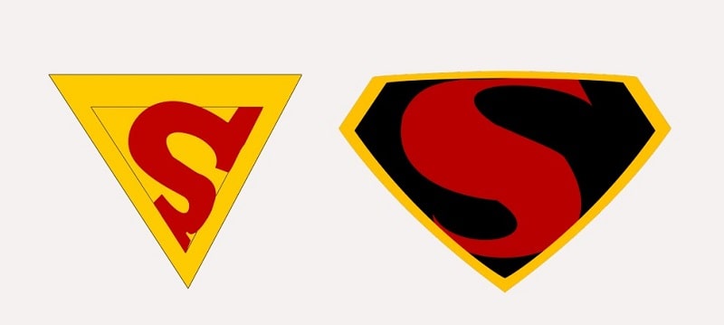
Superman’s logo began taking the shape of a pentagon in early 1941. The new artists working on the logo, Wayne Boring and Leo Nowak, implemented a red background color. The “S” was also in red, whereas the border was in yellow.
On September 26, 1941, some of the logo’s elements changed again. For instance, the background color changed from red to black.
1955 – 1978
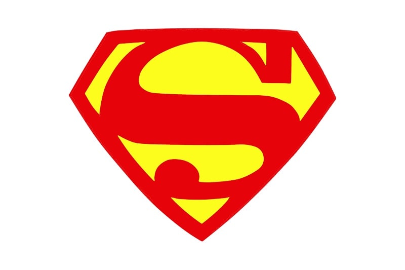
The Superman shield retained much of its appearance, but the “S” sign went through a few changes. First, the sign looked thicker than in previous versions. It also sported a large, round end.
1986 – 1993
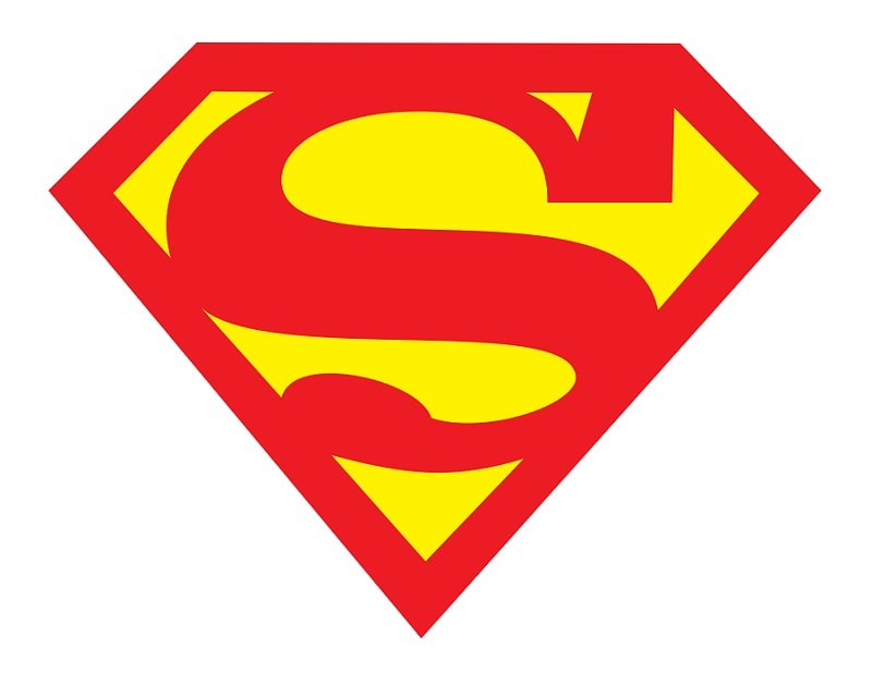
The 1986 logo was very similar to the 1978 one. Except that it was larger and the symbol went across Superman’s chest. The new designer, Jonathan Kent, placed more emphasis on the “S” sign by implementing a large line at the center of the S.
1997 – 2001
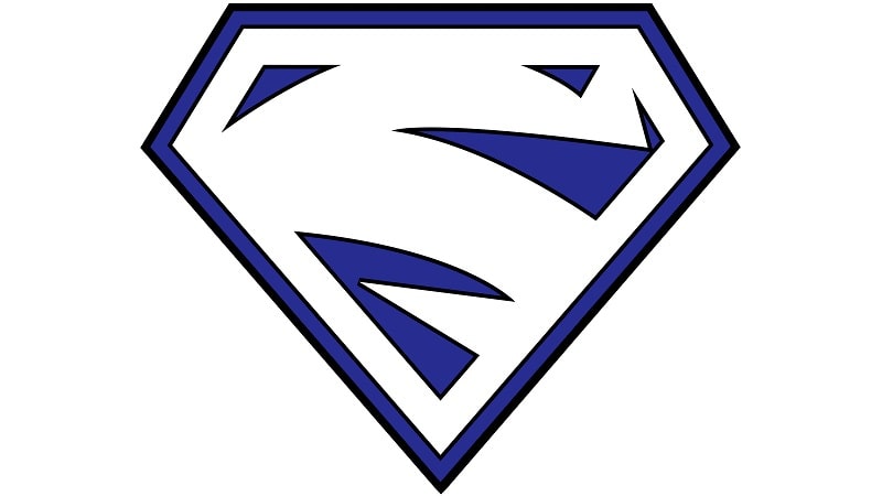
Following the death of Superman, the character acquired new abilities. And so did the logo. The new Superman logo lacked the red and yellow colors. Instead, it featured a white and blue italicized lightning bolt which nearly resembled an “S.”
2006 – 2013
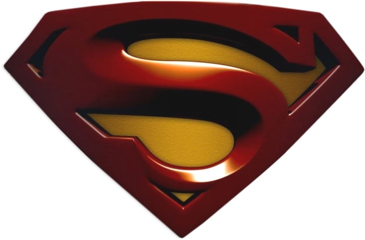
The Superman logo underwent yet another dramatic change in 2006. The red and blue color pattern became darker and the new emblem looked like a raised 3-D shield.
2013 – Present
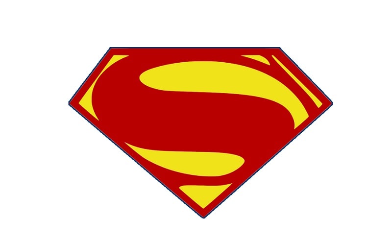
Credits to Dreed-06 from DeviantArt
The last major upgrade to the Superman logo happened in 2013. The new symbol featured more rounded edges and a prominent “S.” It also enhanced the red, yellow, and black colors. This is the logo’s version as we know it today.
Superman is undoubtedly one of the most popular superhero symbols in the world. But to achieve that success, the logo had to undergo countless upgrades and redesigns.

