Last Updated on September 28, 2023
Colors are one of life’s most fascinating things. The right pigment can speak volumes where words wouldn’t suffice. And did you know that the human eye can distinguish approximately 10 million different colors
Another interesting fact about colors is that the millions of different hues visible to the human eye stem from eleven pigments. They include black, white, brown, gray, red, orange, yellow, green, blue, pink, and purple.
Green is among the most symbolic of all common colors. That’s probably due to its association with nature, freshness, and vitality.
Like most colors, green exists in multiple hues. Some shades of the pigment, like jungle green and forest green, are a lot more common. Others, such as sage green, are a bit scarce. And it’s that very rarity that makes them precious and highly sought-after.
This article explores sage green by uncovering the symbolism and recommended applications of this iconic shade of green.
Introducing Sage Green
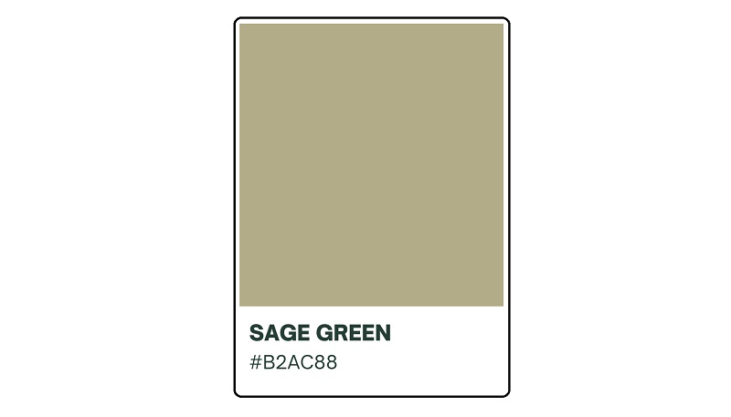
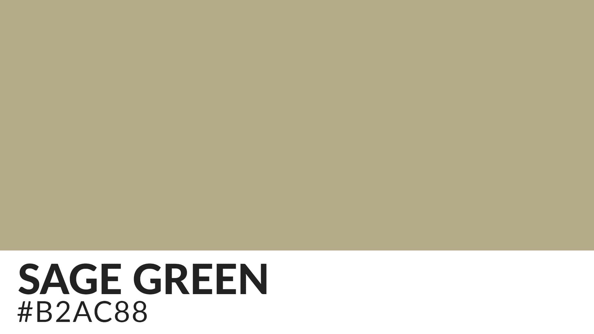
Sage green is a dark grayish-green color that resembles the dried leaves of the eponymous culinary herb. This color is also commonly known simply as sage. The sage green pigment has a hex color code of #B2AC88.
A hex code is basically a representation of the saturation of red, blue, and green in a color. The code is often rendered in a hexadecimal format.
Classification of Sage Green
Sage green is classified as a quaternary color. Quaternary colors are tertiary or intermediate colors made by combining full saturation of one primary color with half saturation of another primary color.
These pigments also typically include only two primary colors, albeit in varying saturations. Rarely will you find a quaternary color comprising more than two discrete primary colors.
Colors That Make Up Sage Green
Sage green comprises an equal mix of citron and slate. Citron is a dark lemon color that bears a striking resemblance to its eponymous fruit. It’s considered an equal mix of green and orange pigments.
Slate, on the other hand, is a gray color with a tinge of azure. It’s named after the eponymous soft-grained rock.
Origin and History of Sage Green
While the origin of some colors can be traced back to specific artists, places, or historical eras, sage green is rather timeless. The pigment has been around for a pretty long time due to its resemblance to and association with dried sage leaves. However, it’s worth noting that many shades of green precede sage in artistic and literary applications.
Green pigments have been popular in art from time immemorial due to their resonance with timeless traits. There’s plenty of evidence on the usage of green color among ancient Egyptians and Greeks. The Egyptians were mostly mesmerized by green earth and malachite while the Greeks favored verdigris.
Green witnessed an eclipse in popularity at some point in history. The color’s popularity suffered a massive blow following speculations that the death of renowned French military commander and political leader Napoléon Bonaparte might have been caused by a lethal green dye known as Scheele’s Green.
After his death, it emerged that Bonaparte’s bedroom was painted in the dye. The fact that Scheele’s Green manufactured during this period contained worrying levels of the heavy metal arsenic led many to believe that the general’s death might have resulted from inhaling the toxin.
However, shades of green resurged in art during the Impressionist movement, thanks to advancements in the manufacture of green paints and pigments. But even in the face of this resurgence, sage green was still poorly represented in art. That’s regardless of its long natural existence in things like the sage herb.
Meaning and Symbolism of Sage Green
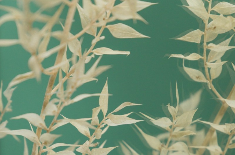
Sage green can conjure several feelings and qualities. Common ones include the following;
1. Knowledge and Wisdom
The term “sage” has been used from at least circa 1300 to mean ‘man of profound wisdom.’ This word was originally applied within the context of the Seven Sages of Greece.
Also known as the Seven Wise Men, the Seven Sages of Greece was a functional unit in ancient Greece that consisted of philosophers, statesmen, and law-givers who were famed for their wisdom.
The seven sages were Thales, Solon, Bias, Periandros, Pittacos, Cleovoulus, and Chilon. They lived between the 7th and 6th centuries, before the advent of renowned Greek philosophers like Aristotle, Socrates, and Plato.
As a symbol of knowledge and wisdom, sage green would be perfect for scholarly projects. Donning sage attire would also be an ingenious way of flaunting your intellect. Besides, the color could make an excellent theme for the cover of informative books and magazines.
2. Peace and Tranquility
Sage green connotes peace and tranquility. These qualities also happen to be associated with green, the main color where the sage pigment comes from.
Inviting sage into a chaotic setting can be a covert way of alleviating the tension between the warring factions. That’s in sharp contrast to hostile colors like red and purple. Sage creates a sense of tranquility so profound that it’s a common choice in the manufacture of picnic supplies like tents and sleeping bags.

3. Nature and Ecology
Numerous variants of green resonate with nature. These shades aptly evoke the imagery of Mother Nature’s classic appearance, that of lush greenery.
However, while many shades of green speak to nature’s vitality, sage symbolizes ecological serenity. The pigment would look particularly gorgeous on earth-themed paintings.
It serves as a reminder of how escaping into the calmness of nature can often shield us from all the chaos in our surroundings.
4. Innocence and Inexperience
The fact that sage is a pale shade of green speaks to its association with innocence and inexperience. You might consider this pigment for art projects with children as the underlying subject.
Sage would also be perfect for projects that depict anything virgin beyond the sexual connotation of the word. For instance, you could introduce hints of sage while painting unexploited landmarks, such as lakes and forests.
 5. New Beginnings
Sage hues also connote new beginnings. The color is associated with rebirth. Incorporating sage into your setting is a subtle message that you’re expecting imminent change. The change could relate to one or more aspects of your life.
For instance, donning sage pants on your maiden date might indicate you’re having high expectations from your new partner compared to your ex. Similarly, making this color the background for your branding materials may be a skillful way of informing your employees that the company is nearing an inflection point.
Of course, it makes more sense if your staffers are also knowledgeable about color psychology.
6. Wealth and Success
Since sage is the color of change and growth, it’s unsurprising that it’s also associated with success and affluence. The color tends to look especially spectacular when used in prestigious designs.
You might have come across sage on the walls of swanky hotels or in high-end fashion accessories. Well, that’s no coincidence at all. It’s how the designers intended to associate the color with opulence.
How to Create Sage Green
Sage green is relatively easy to make. Provided that you’re armed with the right shades (and other color-mixing items), you can quickly whisk a sage for your upcoming art project.
Blue, yellow, and gray are among the most common colors you can use to create sage green. The process would typically unfold as follows;
i. Add two parts yellow paint and one part blue paint to a bowl or a plate.
ii. Use a paintbrush or a palette knife to combine the colors until they form a basic shade of green.
iii. Add three parts of yellow paint to the basic green color to enhance its brightness.
The resultant color would be a bright grass green.
iv. Using your paintbrush or knife, gently stir the mixture until all the discrete colors are uniformly mixed.
v. Add three parts white and one part black to a separate bowl.
These ratios would produce a neutral-medium-light gray.
vi. Stir carefully to achieve uniformity.
vii. Stir the full amount of the gray mixture into the grass green mixture and stir continuously until both are uniformly mixed.

The final product should be sage green. You can enhance its texture further as desired. For instance, adding more black or grass green results in a darker shade of sage while more gray or white lightens it up.
Instead of gray, you could also create sage green using red while preserving blue and yellow. Here’s how to go about it;
i. Add two parts of yellow paint to one part of blue paint to create a basic green color.
ii. Stir the mixture carefully using a paintbrush or palette knife until there are no streaks of either color.
iii. Add one drop of red paint at a time to the basic green mixture to create sage.
Note that red and green sit on opposite sides of the color wheel. The implication is that equal amounts of either color should cancel each other out. However, this isn’t exactly the case, bearing in mind that red is a warm color while green is a cool color.
When mixed together, warm colors tend to create more dramatic effects than their cooler counterparts. That explains the essence of adding red drop-wise to the basic green mixture.
iv. Add small amounts of red, green, black, or white to tweak the sage green to your preferred tone.
Ideally, you’d add more red or more green to the mix to achieve your ideal shade. Then, lighten or darken the shade by adding white or black, respectively.
Pairing Sage with Other Colors
Sage green may be a beautiful and charming color. But you’ll not always find it on its own. The color looks more stunning when paired with other pigments. You only need to know which shades to go for.
Sage would blend seamlessly with other nature-inspired hues. These include brown, taupe, mustard yellow, light gray, and cream. You could also intensify sage’s effects by pairing it with contrasting colors, such as purple and pink.
In fact, the fact that sage green is a neutral color makes it pairable with most pigments, including both warm and cool ones.
Wrap Up
Sage is an elegant shade of green that can bring out the best in any art project. In addition to being rich in symbolism, this color can also blend seamlessly with numerous pigments to add a magical appeal to your projects.

