Rolls-Royce is a household name in the luxury automobile sector. The company may be relatively newer than most automakers. But it has rightfully earned its reputation among the world’s leading high-end automobile brands.
Part of what makes the Rolls-Royce brand so successful and memorable is the company’s defining logo. Many car enthusiasts may dismiss Rolls-Royce’s logo as too simplistic. But it’s that modesty that makes the emblem incredibly outstanding and easily associated with the auto giant.
Want to learn more about the outstanding Rolls-Royce logo? Then read on as we unpack everything to know about the emblem, including its shape, meaning, and evolution.
About Rolls-Royce
Rolls-Royce Motor Cars Limited, commonly known simply as Rolls-Royce, is a British luxury automobile manufacturer. Rolls-Royce was established in 1998 as a wholly-owned subsidiary of renowned German group BMW.
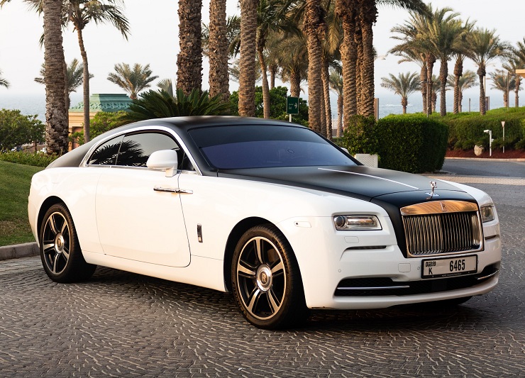
The company operates from purpose-built facilities located in the historic Goodwood Circuit based in Goodwood, West Sussex, England. Some of its notable products include Rolls-Royce Phantom, Rolls-Royce Cullinan, Rolls-Royce Ghost, Rolls-Royce Wraith, and Rolls-Royce Dawn.
However, it’s important to mention that while Rolls-Royce Motor Cars Limited was founded in 1998, the Rolls-Royce brand name is more than a century old.
How Did The Rolls-Royce Brand Come About?
Rolls-Royce was a British luxury automobile and later an aero-engine manufacturer established in 1904 in Manchester, United Kingdom, by Charles Rolls and Henry Royce.
The company enjoyed astronomical success during World War I from its aero-engines manufacturing business. However, in the late 60s, Rolls-Royce suffered adversely from the botched development of its advanced RB211 jet engine. This caused a ripple effect in the company’s fortunes over the next few years.
In 1971, Rolls-Royce owners liquidated the business and sold the useful portions of it to the British government. The new company, Rolls-Royce (1971) Limited, continued with aero-engine manufacturing. However, it sold the holdings to British Aircraft Corporation (BAC) and subsequently transferred ownership of its car division to Rolls-Royce Motors Holdings Limited. The car division was later sold to Vickers in 1980.
In 1977, Rolls-Royce (1971) Limited dropped the ‘1971’ part from its name. And in 1987, the British government renamed the company to Rolls-Royce PLC and sold it to the public. Rolls-Royce PLC continued to operate the company’s core business of aero-engine production. But in 2003, it became a subsidiary of Rolls-Royce Holdings.
What’s The Connection Between Rolls-Royce Motor Cars Limited and The Original Rolls-Royce Business?
Rolls-Royce Motor Cars Limited has no direct relationship with the original company of the same name founded by Charles Rolls and Henry Royce. That also means that Rolls-Royce Motor Cars Limited had nothing to do with any Rolls-Royce-branded cars produced prior to 1998.
The only relationship between these brands is that in 1998, BMW acquired rights to the Rolls-Royce brand name and logo from Rolls-Royce PLC. In other words, all logos previously used by the original Rolls-Royce company plus any subsequent iterations were now a property of BMW.
Shortly after this grand acquisition, BMW established the Rolls-Royce Motor Cars Limited.
Rolls-Royce Logo Appearance
Logo Shape
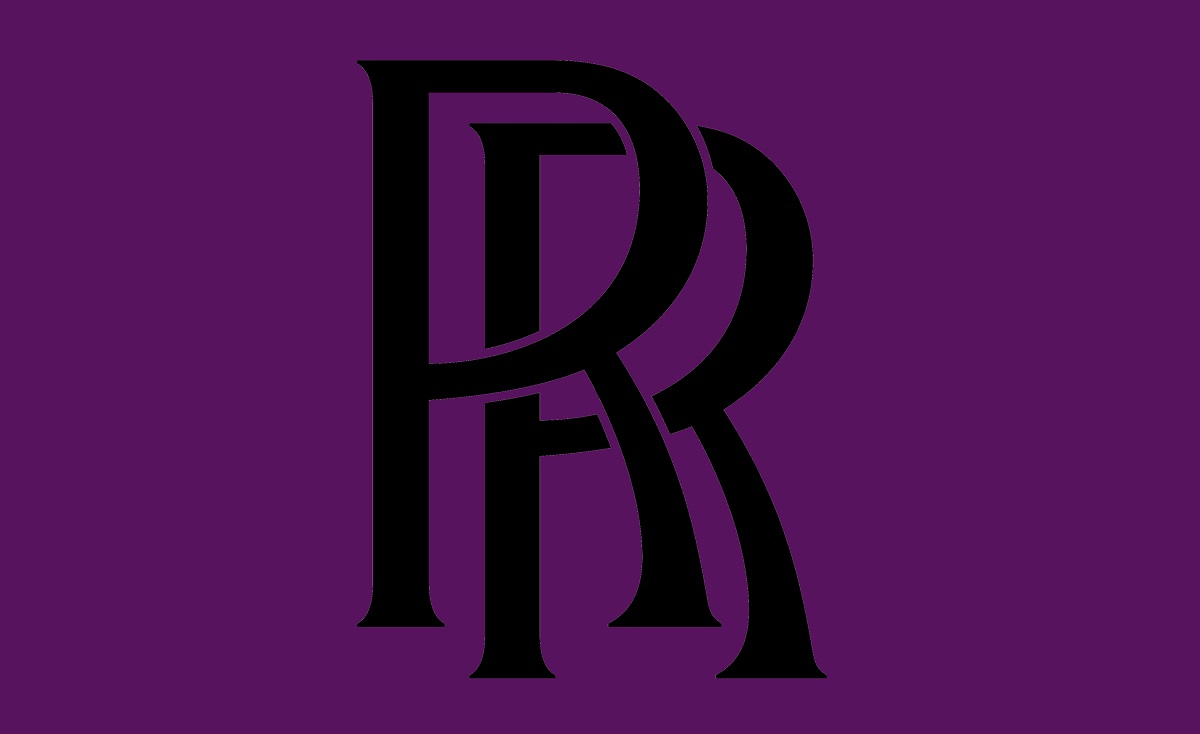
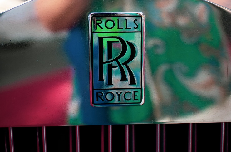
Rolls-Royce logo consists of two letters “R” overlapping into each other. The letters are all in the UPPERCASE and executed in black.
Logo Colors
Rolls-Royce logo uses a monochromatic color scheme. The two letters R appear in black, with white or colorless serving as the background color.
Logo Font
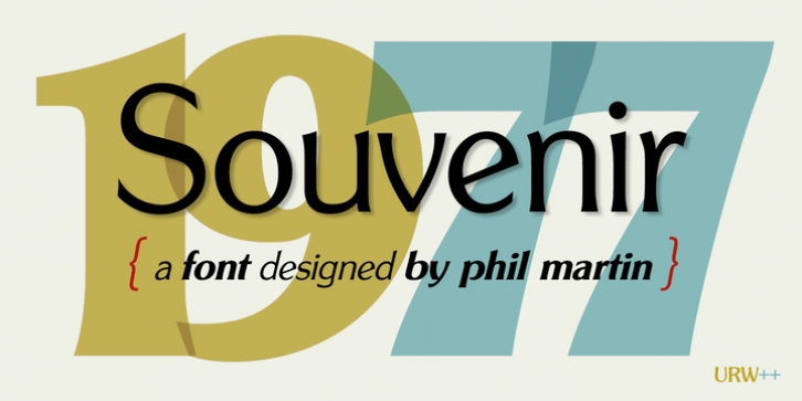
The two letters R on Rolls-Royce logo seem to have been modeled based on the Souvenir Gothic URW Regular font. This is a regular version of a typeface designed by Phil Martin and released via the famous Unternehmensberatung Rubow Weber (URW) font foundry.
Smashing Fonts and Font Gala are examples of websites where you can download any font in the Souvenir Gothic URW family.
Symbolism of the Rolls-Royce Logo
Symbolism of the Two Letter Rs
The two Rs on Rolls-Royce logo represent Rolls and Royce, the masterminds behind this legendary brand. Not only do the letters stand for the names of the company’s original founders. But they also help to perpetuate the Rolls-Royce legacy.
Symbolism of the Colors
Black is a symbol of power, elegance, and sophistication. Rolls-Royce might have adopted this color to portray its cars as strong and elegant.
Rolls-Royce Logo History
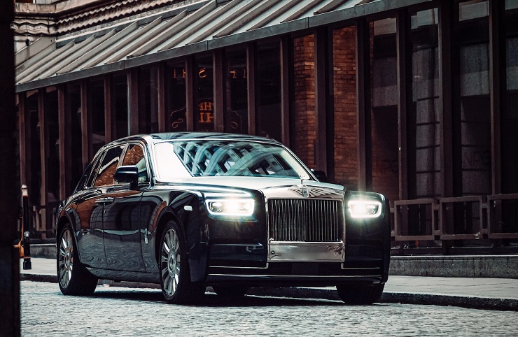
As we’ve already indicated, BMW acquired all rights to the brand name and logo of the original Rolls-Royce company. Therefore, this section highlights the history of the Rolls-Royce logo since the company’s establishment in 1904.
Rolls-Royce operated without a logo for nearly two years after its establishment. The company’s debut logo emerged in 1906 and stayed with the brand until 1934. It looked like a traditional four-piece coat of arms.
At the top left of the shield was an image of the Spirit of Ecstasy, while the lower right of the design had two wings associated with the goddess of victory – Nike. A rectangle appeared at the central part of the shield containing the monogram of two “R” as well as the inscription “ROLLS ROYCE.” Other elements in the debut logo included lions, a seahorse, and the Red Rose of Lancaster.
Although Rolls-Royce’s debut logo lasted till 1934, the company came up with several designs in between. In fact, as you shall find, most Rolls-Royce logos were designed in periods that somewhat overlapped.
1911 – 1934
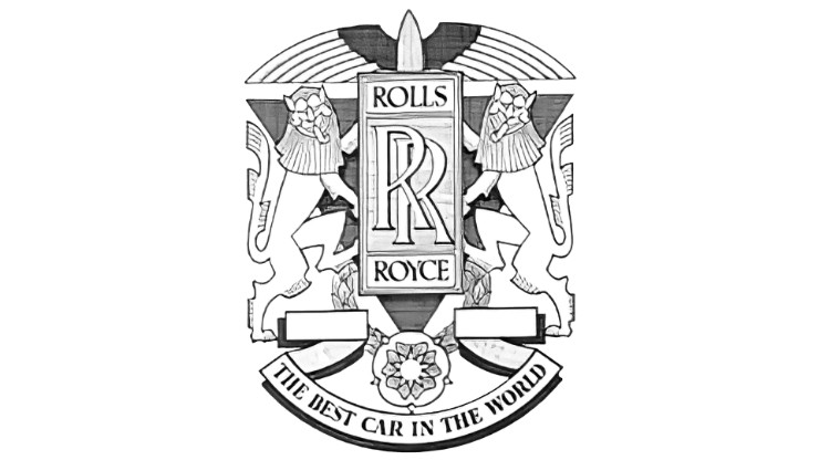
The logo used during this period featured a rectangle as a shield, with two heraldic lions holding it. The rectangular frame contained the company’s name. Above the shape were stylized wings and underneath it were the Red Rose of Lancaster and a ribbon bearing the tagline “THE BEST CAR IN THE WORLD.”
1911 – 1973
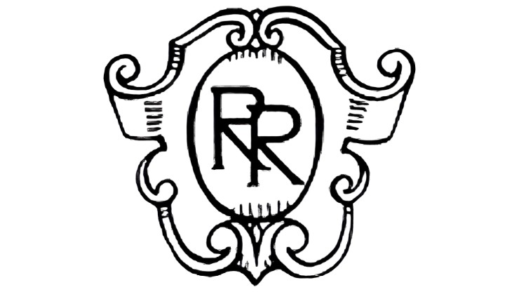
Rolls-Royce’s logo became minimalistic for the first time. The new design featured a symbol with the monogram “RR” executed in an oval that was placed inside a figured coat of arms.
1911 – 2020
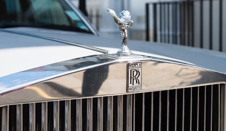
This is arguably the most iconic Rolls-Royce logo of all time. Christened ‘the Spirit of Ecstasy,’ the badge was the figure of a woman inclined forward, with her wing-like arms outstretched behind her back. The image was set in a double-framed silver shield.
Although the Spirit of Ecstasy no longer functions as Rolls-Royce logo, the mascot continues to feature in the bonnet of Rolls-Royce cars.
1973 – 1998
Rolls-Royce reverted to its monogram logo. Only that this time around, the two letters “R” overlapped. The letters were executed in white then set on a vertically-placed rectangle with smooth edges and dark-blue background.
1998 – 2020
This was the first Rolls-Royce logo under the management of BMW. The emblem was a modified version of the previous one. The monogram became black and was now set in a grey upturned rectangle, which was further inscribed in another larger rectangle. Above the monogram was the word “ROLLS” and below it was the inscription “ROYCE.”
2020 – Present
The current Rolls-Royce logo emerged in 2020. Designers did away with the rectangular frame and inscriptions, leaving the monogram in a bolder, black color.
Final Word
The original Rolls-Royce company may be largely forgotten. But the company’s name lives on, thanks to a bold move by BMW to acquire rights to its brand name and logo.

