Last Updated on June 29, 2023
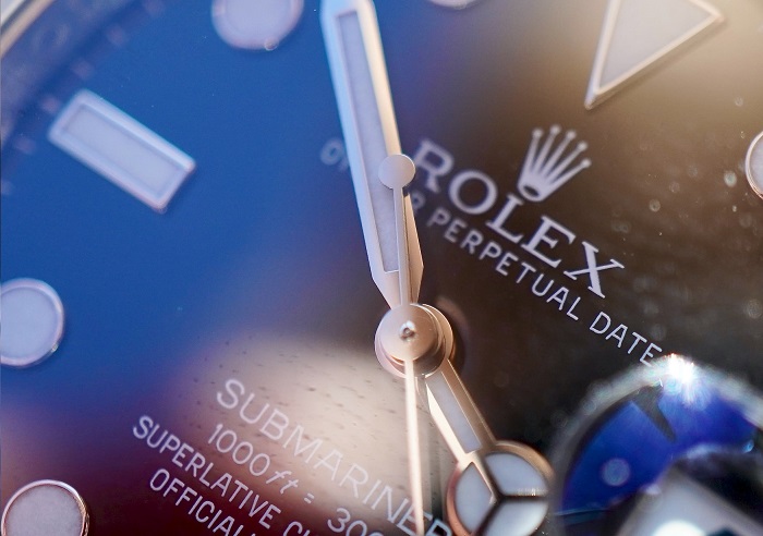
Rolex SA, commonly known simply as Rolex, is a British-founded Swiss-based watch designer and manufacturer. The company was established in 1905 in London, United Kingdom, by Hans Wilsdorf and Alfred Davis. It was previously known as ‘Wilsdorf and Davis,’ based on its founders’ surnames.
Although Rolex was founded in England, the company moved its headquarters to Geneva, Switzerland, following the economic ravages of World War I in the UK. The watchmaker is especially famous for its mechanical timepieces, although it has occasionally produced quart watch models too.
The Rolex Font
The Rolex logo features a 5-pointed crown with small dots at the tips of each point. Underneath the crown design is the watchmaker’s wordmark, executed in CAPITAL LETTERS. The lettering appears in numerous shades, with green and black being the predominant ones. As for the font, the ‘ROLEX’ wordmark appears to have been modeled after the Garamond typeface.
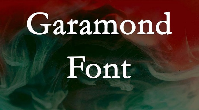
Garamond is a family comprising numerous serif typefaces. These fonts are named after renowned 16th-century Parisian engraver Claude Garamond.
Garamond fonts were designed taking inspiration from a once-popular typeface cut by punchcutter Francesco Griffo for Venetian printer Aldus Manutius in 1495. Like Griffo’s styles, the modern Garamond fonts sport a relatively balanced structure that somewhat resembles handwriting with a pen. This design technique makes the fonts look realistic, regardless of the surface they’re printed on.
However, Garamond fonts have one notable difference from Griffo’s original typefaces in terms of their overall structural design. The modern Garamond styles feature a more structured, upright design.
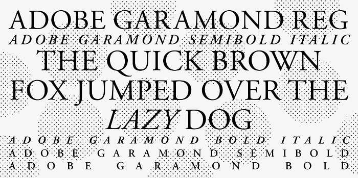
Garamond fonts are also noted for the distinctive shapes of their letterforms. For instance, the small letter “a” has a small bowl that makes a sharp turn at the top left. Also, the letter “e” sports a smaller eye than in most serif typefaces. All small letters have a low x-height, especially when in large print sizes.
Another key feature of Garamond‘s letterforms are the Roman square shapes of UPPERCASED letters. The capital letter “M” especially stands out for its outward-facing serifs while the capital “R” appears with its leg stretching outwards from the letter.
Garamond typefaces are especially popular in book printing. Thanks to their incredible legibility, these fonts are suitable for both headers and body text. However, you can apply the fonts on virtually any design project.
Like most early typefaces, Garamond has undergone tremendous evolution since it was first released for public use. The typeface is now available in numerous styles and weights, including several digital versions.
Renowned designers like Robert Granjon and Jean Jannon are credited for developing additional Garamond styles, making it one of the most versatile font families.
Where to Download the Rolex Font
Garamond font is available for download from Adobe Fonts. This website grants you access to several Garamond styles and weights, including Garamond Pro Regular, Garamond Pro Italic, Garamond Pro Bold, Garamond Pro Bold Italic, Garamond Pro Semibold, and Garamond Pro Semibold Italic. Other popular websites where you can download Garamond fonts include Free Fonts Vault, DaFont, and Fonts Family.
Garamond is licensed as free for personal and commercial usage, which means you can apply the font on all kinds of design projects. However, be sure to read the full licensing information before using Garamond typefaces on official branding materials.