Last Updated on June 26, 2023
Red Bull is a brand of energy drinks manufactured by Rauch and distributed by the Austrian company Red Bull GmbH. The brand was launched in 1987. Its creation was inspired by a similar drink known as Krating Daeng, introduced in 1976 in Thailand by Chaleo Yoovidhya.
Businessman Dietrich Mateschitz discovered and became a fan of Krating Daeng while on a business trip in Thailand. Mateschitz partnered with Yoovidhya and the duo founded Red Bull GmbH in 1984, through which they launched the Red Bull brand in 1987. ![]() Both Red Bull and Krating Daeng maintained their respective names. The two brands also used identical logos. However, Krating Daeng was geared more towards the Thai market as Red Bull focused on European and American markets.
Both Red Bull and Krating Daeng maintained their respective names. The two brands also used identical logos. However, Krating Daeng was geared more towards the Thai market as Red Bull focused on European and American markets.
Read on as we delve deeper into Red Bull’s logo design, meaning, and history.
Red Bull Logo Appearance
Logo Shape
![]() Red Bull uses one of the simplest yet most intuitive logos of all energy drink brands. The logo features two raging bulls charging at each other, with their horns almost locking. The two bulls are painted red and have their lower contours outlined in yellow.
Red Bull uses one of the simplest yet most intuitive logos of all energy drink brands. The logo features two raging bulls charging at each other, with their horns almost locking. The two bulls are painted red and have their lower contours outlined in yellow.
The front sections of the two red bulls, right from their humps, appear to be superimposed on a yellow, sun-like circle. On top of the emblem is the company’s lettering. The wordmark is lowercased, except for the letters “R” and “B.”
Also, in some versions of the Red Bull logo, the inscription ‘ENERGY DRINK’ appears underneath the logo’s graphic image.
Logo Color
![]() Red and yellow are Red Bull’s primary colors.
Red and yellow are Red Bull’s primary colors.
Red is used for the two charging bulls as well as for the inscriptions ‘Red Bull’ and ‘ENERGY DRINK’ appearing on top and underneath the logo’s graphic image, respectively.
On the other hand, yellow is used for the sun-like circle. Hints of yellow can also be seen outlining the lower parts of the bulls, including their legs and neck areas.
Logo Font
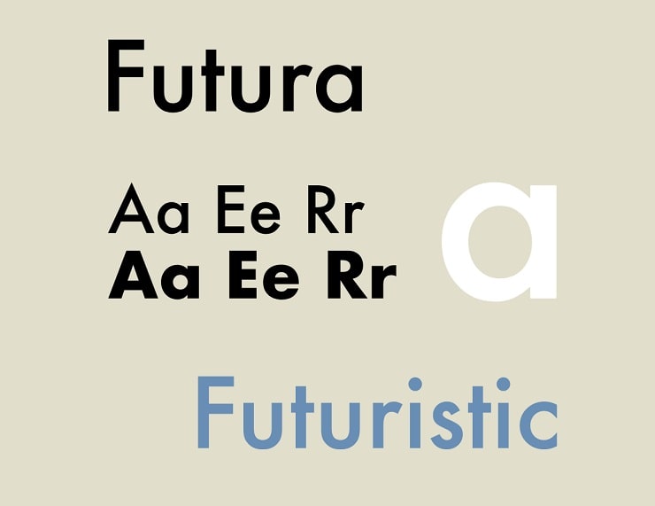 Red Bull uses Futura on its logo. Futura is a geometric sans-serif typeface developed by Paul Renner and initially released in 1927.
However, it’s worth noting that Futura is only used for the ‘Red Bulls’ inscription. The ‘ENERGY DRINK’ portion changes fonts frequently based on the media the logo appears in.
Symbolism of the Red Bull Logo
The Raging Bulls
![]() The raging bulls on Red Bull’s logo symbolize strength and energy. They pretty much sum up the original intentions behind creating the Red Bull brand – to offer powerful energy-boosting drinks.
The raging bulls on Red Bull’s logo symbolize strength and energy. They pretty much sum up the original intentions behind creating the Red Bull brand – to offer powerful energy-boosting drinks.
The raging bulls also connote work ethics. Considering that Red Bull (read Krating Daeng) was originally meant to appeal to Thailand’s working-class population, it’s easy to see why the brand needed a logo that speaks to the values of workplace productivity.
Last but not least, the image of a bull resonates with stamina, confidence, and stability. Perhaps Red Bull settled on this graphic element to portray itself as a stable and reliable brand in the energy drinks sector.
Symbolism of the Circle
A circle symbolizes the globe. It conveys Red Bull’s desire to become a global leader in the supply of energy drinks. It is also one of the most casual geometric shapes. It stands for Red Bull’s friendliness and approachability.
Besides, a circle is one of the few geometric shapes without a beginning or an end. This infinite design allows circular shapes to convey a sense of community and connectedness, which speaks to Red Bull’s desire to spread love and warmth across the globe. But the most interesting bit is that Red Bull’s circular image looks a lot like a rising sun. Many traditions regard the sun as the ruler of the earth and the ultimate custodian of life, light, influence, and energy. The sun also stands for health, growth, and timelessness.
Red Bull might have chosen the sun-like image to portray its energy drink as healthy, powerful, and timeless.
The Wordmark
![]() Red Bull’s wordmark serves the principal role of enhancing the brand’s visual appeal. Spotting Red Bull’s logo – the part with the bulls and then golden sun – may not instantly draw attention to the brand behind the emblem. But seeing the logo alongside the wordmark leaves no doubt as to what the company is.
Red Bull’s wordmark serves the principal role of enhancing the brand’s visual appeal. Spotting Red Bull’s logo – the part with the bulls and then golden sun – may not instantly draw attention to the brand behind the emblem. But seeing the logo alongside the wordmark leaves no doubt as to what the company is.
Note that the Red Bull logo occasionally appears with the word ‘ENERGY DRINK’ underneath the graphic element. This offers insights into the specific industry the product deals in.
Symbolism of the Colors
 Photo by Kaleb Becker on Unsplash
Red is the color of passion, love, and willpower. The color also symbolizes courage, strength, and fearlessness. Most of these attributes are found in bulls. So, it’s not surprising that Red Bull settled for red as its main logo color.
Yellow symbolizes affluence, success, and lavishness. The choice of the yellow color was appropriate considering that Red Bull initially targeted the working-class population. Yellow also stands for freshness, happiness, and energy. These are other core virtues that Red Bull strives to live by.
Red Bull Logo History
Red Bull’s logo has changed modestly since the brand’s introduction over thirty years ago. The current logo looks a lot more like its original version.
Original Red Bull Logo
Red Bull’s original logo featured two raging bulls and a sun-like circle, the same design elements the logo has maintained to date.
One distinguishing feature between Red Bull’s original and current logo was the emblem size and the distance between the bulls. The original logo was larger than the present one. The space between the bulls’ horns was also wider.
Another distinguishing feature was the appearance of the sun-like circle. The circle in the original logo was outlined in red. Also, unlike the current logo, the lower contours of the two bulls weren’t outlined. However, small yellow stripes could be seen in the bulls’ neck and hump regions.
Lastly, many versions of Red Bull’s original logo featured a dark-blue inscription “Krating Daeng” written in Thai and set underneath the graphic element. Krating Daeng is simply Thai for Red Bull. Red Bull used this logo from 1987 until the early 90s. ![]() Red Bull performed the first notable modification to its original logo only a few years after the brand’s establishment.
Red Bull performed the first notable modification to its original logo only a few years after the brand’s establishment.
One of the major changes was translating the inscription ‘Krating Daeng’ into English. Also, the new inscription changed from dark-blue to red and now appeared on top of the graphic element.
Lastly, the sun’s red outlines disappeared.
2000 – Present
![]() Red Bull’s current logo emerged in the early 2000s. The logo’s colors became bolder while the images grew a bit smaller. Aside from the emblem’s basic design elements, many of its versions also appeared with the inscription ‘ENERGY DRINK’ underneath it.
Red Bull’s current logo emerged in the early 2000s. The logo’s colors became bolder while the images grew a bit smaller. Aside from the emblem’s basic design elements, many of its versions also appeared with the inscription ‘ENERGY DRINK’ underneath it.
Red Bull has been around for more than three decades. However, the company’s logo has largely remained unchanged. That’s clear proof that the raging bulls and golden sun design work in favor of the brand’s marketing campaigns.