Last Updated on October 9, 2023
When you say you want something to look ‘professional’, it doesn’t necessarily mean ‘boring’. It usually implies timeless forms and clean, sleek silhouettes. Nothing too fancy, yet still carries an air of sophistication. Something one can take seriously.
When it comes to looking sharp and in-charge, opt for fonts that have already stood the test of time. You’ll know them because other people have used them as well – and with great success. A good font can make your corporate portfolios, executive resumes, or real estate pitches look flawless. So pick wisely.
Not sure which one to choose? Explore this trusted list of professional fonts for the right type.
Gorgeous Professional Fonts
1. Amoretta
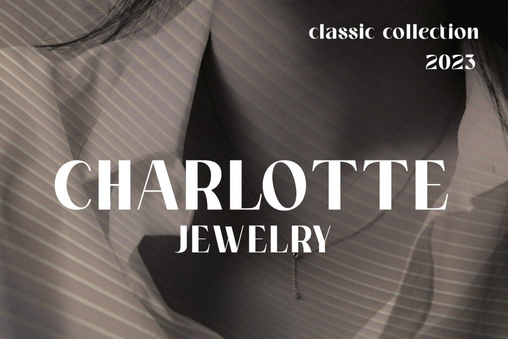
Looking for a typeface of remarkable beauty? Then search no further than Amoretta, the font of elegance and sophistication. Its refined serifs and graceful curves inspire a sense of enduring charm and style.
This typeface’s flexibility makes it ideal for both headings and body text, while its legibility guarantees effective communication. Use it for branding, editorial design, or invitations – Amoretta is sure to bestow an air of opulence on any project. It is truly a work of art in its own right.
2. Helvetica
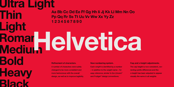
Designed by Max Miedinger and published by Linotype, this sans serif has appeared in many typography projects, including brands like Toyota, Lufthansa, Panasonic, and American Apparel. With its no-nonsense look and functionality, it’s perfect for international communication and info dissemination.
3. Futura
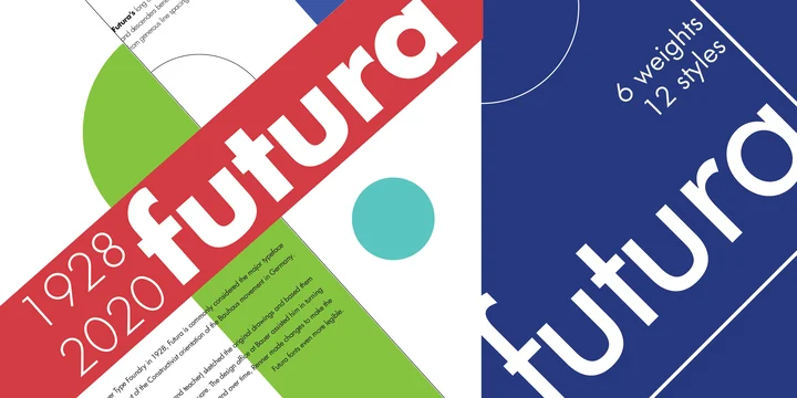
With 22 fonts to choose from, the family pack is highly versatile and works great for space-sensitive concepts. Created by Paul Renner (with assistance from the Bauer Type Foundry) in 1928, its shapes and forms transcend decades. It’s best used on captions, quotes, or short texts.
4. Amenti
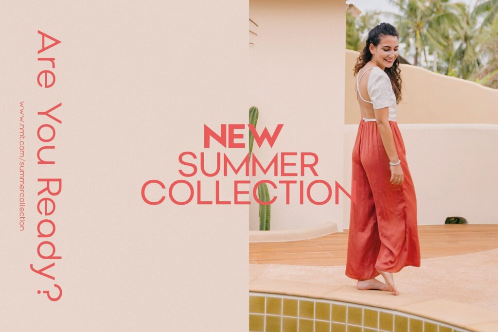
The clean lines and simple beauty of the Amenti font radiates modern and classy vibes. It’s a no-brainer option for any design project. Plus, with six different weights to choose from, it’s super versatile and can make any composition look top-notch. Amenti’s sans serif style is both charming and minimalist, so it’s perfect for catching the eye without being too flashy.
And if you need to get your message across loud and clear, the font’s high legibility is ideal for branding projects, printed works, or website design. Trust us, Amenti opens up a whole new world of possibilities!
5. Trajan
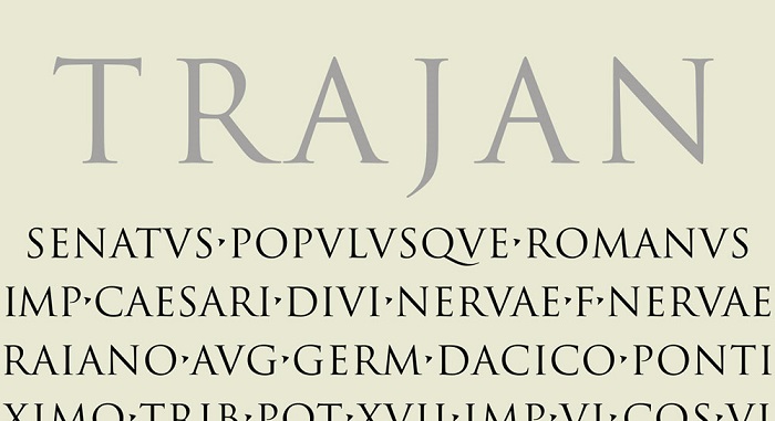
Inspired by carved letter styles produced by Romans during the 1st century AD, Carol Twombly has made an enduring typeface that’s as popular as the movies they were seen in: The Mummy, Titanic, and Lord of the Rings, to name a few. Its bold version will help you emphasize text in posters, invitations, letterheads, and presentations.
6. Sabon

Smooth, versatile, and timeless, this font designed by Claude Garamond and published by Linotype, has long been a favorite of typographers for book text. The elegant serifs give it an old-world feel, making it a wonderful option for brochures, invites, web pages, social media posts, and more.
7. Bodoni
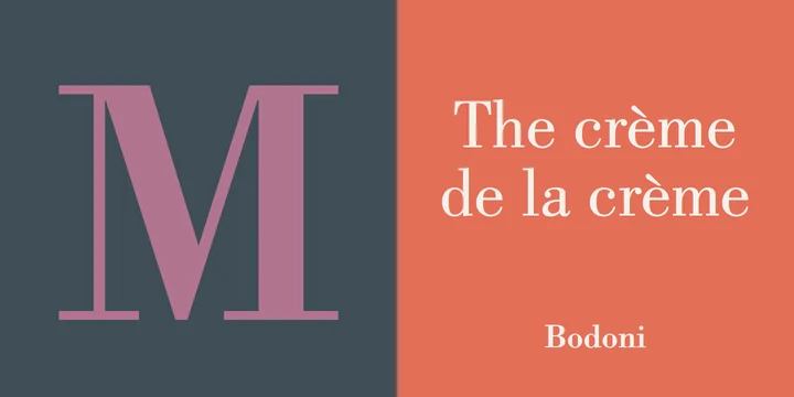
Featuring 7 styles, Morris F. Benton breathed a fresher take on Giambattista Bodoni’s original fonts to give us this classic masterpiece. The thin and thick lines make it a strong choice for printed works.
8. Garamond Classico
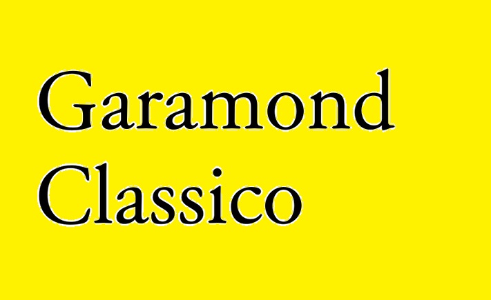
Designed by Claude Garamond and published by Linotype, this elegant serif has characteristics of Transitional style fonts, giving it a lovely, traditional feel. The modest letters can be trusted to remain legible even when applied online.
9. Proxima Nova
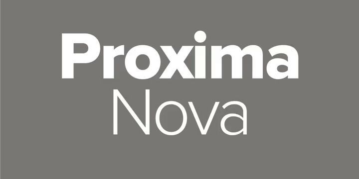
This massive font family from Mark Simonson boasts of 48 styles – and is continuously being updated. A supposed hybrid typeface with geometric forms and modern proportions, it’s one of the most widely used fonts on the Web. You’ve likely noticed it on Mashable, NBC News, BuzzFeed, and Wired.
10. FF DIN
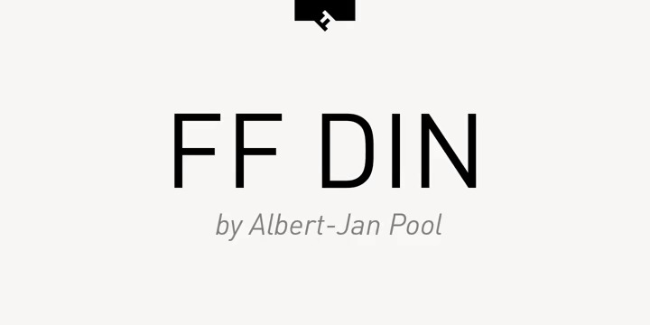
Created by Albert-Jan Pool, this highly functional font offers advanced typographical support for fractions, super- and subscript characters, and stylistic alternates to make any creative’s job a lot easier. It’s ideal for editorial, publishing packaging, advertising, web, and screen design.
11. Frutiger
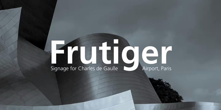
This font was the result of a commission from Adrian Frutiger, when he was asked to create sign and directional system for the new Charles de Gaulle Airport in Paris back in 1968. The end product is an understated yet highly readable font. Aside from signage, it’s also a favorite font for booklets and magazines.
12. Bickham Script 3
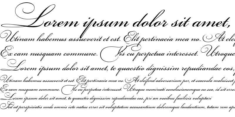
Need a good 18th century inspired typeface that suits digital screens? Named after English writing master and engraver, George Bickham, this ornate script from Richard Lipton includes 3 styles to help you flourish your menus, invitations, logos, and ads with ease.
13. Rockwell
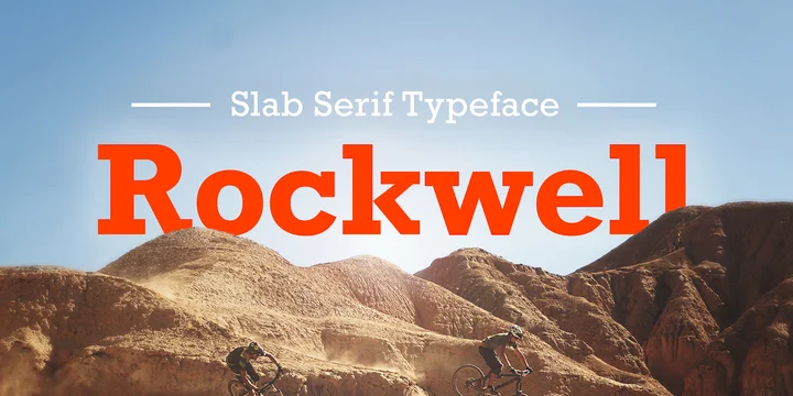
Robust, adaptable, and charming, this square serif by Monotype Studio is more than meets the eye. Aside from its subtle quirks, it’s a great font to use in headlines or displays, as well as on body copy.
14. Gill Sans
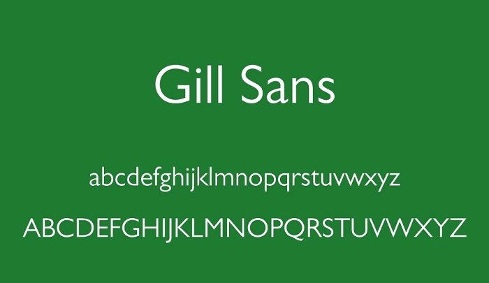
You probably recognize this font if you’re using Microsoft Word a lot. This versatile sans serif works surprisingly well for modern or retro projects. Its 4 styles can be used on almost anything – from branding to editorials. Brought to you by Eric Gill and published by Monotype.
15. Franklin Gothic
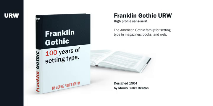
Created in response to an evolving type industry, this font by URW Type Foundry is suitable for editorial, publishing, or advertising fields. Strong but straightforward, it’s a staple in every typographer’s arsenal.
16. Bembo
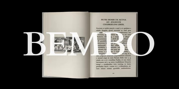
The history of this classic font dates back to 1496, when a new roman typeface was used to print a travelogue by writer Pietro Bembo. Years later, a revival type design by Monotype Studio has come to offer you its quiet presence and graceful stability.
17. Avenir
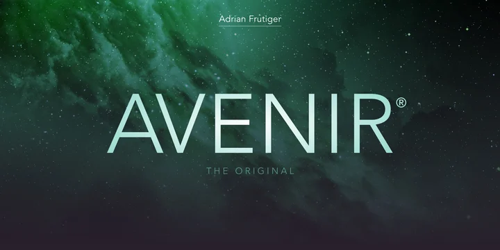
This handsome and organic typeface by Adrian Frutiger was created to bring the geometric shapes of the early 20th century to modern times. The result is a somewhat humanist font that’s lightweight and ready for the future.
18. Baskerville
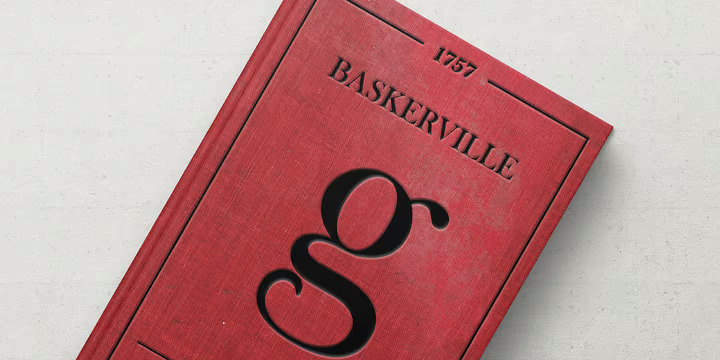
Originally designed by John Baskerville during the 1750s, this recutting version by Bitstream stays true to its unique forms, but made more suitable for today’s demanding usage.
19. Oswald
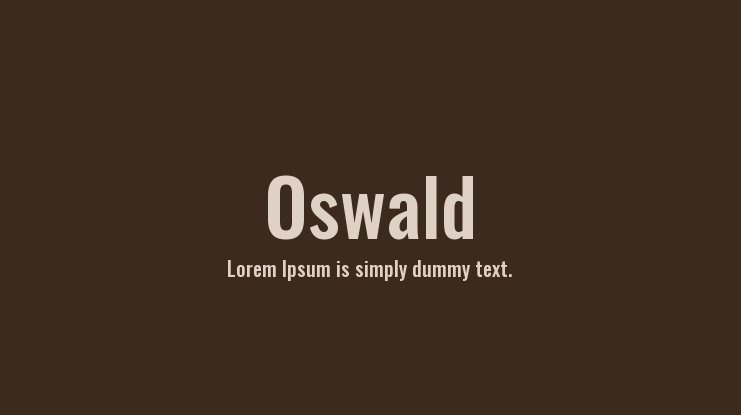
Vernon Adams masterfully reworked an ‘Alternate Gothic‘ sans serif into something that’s ideal for web browsers, digital screens, and mobile devices. Clean, functional, and highly legible, it’s a must-have for every designer.
20. Glasgow Bold
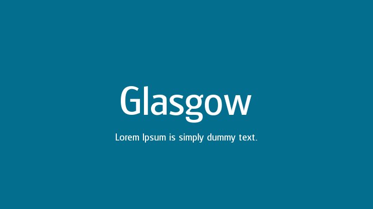
Designed by Steve Jackaman and published by Red Rooster Collection, this typeface may seem simple, but its bold style and basic appearance has limitless uses for the daring and imaginative.
21. Eurostile
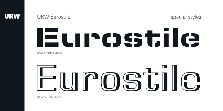
Sometimes misspelled as ‘Eurostyle’, this technical-looking font from Aldo Novarese was initially crafted to complement the titling font, Microgramma. But it sure proved to stand on its own. With square forms and a modern flair, it’s great for architecture, industrial, or futuristic concepts.
22. Warnock
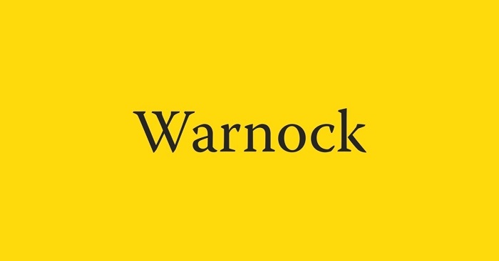
This full-featured, updated OpenType family from by Robert Slimbach features Latin, Cyrillic, and Greek character sets. Named after Adobe Systems co-founder John Warnock, this versatile font is a delightful tribute to a visionary, whose works drove major advances in graphic arts software and desktop publishing.

