Last Updated on August 7, 2023
Porsche, short for Dr.-Ing. h.c. F. Porsche AG, is a German automobile manufacturer founded by Ferdinand Porsche in 1931.
The company is popularly known for its high-performance sports cars, sedans, and SUVs. Some of its current offerings include the 718 Boxter/Cayman, Panamera, Cayenne, 911 (992), Taycan, and Macan.
Porsche operates under the ownership of Volkswagen AG. The automaker has maintained its headquarters in Stuttgart. However, its automobiles are sold worldwide.
They may not be the most successful automobile manufacturer in the world; but the company has maintained a consistent growth trajectory over the years. It reported an annual output of 272,162 vehicles in 2020.
In addition to its high-end automobiles, Porsche also offers automotive financial services, investment management, and engineering services.
Porsche Logo Appearance
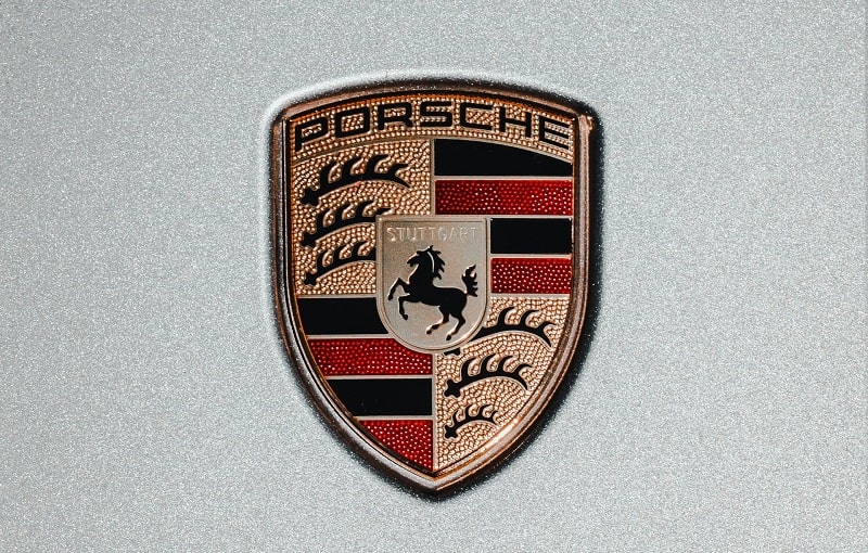
Porsche’s logo is arguably the most captivating of all logos by renowned automobile manufacturers. The logo features two seals whereby the smaller seal is set inside the larger one.
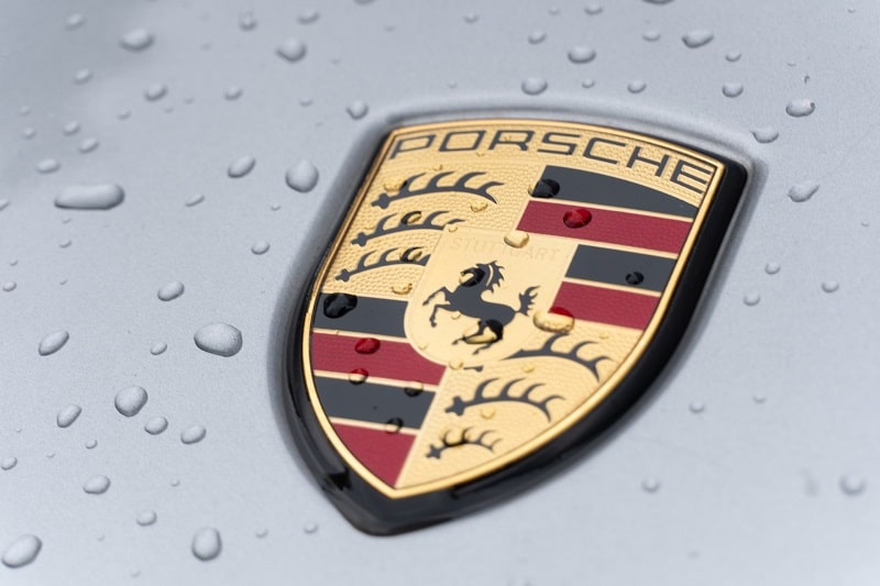
The uppermost section of the larger seal is inscribed with the word “PORSCHE” in slim black letters. Underneath this word mark is an alternating pattern of black and red stripes, separated by golden boundaries.
You’ll also sport what looks like deer antlers. The antlers are set in black against a golden background and are six in total – three on the upper left-hand side and three on the lower right-hand side.
The uppermost part of Porsche’s inner emblem is the word “STUTTGART.” Right below the wording is undoubtedly the most iconic feature of Porsche’s logo – a black horse set against a golden background. The horse comes in the shape of a crest.
Porsche Logo Font
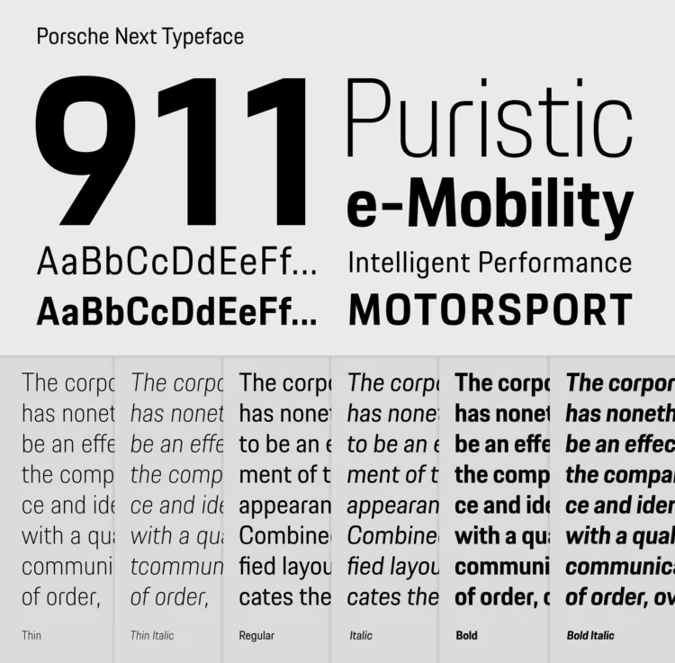
Beneath the entire Porsche’s logo is the automaker’s CAPITALIZED word mark written in a bold black color. The word mark sports clean smooth lines, which are slightly elongated and flattened. These features make the emblem look stunning and legible.
The wordmark was originally set in a custom sans-serif typeface. But in 2016, the Berlin-based branding agency Meta-Design created a new corporate typeface for Porsche known as Porsche Next. Although still inherently a custom-made typeface, Porsche Next became the main font used on the company’s word mark that appears beneath its official emblem.
The font can also be seen in many other official branding information by the automaker.
Porsche Logo Symbolism
The horse appearing on the Porsche logo was inspired by the coat of arms of the Free People’s State of Württemberg.
Now, Porsche chose Stuttgart as its company headquarters and Stuttgart was the capital of Württemberg. In 1952, following the formation of West Germany, Württemberg-Baden and Württemberg-Hohenzollern merged into the Federal State of Baden-Württemberg.
Württemberg used a horse as the primary symbol of its coat of arms. So, the horse’s appearance in the shape of a crest was a special tribute to the traditions of Württemberg-Baden.
Perhaps your next question is, “what symbolism did a horse have on Stuttgart or the Free People’s State of Württemberg at large?”
The choice of a horse as Württemberg’s state seal was not by accident but rather by design.
It’s worth noting that Stuttgart, the capital of Württemberg, was actually built on top of a horse-breeding farm. In fact, the word “Stuttgart” loosely translates to “stud farm” in German, and a stud farm is basically a term for a horse-breeding farm. Porsche could have settled on any horse color. So, why did they choose black?
The obvious reason is that black and red stripes were the choice colors of Württemberg’s state seal. Besides, black is associated with power, affluence, and growth – three attributes that Porsche has continually strived to achieve. Black is also a mark of prestige. The automaker might have chosen the color to portray its high-performance cars as powerful, elegant, and prestigious.
The deer antlers appearing on the Porsche logo were also based on the coat of arms of the Free People’s State of Württemberg. Interestingly, the original Württemberg’s state seal didn’t have the image of a horse despite the horse being the main inspiration behind the naming of Stuttgart city.
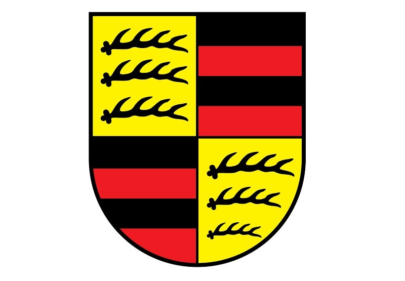
On the contrary, Württemberg’s state seal included two images of full deer and a seal that looks very similar to the one appearing on Porsche’s logo. However, the black horse against a yellow/golden background was incorporated into the Stuttgart’s coat of arms in 1938.
The coat of arms was further modified in 1948 following the expansion of Württemberg into Württemberg-Hohenzollern and later into the Federal State of Baden-Württemberg.
Lastly, note that Porsche’s text-based logo – the part that bears the company’s CAPITALIZED word mark placed underneath the main seal – did not come with the brand’s original logo designed in 1952. The logo-type was incorporated in 1963 as an additional feature.
Although generally used alongside the ornate gold emblem, the word mark can be used on its own.
Porsche Logo Origin and History
It’s unclear as to who created Porsche’s logo. Most Americans believe that the emblem might have been designed by Ferdinand Porsche’s son Ferry. Apparently, Ferry drew the logo while he was having a meal with the American Porsche distributor – Max Hoffman.
However, Germans seem to have a completely different narrative. According to them, the logo was created by an engineer known as Frank Xaver Reimpiess.
But despite the conflicting accounts on the origin of the Porsche logo, one thing’s for sure – the emblem has continued to tower over those of fellow automakers, contributing to much of Porsche’s brand identity.
Another indisputable fact is that the current Porsche logo was first introduced to the United States automotive market in 1952. Before the adoption of its current logo, Porsche used a simple logo that only featured the inscription “Porsche” inscribed on the hoods of the company’s cars.
And unlike many automotive manufacturers who have continually experimented with newer logos, Porsche’s current emblem hasn’t changed much since its introduction. That’s probably because the logo came with everything the automobile manufacturer required – uniqueness, elegance, and memorability.
The only noticeable changes over the years happened in 1994 and touched on the horse’s size as well as the color and the wording “PORSCHE” placed on the upper part of the logo’s outer seal.
The horse’s head became remarkably smaller and the body became thinner, while the color of the logo’s text placed in the upper part of the emblem changed from yellow to black.

