Last Updated on August 17, 2023
PlayStation, commonly abbreviated as PS, is a renowned video game brand. The brand is made up of five home video game consoles as well as two handhelds, a smartphone, and a media center. It also consists of an online service and several magazines.
PlayStation is produced by Sony Interactive Entertainment, the main entertainment division of the Japanese multinational conglomerate Sony Group Corporation.
The first home video game console under the PlayStation series was released in December 1994. The console, commonly known as PlayStation One or PS1, was initially available in Japan before being released internationally the following year.
PS1’s successor, PlayStation Two (PS2), was released in 2000. PS2 is considered the best-selling home video game console of all time. The console had sold upwards of 155 million units worldwide as of December 2012.

Photo by Kerde Severin on Unsplash
Sony followed up the success of its second home video game console by releasing PlayStation Three in 2006. PS3 had sold over 87 million units by March 2017.
The next PlayStation, PS4, was released in 2013. PS4 sold one million units within a day, becoming the fastest-selling game console in history. The fifth and final console in the PlayStation series so far, PS5, was released in 2020.
In addition to its home video game consoles, PlayStation has registered massive success in its handheld consoles. The two handheld consoles, PlayStation Portable (PSP) and PlayStation Vita, have both sold millions of copies. The same trend has been witnessed in other products in the PlayStation brand, including smartphones.
Like most established companies, a considerable portion of PlayStation’s success is credited to the brand’s unique logo. In this post, we dive deep into the PlayStation logo by examining the emblem’s appearance, meaning, and its redesign through the years.
PlayStation Logo Appearance
Logo Shape
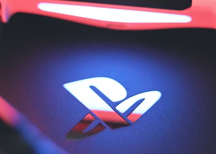
The official PlayStation logo utilizes a “PS” monogram. The letters are creatively incorporated into a three-dimensional (3D) graphic image that creates the illusion of floating in space. If examined up-close, the descender of the letter “P” is connected to the lower tail of the letter “S.”
Although the PlayStation logo has undergone multiple subtle changes through the years, the original concept has remained the same. The logo also utilizes its original colors in numerous versions. However, the current emblem is largely monochromatic.
Also, note that the logos used by the various PlayStation consoles may differ slightly. For instance, PlayStation Three uses a logo that features a blue “S” which looks almost horizontally inclined. The letter is usually complemented by red or yellow dots at its top or bottom.
Another noteworthy thing about PlayStation’s logo is that the logo occasionally appears with the word ‘PlayStation’ set underneath it.
Logo Colors
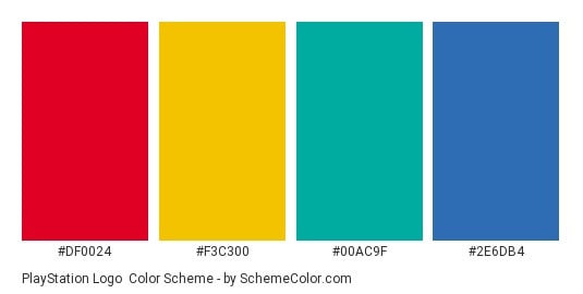
The original PlayStation logo used various colors, including red, yellow, blue, and green. Red was used for the letter “P,” whereas yellow, green, and blue were used for the letter “S.”
However, the current PlayStation logo no longer appears only in the four colors. There’s a popular version where the icon appears in black and white, whereby white is used for the “PS” portion and black as the background color. White is also commonly used for the word ‘PlayStation’ in versions where the brand’s full wordmark accompanies the logo.
Besides, the PlayStation design may adopt several colors depending on the surface it’s printed on.
Logo Font

PlayStation utilizes a custom font on its logo. However, it bears a close resemblance to a typeface known as Zrnic SemiBold. Zrnic SemiBold is a semibold variant of Zrnic, an ultramodern typeface developed by Ray Larabie and published by Typodermic Fonts Inc.
Zrnic is available in six different styles, including Zrnic Regular, Zrnic Light, and the Zrnic SemiBold version which resembles the original typeface used on the PlayStation logo.
Unfortunately, Zrnic is NOT free to download. The font is marketed as a premium typeface, which implies that you must purchase a full license before downloading and using it for your projects. The DaFont website is one of the best platforms to download the Zrnic font.
Logo Designer

The face behind PlayStation’s iconic logo is Sony’s in-house designer Manabu Sakamoto. Sakamoto is also the same person who designed the VAIO insignia.
Elegance and uniqueness were the primary considerations while developing PlayStation’s logo. Sakamoto wanted a logo that was unique enough to distinguish the video game brand from other companies with similar graphic images, yet still memorable and eye-catching.
He experimented with more than twenty designs before settling on one that he thought could maximize the video game’s brand appeal.
PlayStation Logo Meaning
The “PS” Symbol
The letters “PS” that form the basis of PlayStation’s logo simply stand for Play Station. Ken Kutaragi conceptualized the name and concept of PlayStation.
Kutaragi was a Sony executive who worked as a manager in one of the company’s hardware engineering divisions. Thanks to his ingenious invention, Kutaragi was later dubbed “The Father of the PlayStation.”
It’s unclear why Kutaragi settled for the name ‘PlayStation.’ But whatever his inspirations were, the concept has undoubtedly evolved into one of Sony’s most profitable ventures.
Meaning of the Colors

PlayStation’s logo has somewhat maintained its four primary colors – red, yellow, blue, and green – since the brand’s establishment. The colors jointly symbolize power, energy, joy, and passion. The choice of the primary colors also makes the logo look simplistic.
Manabu Sakamoto claims to have chosen the colors as they’re simple and easy to describe. In his own words, “I chose those primary colors because they are so simple so that you can describe them with the words that everybody knows: red, yellow, green, and blue.” “Simplicity in communication, I believe, is the key to a successful brand,” he added.
However, note that PlayStation’s current logo mainly appears in black and white. This monochromic design is simplistic yet modern. Four different colors would make the graphic image appear too posh.
PlayStation Logo History

As already mentioned, the original PlayStation logo was developed and designed by Manabu Sakamoto. Sakamoto intended for the logo to complement the three-dimensional support of the video game console. To that end, he added depth to the letters “P” and “S.”
But Sakamoto did not stop there.
He also created an optical illusion that indicated the letters were in depth of space. The letter “S” appeared as though it was set flat against the surface, with letter “P” emerging vertically from it.
To make his graphic design stand out even more prominently, Sakamoto implemented an array of colors. The letter “P” was in bright red color, whereas the letter “S” spotted a mix of yellow, green, and blue.
Also, the tail of the letter “P” was connected to the descender of the letter “S.” ‘P’ was also stylized such that the bowl did not entirely enclose its counter. This logo commonly appeared in white or transparent backgrounds. The background choice made the four colors stand out conspicuously regardless of the surface the logo appeared in.
However, despite the original PlayStation logo sporting a chic and elegant design, it was only a matter of time before the emblem changed its image.
Sony has undertaken multiple upgrades to its logo over the years. But the first and only major upgrade to the design happened in 2009.
The current logo maintains the intertwined ‘PS’ monogram shape of its predecessor. However, the image became more minimalist. Also, the current logo mainly appears in a black and white color palette, although the previous colored version is still fairly popular.
The current PlayStation logo looks a lot like the previous design, with the only noticeable difference being the color schemes. The fact that the emblem has maintained its original concept only speaks to its powerful visual appeal.

