Last Updated on June 26, 2023
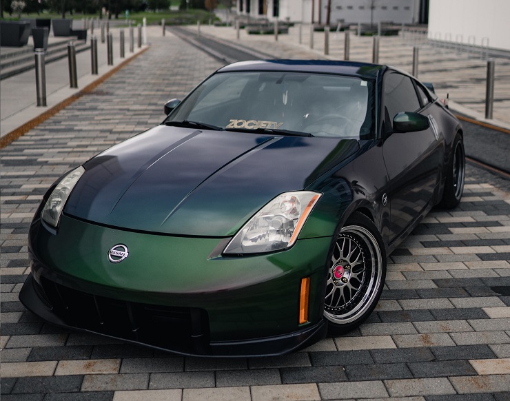
Nissan manufactures luxury cars, commercial vehicles, forklift trucks, and outboard motors. The company sells its vehicles under the Nissan, Datsun, and Infinity brands. These products are available worldwide.
In this article, we review Nissan’s logo; a logo that has undergone several modifications yet has kept its basic original design.
About Nissan
Nissan Motor Co., Ltd., commonly known simply as Nissan and generally trading as Nissan Motor Corporation, is a Japanese multinational automobile manufacturer.
The company was founded on December 26, 1933, by Yoshisuke Aikawa, Masujiro Hashimoto, Kenjiro Den, Rokuro Aoyama, Meitaro Takeuchi, William R. Gorham, and the DAT line. It’s headquartered in Nishi-ku, Yokohama, Japan.
The company has grown from humble beginnings to become the giant automaker we know it today. In 2013, Nissan emerged as the world’s 6th-largest automobile manufacturer. Toyota, General Motors, Volkswagen Group, Hyundai Motor Group, and Ford took the first to fifth positions, respectively.
In 2014, Nissan was North America’s largest automaker. And as of April 2018, the company was the world’s largest manufacturer of electric vehicles (EVs). Feel free to go to their official website for more information on the Nissan brand and its products.
Nissan Logo Appearance
Logo Shape
![]()
Nissan’s logo features a horizontally halved circle, with the word “NISSAN” set across the circle. The circle is so broken that it features two sharpened arches at both sides. The two pairs of arches protrude slightly from the circle, creating what looks like horseshoes.
Another noteworthy feature is that the first and last letters of the “NISSAN” wordmark are nestled right between the horseshoe patterns created by the two pairs of arches on both sides of the broken circle. The other letters are positioned inside the circle.
Logo Colors
![]()
Nissan uses a monochromatic color pattern. The wordmark as well as the circular frame are in black, whereas the background color is white/transparent. However, Nissan’s logo may also appear in various color shades besides black and white. Popular ones include red and grey.
Logo Font
Nissan’s logotype isn’t based on any preexisting typefaces. Therefore, it’s logical to infer that the wordmark was created exclusively for the automaker by an in-house design team.
However, several fonts have since been developed based on the original typeface used for Nissan’s logotype. One such font is aptly named ‘Nissan.’
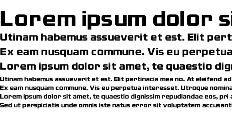
Nissan is a sans-serif typeface designed and published by Opti font. The font is characterized by its square letterforms, a design technique that’s also evident on the original typeface used for Nissan’s wordmark.
Nissan comes in several styles and weights. Examples include Nissan Regular, Nissan Decal, and Nissan Opti. Each style is available in UPPERCASE and lowercase letters, as well as letterlike symbols, integers, and basic punctuations. You also get mathematical operators, currency symbols, and a slew of other quirky characters.
There are multiple places to download Nissan font. Examples include Fonts Geek and Dafont Free. The font is marketed as free for personal use only.
Nissan Logo Symbolism
Symbolism of the Broken Circle
The circle appearing on Nissan’s logo represents the rising sun. Note that the image of the rising sun is highly symbolic in Japan. It resonates with creativity, innovation, and community.
A circle also symbolizes the globe. Nissan probably adopted this geometric shape for its logo to represent the company’s desire to avail its automobiles all over the world.
Symbolism of the Colors
Black is the color of power, class, and elegance. The color also connotes mystery. It’s not difficult to associate most of these qualities with Nissan cars. White stands for purity and innocence. However, Nissan likely used the color to accentuate its black emblem.
As already mentioned, Nissan’s logo may appear in a range of other colors, including red and grey. These colors also carry their individual symbolism. For instance, red connotes passion and strength, with grey mainly representing mystery and neutrality.
Symbolism of the Wordmark
![]()
The word “Nissan” emerged around the 1930s. The term was originally used on the Tokyo stock market as an abbreviation for Nippon Sangyo.
In 1930, Nissan’s cofounder Yoshisuke Aikawa merged the automobile parts department of Tobata Casting with DAT Motors. Seeing as Tobata Casting was a Nissan company, the name became the official reference for Nissan’s automobiles.
But how did the word come about?
Although commonly viewed merely as the shortened version of Nissan Motor Co., Ltd., the word “Nissan” has a figurative meaning. In kanji, “ni” stands for ‘the sun,’ whereas “ssan” loosely translates to ‘birth’ or ‘product.’ The word derives its meaning from Japan’s popular reference as the “Land of the Rising Sun.”
Nissan Logo History
Nissan has implemented nearly 30 logo redesigns throughout the automaker’s history. But as you shall find, most of these changes were rather subtle.
Nissan’s Original Logo
![]()
Nissan’s original badge featured a red circle, with a blue rectangle placed right across the circle. The blue rectangle contained the word “NISSAN,” written in a bold white color. Nissan used this logo until 1940.
1940 – 1950
![]()
Nissan experimented with multiple logo designs during this period. The most famous of these emblems is one that featured an innovative geometric shape executed with six corners, with two curved corners to the top as well as at the bottom.
In this version, the “Nissan” wordmark appeared in a friendlier, hand-drawn typeface. The letter ‘A’ in the logotype was enlarged, whereas the letters ‘s’ featured trimmed outlines. Red was the primary color for the design, with white being used for the wordmark and outlines.
1950 – 1959
![]()
Nissan’s logo became more minimalistic in the 1950s. The emblem only utilized a rectangle containing the company’s lettering in the UPPERCASE. There were no changes in the color scheme. However, the letters featured a larger and bolder font.
1959 – 1960
![]()
This logo looked a lot like its previous iteration. The only noticeable differences were the angular lettering and the absence of a frame.
1960 – 1967
![]()
In the 1960s, Nissan’s logo adopted more cursive lettering and sharp lines. The wordmark now appeared in red on a white background. This logo looked minimalistic yet still elegant enough to draw attention to the brand.
1967 – 1970
![]()
During this period, Nissan utilized a clean wordmark that appeared in an italicized, rounded typeface. For the first time in a long time, the color palette changed from red/white to brown.
1970 – 1978
![]()
The rectangular frame popular in previous versions came back, except that it now appeared in a different color palette (black with a silver outline). The “Nissan” wordmark was lighter and sported large, uniform letters.
1978 – 2001
![]()
Nissan’s 1978-2001 logo iteration was largely a recreation of the 1933 badge. The company placed a small copy of the throwback emblem inside a small white rectangle, which was then set in a larger blue rectangle. To the right side of the small design was the white inscription “Nissan.”
2001 – 2020
![]()
This logo was modeled based on its previous iteration. However, the red color scheme changed to silver. Besides, the letters became more uniformly spaced.
2020 – Present
![]()
Nissan’s current logo emerged in 2020. Designers reduced the thickness of the circular boundary in the previous logo, split the circle into two horizontal halves, and changed the color from silver to black.
The rectangle where the word “NISSAN” appeared also jettisoned, rendering the inscription on a clean white background.
Final Word
Nissan’s logo may look simplistic compared to that of other successful automobile manufacturers. But the circular symbol is highly effective, mainly due to its broken design.