Last Updated on July 3, 2023
Naruto is a Japanese manga series created by Masashi Kishimoto and published by Shueisha. The series is centered on Naruto Uzumaki, a young ninja who struggles for recognition among his peers as he endeavors to become the Hokage, the leader of his village.
Naruto is based on two one-shot manga by Kishimoto, including Karakuri (1995) and Naruto (1997). The series initially run from September 21, 1999 to November 10, 2014. It’s currently considered the fourth best-selling manga series of all time, having sold over 250 million copies worldwide.
But earning a prestigious spot among the world’s most popular manga comics wasn’t an overnight event. It took some time for Naruto to be accepted in Japan, let alone worldwide.
Short Summary of Naruto
On the day of his birth, Naruto’s village of Konoha is viciously attacked by the 9-tailed fox demon. In order to subdue the demon and protect his village from annihilation, Naruto’s father – the 4th Hokage – had to sacrifice his life.
Thirteen years after the ordeal, Naruto graduates from the ninja academy and earns the title of a shinobi. His ultimate goal is to become the next Hokage of his village so he may take over from where his father left.
Naruto is joined by his rival Sasuke Uchiha. Uchiha attempts to gain power so he can avenge his clan after they were killed by his older brother Itachi. The storyline also includes Sakura Haruno, Naruto’s friend who is in love with his rival, Sasuke.
Later on, the murderous Itachi returns to the village and Sasuke vows to put him where he belongs. However, Itachi proves too strong for Sasuke. The plot thickens as Naruto gradually steps into the role of the superhero he was destined to be.
Part of the reason the series has gained a cultic following is due to its unique logo. The following sections shine more light on Naruto’s logo.
Background on the Naruto Logo
Logo Shape

Naruto’s logo is predominantly text-based. It features the series’ name set in CAPITAL LETTERS. The wordmark is stylish and eye-catching, thanks to the use of a bright orange color that appears in numerous shades.
Naruto’s nameplate is so creatively executed that there’s no space between adjacent letters. Instead, the outlines of each letter connect to that of the bordering letters.
The letters in the ‘Naruto’ wordmark also sport fancy geometric shapes. Some edges appear smooth and uniform, whereas others are sharp and curvy. The tail of the letter R is a bit elongated such that it stretches halfway underneath the letter U.
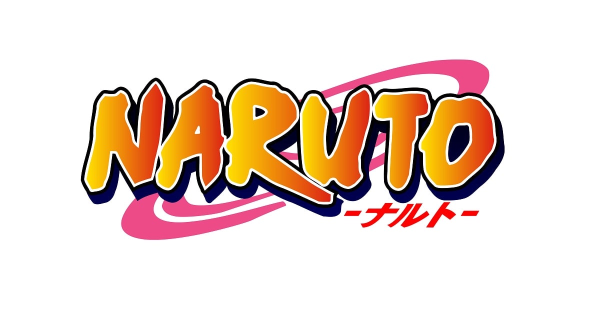
Besides the logotype, Naruto’s emblem also sports two other notable elements – a double-edged oval ring set on the wordmark’s background and Japanese characters.
The ring appears as a laconic spiral with a triangle-like element on one side and a short line on the edge of the opposite side. It’s pink and executed in such a manner that its double outlines touch all the letters in the logotype.
The Japanese wordings are red and set underneath the wordmark, right below the characters “-UTO.”
Logo Colors

One unmistakable feature of the Naruto logo is the bright and bold color used for the wordmark. However, the series uses a diverse color combination on its logo.
The ‘NARUTO’ nameplate appears in gradient orange. The orange color features multiple shades, ranging from darker to lighter and more intense shades.
Besides the orange color used for the nameplate, Naruto’s logo also features pink and red colors. Pink is the color used for the oval ring, whereas red is used for the Japanese inscriptions set below the logotype.
Logo Font

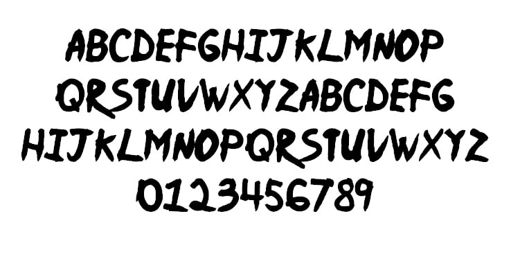
The inscription appearing on the Naruto logo is executed in a custom hand-drawn typeface, complete with extra-thick graffiti-style lines. Naruto is one of the many renowned brands that utilize a unique font on its logo.
That said, there are a couple of typefaces that look like the original font used on Naruto’s logo. One such font is known as Ninja Naruto.
Ninja Naruto is a script-type font created by Sk89q. The font is marketed as free for both personal and commercial usage.
Ninja Naruto is presently available only in one style. But for the single style, you get to experiment with UPPERCASED and lowercased characters, as well as integers, basic punctuations, and other special symbols like currency signs. The font is also compatible with numerous devices and operating systems, including PC, macOS, Android, iOS, and Linux.
Note that despite the name similarities, Ninja Naruto is not a patented font of the Naruto anime series.
Symbolism Behind Naruto Logo

Wordmark
The nameplate used for Naruto’s logo serves one fundamental purpose – representing the anime’s brand name. Whenever you spot the logo, attention is almost immediately drawn to the famous anime.
The wordmark is large, UPPERCASED, and sports a geometric shape complete with wavy outlines. These design elements help Naruto’s logo stand out from the various surfaces it’s printed on.
The Oval Ring and Japanese Characters
The laconic spiral on the Naruto logo symbolizes Naruto’s village of Konoha and by extension, the world that the anime is set in. The red Japanese characters appearing underneath the nameplate simply translate to “Naruto.”
It’s important to note that Naruto is more popular in Japan than the rest of the world combined. Out of the 250 million copies sold, Japan alone accounts for 153 million copies. Therefore, it was necessary for the logo to feature Japanese inscriptions in addition to the regular English alphabets.
Symbolism of the Colors
All the colors used on the Naruto logo have their respective symbolism. Orange is associated with warmth, sunshine, and creativity. Pink is the color of universal love, friendship, and harmony, whereas red is the color of love, life, and health.
It’s undeniably true that Naruto embodies most of these attributes. However, the orange-pink-red color palette was used more for its aesthetic appeal than for figurative purposes.
History of Naruto Logo
The original Naruto logo was created by Masashi Kishimoto and made its debut in 2002.
Unlike most brands that have implemented countless changes to their designs, the Naruto icon has remained the same since its creation. That’s probably because the anime series has equally maintained a consistent storyline over the years.
The events in the series may vary significantly depending on the episode. But the general plot speaks to a ninja who’s determined to pull all the stops in saving his village from evil forces.
However, note that Naruto’s logo may change slightly depending on the components of the franchise it depicts. For instance, Naruto Shippuden usually has the word “Shippuden” added underneath the logo. The word normally appears in Japanese.
Wrapping Up…
The original Naruto logo hasn’t changed for the 20+ years the series has been around. And there’s little indication that the design may change anytime soon. But even if it does, most anime fans would expect the new emblem to retain most of the logo’s fundamental elements.

