Last Updated on August 17, 2023
It doesn’t matter whether it appears on the SUV in front of you or on a car magazine – the three-pointed Mercedes logo immediately resonates with speed and luxury. But what exactly does the Mercedes-Benz
design symbolize? Let’s find out.
About Mercedes-Benz

Mercedes-Benz, commonly known simply as Mercedes, is a German luxury automotive manufacturer based in Stuttgart, Baden-Württemberg, Germany. The company was founded on June 28, 1926, by Karl Benz, Gottlieb Daimler, and Wilhelm Maybach. It produces both consumer luxury automobiles as well as commercial vehicles.
Although founded in 1926, Mercedes-Benz enjoys a longer history and heritage. The company was preceded by Mercedes (1901 – 1926), Daimler-Motoren-Gesellschaft (1890 – 1926), and Benz & Cie. (1883 – 1926).
Mercedes-Benz has consistently featured among the world’s top luxury car manufacturers. In 2018, the company was the world’s largest seller of premium vehicles, with 2.31 million passenger car sales.
In addition to automobile production, Mercedes-Benz also offers automobile repair and financial services. Learn more about the company’s history, products, and services from their website.
Mercedes Logo Appearance
Logo Shape

The official Mercedes-Benz logo features a three-pointed star enclosed in an orbit. The star is set within the circle such that one of its prongs point directly to the top of the orbit, with the other two prongs located further near the bottom.
To the right of the circle containing the three-pronged star is the word “Mercedes-Benz.’ The wordmark is executed in lowercase but appears in large, clean fonts.
Logo Colors

Mercedes utilizes a silver and white color palette on its logo. Silver is used for the three-pronged star as well as for the boundary of the orbit. The wordmark also appears in silver. White is generally used as the background color and for the inner space of the orbit.
Logo Font
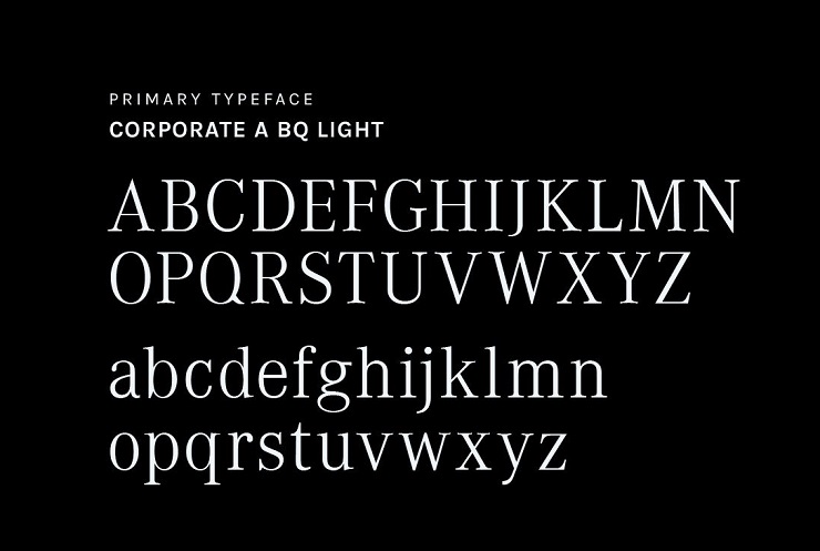
Mercedes’ logo uses a typeface known as Corporate A BQ Light. This is the font that the company’s wordmark is modeled in.
Corporate A BQ Light is a variation of Corporate A, a typeface created by renowned German designer and typographer Kurt Wiedemann. The font is typically marketed as free for personal use. Which means that you’ll need express authorization before applying it to commercial design projects.
You can download any font in the Corporate A family from Fonts Greek and My Fonts.
Mercedes Logo Symbolism
Symbolism of the Orbit and Three-Pointed Star
The three-pronged star is deeply rooted in Gottlieb Daimler’s family. The design is the brainchild of Paul Daimler and Adolf Daimler, Gottlieb’s sons.
Paul and Adolf reportedly came up with the three-pointed star based on a symbol that their father previously used to mark family postcards. In 1909, nine years after their father’s death, Paul and Adolf Daimler recalled an 1872 picture postcard that their father sent to their mother.
In the postcard, Gottlieb used a three-pointed star to mark the location of his house in Germany and explained that he hoped the star would bring luck and prosperity to his factory.
The Daimler-Motoren-Gesellschaft company adopted the star as its logo and went on to trademark it. When the company merged with Benz & Cie in 1926, the new outfit consequently adopted the design.
But why did Mercedes (and its predecessors) settle on the image of a three-pronged star in an orbit?
A circle typically symbolizes the globe. And when combined with a star, the image stands for the universe, including the land, sea, and firmament. So, Mercedes-Benz likely chose the image of the star to convey the brand’s desire to dominate the land, sea, and skies.
Symbolism of the Colors

Silver is the color of affluence, luxury, and flamboyance. Mercedes founders may have settled on the silver color to portray the brand as a leading manufacturer of luxury automobiles.
Of course, elegance isn’t the only quality associated with Mercedes-Benz cars. These vehicles also stand out for their incredible engine power, which translates to thrilling speed on the highways and racetracks.
White signifies purity and innocence. However, it’s unlikely that the Mercedes-Benz founders selected this car for those qualities. Instead, white is mainly used to balance out the silvery elements of the company’s logo.
Symbolism of the Wordmark

The “Mercedes-Benz” wordmark that appears on the official emblem of Mercedes cars simply represents the brand name.
Although the three-pronged star is almost exclusively synonymous with the Mercedes brand, there’s a chance that some people may see the design and fail to associate it with the luxury automobile manufacturer.
In such cases, the “Mercedes-Benz” lettering leaves no doubt about the company the emblem represents.
Mercedes Logo History
As already mentioned, Mercedes’ predecessor Daimler-Motoren-Gesellschaft already used the three-pointed star before the design came to be associated with the Mercedes-Benz brand. And as you shall find, the logo assumed several iterations. But our primary focus is on how the emblem has changed since the founding of Mercedes-Benz in 1926.
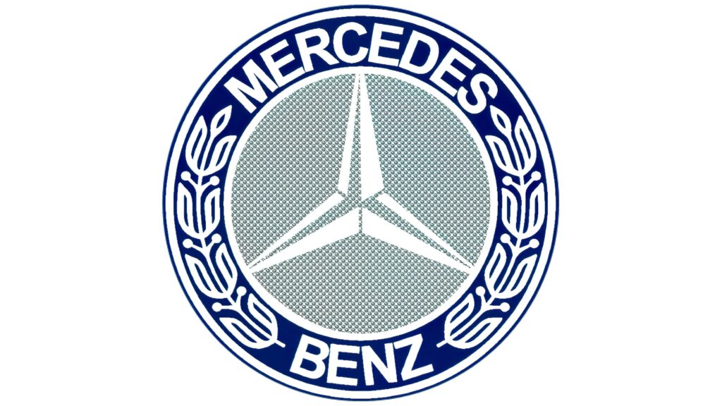
The original Mercedes logo featured a blue and white star executed on a burgundy-red background, with the entire design enclosed in a thick circular frame. The badge also appeared with the company’s wordmark and leaves ornament, drawn in white.
In 1933, Mercedes-Benz redesigned its original logo and replaced the burgundy-red background color with light grey. The star also changed color from blue and white to white and grey. The leaves on the frame became larger. However, the thick blue framing remained unaltered.
This version of the Mercedes logo is occasionally used to date. Here are other ways the Mercedes logo has changed:
1989 – 2009
The three-pronged star became 3-dimensional in a design upgrade that was aimed at the modern market. Also, the color palette changed to shades of grey, including chrome and silver. The “Mercedes-Benz” wordmark appeared in a clean, black serif font and was set underneath the badge.
2009 – 2011
In 2009, Mercedes implemented subtle changes to its previous logo. The three-pointed star became thicker and looked a lot like the steering wheel of a racing or sports car. The entire emblem plus the wordmark appeared in grey color, without any outlines or accents.
2011 – Present
The current version of the Mercedes-Benz logo emerged in 2011. The only notable upgrades to the 2009-2011 iteration were with respect to the color and texture.
Designers implemented a bolder silver color and added weight to the wordmark, making both elements of the logo remarkably legible.
Final Word
Mercedes-Benz enjoys a history spanning close to one century. While the company’s fortunes have changed dramatically since its establishment, its logo has largely remained unaltered.
It appears that the Gottliebs were right in their decision to adopt the image of a three-pointed star in an orbit for their company’s emblem.

