Last Updated on August 17, 2023
Mazda is one of the world’s oldest automobile manufacturers. Although the company has experienced changing fortunes during its existence, it has maintained its reputation as a producer of high-end cars and automotive engines.
Below is an overview of the Mazda brand, followed by a detailed review of the company’s charming logo.
About Mazda
Mazda Motor Corporation, popularly known simply as Mazda, is a Japanese multinational automobile manufacturer. Mazda was founded on January 30, 1920, by Jujiro Matsuda. The company is headquartered in 3-1 Shinchi, Fuchū, Aki, Hiroshima, Japan. However, it avails its products far beyond the Japanese borders.

Unlike many car manufacturers that specialize in vehicle production, Mazda also designs and manufactures vehicle engines. In fact, the company began as a cork-making factory before later venturing into automotive production in 1931. It was previously known as the Toyo Cork Kogyo Co., Ltd, before changing its name to Toyo Kogyo Co., Ltd., and eventually to Mazda in 1984.
Another interesting fact about Mazda is that the company went bankrupt in the late 1920s and had to be bailed out by Hiroshima Saving Bank and other investors in Hiroshima. Today, Mazda is a leading car manufacturer, with annual production output surpassing one million units in recent years.
The company is owned by a number of established brands, including Toyota, Japan Trustee Services Bank, The Master Trust Bank of Japan, and Sumitomo Mitsui Banking Corporation. For more information about the brand and their products, visit the Mazda official website.
Mazda Logo Appearance
Logo Shape
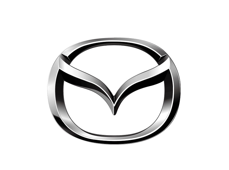
Mazda’s current logo is arguably the most stunning design the company has used since its establishment over a century ago. The logo is based on two stylized letters – M and V – enclosed in an oval.
The left and right stems of letter M form part of the oval frame whereas the ascenders of the letter V also touch the frame, right where the shoulders of ‘M’ begin from.
Underneath the entire design is the company’s lettering. The wordmark appears in blue and is executed in lowercase lettering except for the letter ‘D.’
Logo Colors

Mazda utilizes two primary colors – silver and white. Silver is used for the stylized letters ‘V’ and ‘M,’ as well as for the frame of the oval. The inner space of the oval and background color appear in white.
Logo Font
Mazda uses a typeface known as SF Automaton Regular. This is the font that the company’s lettering appears in.

SF Automaton Regular is a regular variant of SF Automaton, a sporty typeface released in 2008 by Shy Foundry. The font is noted for its clean and square letterforms. It comes in both UPPERCASE and lowercase letters, as well as basic punctuation, integers, and accented characters.
Besides the regular version used for Mazda’s logo, the SF Automaton typeface is also available in many other styles. Numerous websites allow you to download SF Automaton Regular or other variants of the SF Automaton font, such as Font Space and 1001 Fonts.
Note that SF Automaton is free for personal use only. Remember to contact Shy Foundry on their official website if planning to use this typeface for commercial purposes.
Mazda Logo Meaning

Meaning of the Stylized Letters ‘M’ and ‘V’
The letter M represents the automaker’s name, whereas the letter V is a sign of victory. M also stands for the Hiroshima River.
Meaning of the Oval
An oval stands for the globe. Mazda likely incorporated the image of an oval into its logo to convey the company’s ambitions of becoming a global leader in automobile production. The oval shape also combines harmoniously with the stylized letters to produce a stunning 3D effect.
Meaning of the Colors
Silver is the color of affluence, sleekness, glamor, and sophistication. Mazda probably adopted this color as a message of the core values its automobiles represent. White stands for purity and innocence. However, the color is mainly used on Mazda’s logo to accentuate the silver color.
Meaning of the Wordmark

The blue wordmark appearing underneath the graphic image represents the company’s name. But how did the name come about? Now, the word ‘Mazda’ has two origins.
First, the name originated from a mispronunciation of the name Matsuda (the company’s founder) by the Americans. Mazda is also the name for Ahura Mazda, the deity of wisdom, light, and harmony.
Mazda Logo History
Mazda has had numerous logos. However, this section goes over the most memorable ones.
As already mentioned, Mazda began as a producer of engineering equipment before venturing into automobile manufacturing. The first emblem used by the company during this period was a stylized image of a milling cutter.

When Mazda went into automobile production in 1931, the company adopted a triangular logo. The emblem featured white and blue sectors that formed a star with the rays. Mazda’s name appeared in a slanted handwritten typeface, executed in transparent letters that consisted only of a frame.
In 1934, Mazda unveiled its first emblem as a full-fledged automobile manufactured. The logo was a simple wordmark executed in a fancy and stylish font. The stems of the letter “M” were curved in their respective directions, with the left stem so twisted that it nearly pointed upwards. Also, the letter Z appeared with a stroke through the center. This logo stayed with the company for only two years.
The Mazda logo would subsequently change as follows:
1936 – 1962
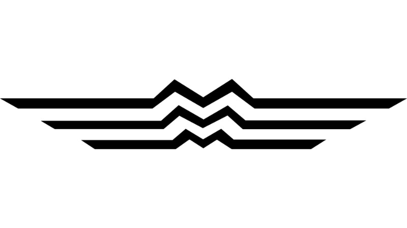
Mazda introduced its first stylized logo as a car manufacturer in 1936. The logo was based on three letter “Ms” sitting vertically next to each other, such that they formed what looked like a mountain or flowing river. Also, the letters were drawn with their tails extended horizontally, resembling the wings of a bird.
The three duplicated Ms represented “Mazda Motor Manufacture,” whereas the extended tails stood for agility and speed. The design also symbolized Hiroshima. This entire logo was in monochrome.
1962 – 1975
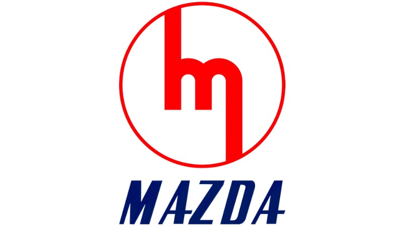
In 1962, Mazda’s logo was a stylized letter M, enclosed in a circle with a thin frame. The right stem of the letter extended further below the baseline and touched the circular frame, whereas the left stem had an upper protrusion that also touched the frame from above.
1975 – 1991
After experimenting with monochromatic colors for decades, Mazda finally unveiled the first colored version of its logo. The emblem was a stylized version of the company’s name.
The logotype was in blue, set in lowercase (except for the letter D), and featured a square font. Of notable mention was the letter ‘z,’ whose horizontal lines were broken from the diagonal stroke.
1991 – 1992
For the next year, Mazda’s badge featured a diamond set in an oval design. The logo evoked the images of wings and the sun.
1992 – 1997
Shortly after unveiling the 1991-1992 logo, Mazda refined the badge to reduce its similarity to Renault’s. The new design became smaller and featured smoother edges, representing the image of rotary engines, which Mazda was already famous for.
1997 – Present
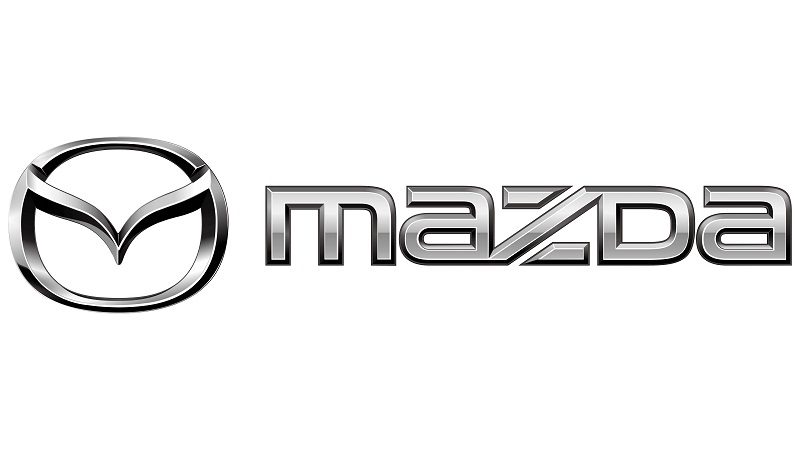
The current version of Mazda’s logo was unveiled in 1997. However, there have been several minor tweaks to the original version released in 1997, especially with regard to the sharpness of the letters and boldness of the colors.
Final Word
Not only does Mazda enjoy a reputation for manufacturing powerful vehicles and automotive engines. The company also stands out for its beautiful logo, which is a far cry from all the emblems the brand has used in the past.

