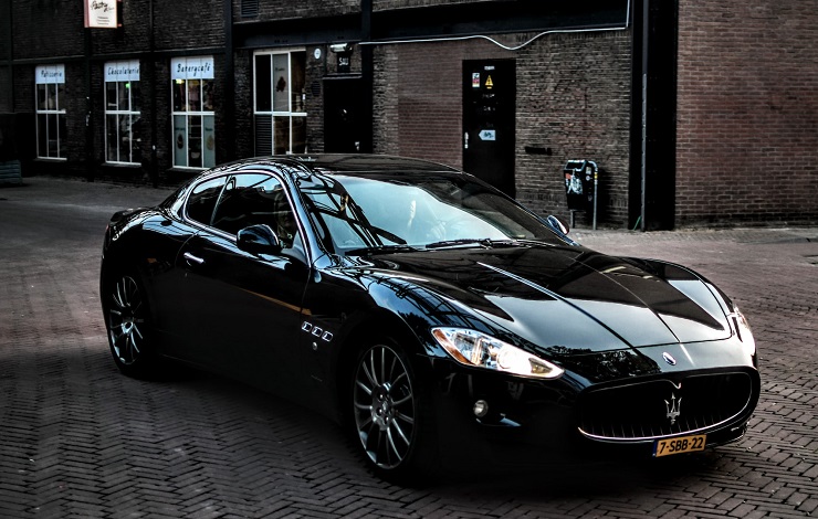
The mention of Maserati evokes feelings of luxury and glamor, which pretty much sums up the heritage of this Italian auto giant.
Although Maserati doesn’t rank among the world’s top automobile manufacturers by annual production output, the company has maintained its place among the most successful luxury car manufacturers of all time.
Maserati’s success in the automotive industry is partly due to the brand’s willingness to embrace new technology and partly due to its ambitious marketing campaigns, most of which are aided by its highly symbolic logo.
Read on for more insights into the shape and appearance, as well as the meaning and evolution of the Maserati logo.
About Maserati Luxury Vehicles Company
Maserati S.p.A is an Italian luxury automobile marque. The company was established on December 1, 1914, in Bologna, Italy, by Alfieri Maserati. It’s currently headquartered in Modena, Italy, but avails its automobiles worldwide.
Maserati has been owned by numerous entities since its inception over a century ago. The company was originally owned by Alfieri Maserati alongside his brothers Bindo, Carlo, Ettore, and Ernesto.
In 1937, the Adolfo Orsi family purchased Maserati shares from the Maserati brothers and subsequently relocated the company’s headquarters to Modena three years later. In 1948, Citroën took control of Maserati but retained Adolfo Orsi as the company’s nominal president.
On August 8, 1975, the Italian government purchased Maserati from Citroën. The auto marque was now under the control of the state-owned GEPI Holding Company. Its new president was Argentinian industrialist and retired racing driver Alejandro de Tomaso.
Maserati changed ownership yet again on May 19, 1993, after Alejandro de Tomaso sold his 51% stake in the automobile giant to FIAT. In July 1997, FIAT sold a 50% stake in Maserati to Ferrari. Two years later, Maserati became a wholly-owned luxury division of Ferrari.
Since 2021, Maserati has been owned by Stellantis. Here’s a link to the brand’s official website for more information on its history and offerings.
Maserati Logo Appearance
Logo Shape
![]()
The Maserati logo comprises a white or silver trident on a black or blue background. The trident generally appears alone. However, it may also be accompanied by the company’s wordmark, either UPPEPRCASED and in a clean font or lowercased (except for the letter M) and in a fancy serif.
Maserati’s logo may appear with the tagline “EXCELLENCE THROUGH PASSION” executed underneath the trident image.
Logo Colors
![]()
Maserati’s trident-themed logo can appear in a wide range of colors. The trident is usually white or silver, but it can also be black or red. Black and blue are commonly used for the background color. However, the background can also be white or transparent.
Logo Font

Maserati’s logo utilizes a unique custom typeface. However, the font looks a lot like Bembo Std Bold.
Bembo Std Bold is the font resembling the typeface used on Maserati’s wordmark, the fancier version that usually appears in lowercase. The font is marketed as free for personal use and you can download it from Free Fonts Vault.
Maserati Logo Symbolism
Symbolism of the Trident
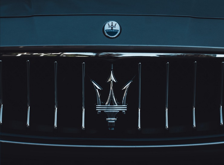
The Trident on Maserati’s logo represents the Fountain of Neptune’s trident at Bologna’s Piazza Maggiore. Neptune is the deity of the sea and wind.
The symbol was chosen for the sports car because it connotes speed and gracefulness, just like the wind and sea. Besides, the statue symbolizes the original home town of the Maserati brand.
Symbolism of the Colors
As already mentioned, Maserati’s logo can appear in a range of colors. Each color stands for specific qualities associated with the auto marque. For instance, black symbolizes the strength and elegance of Maserati automobiles while red represents the fiery power of Maserati cars. Silver resonates with affluence and glamor.
Symbolism of the Wordmark
![]()
Maserati’s wordmark doesn’t always appear alongside the trident. But when it does, the lettering represents the brand while also paying homage to Alfieri Maserati, the company’s founder.
Maserati Logo History
Maserati operated without a logo for more than a decade after the company’s establishment.
The first official logo emerged in 1926 and stayed with the company until 1937. It comprised a vertical rectangle in silver metal, featuring a detailed image of a trident. Underneath the trident image was the company’s wordmark, set in the UPPERCASE and executed in a sans-serif font.
![]()
In 1937, Maserati’s iconic trident became simpler, bolder, and more legible. Also, the oval now appeared inside the rectangle. The company’s lettering was placed on the bottom section of the oval, with a horizontal line separating the wordmark from the oval’s upper part.
Maserati redesigned its logo yet again in 1943. The new emblem now featured a red trident set on a blue oval. A horizontal rectangular badge containing the company’s wordmark crossed the oval. The lettering was white, CAPITALIZED, and executed in a massive sans-serif font. Lastly, a silver-grey outline surrounded the entire badge.
The following are other notable evolution timelines of the Maserati logo:
1951 – 1954
![]()
Maserati’s logo used during this period was modeled after the design of the company’s debut logo. The main difference is that the trident from the debut badge now appeared in red and was placed inside an oval which was split into two horizontal parts.
The biggest half of the oval was painted white and contained the image, whereas the smaller part was blue and featured the wordmark in white. Also, the entire oval was outlined in blue.
1954 – 1983
![]()
The shade of blue appearing in the previous logo became darker and the bottom half of the oval became larger. The wordmark also became larger, bolder, and more visible.
1983 – 1985
![]()
During this period, Maserati experimented with a minimalistic emblem that featured a light blue trident executed in thick lines and placed on a white background. At the bottom of the image was a bold black lettering. Black outlined the white oval emblem.
1985 – 1997
![]()
Maserati introduced yet another throw-back logo by recreating its 1954 emblem. However, the lines and contours in the new design became cleaner. Also, the company’s name appeared in white and featured a more elegant sans-serif typeface.
1997 – 2006
![]()
This was more or less an overhaul of Maserati’s previous logos. All the elements in the previous badges became larger and smoother, whereas the oval became narrower.
2006 – 2015
![]()
Maserati introduced two logos in 2006. The first had its bottom blue section elongated and the red trident refined. The wordmark was still in white but appeared in sharp serifs. This logo is still occasionally used today.
The second version was a three-dimensional depiction of the trident with grey gradient shades and smaller lettering. This version was used until 2015.
2015 – 2020
![]()
In 2015, Maserati’s logo appeared without framing. The iconic trident was placed above the letter “E” in the wordmark and all the logo’s elements appeared in dark grey.
2020 – Present
![]()
The current version of Maserati’s logo appeared in 2020. The grey color became black and white, while the contours of the trident became sharper. Also, the wordmark changed to a custom cursive, with all the letters connected to one another in their lower sections.
Final Word
Maserati’s trident-based logo is unmistakable. Whether the image appears on a car bonnet, lifestyle magazine, or wallpaper, it leaves little doubt about the company behind it. Although Maserati has undertaken tons of upgrades to its logo over the years, the trident image has been largely untouched.