Last Updated on August 21, 2023
Instagram is an American photo and video-sharing social networking platform founded by Kevin Systrom and Mike Krieger and initially released on October 6, 2010. The name was formed by combining the first and last syllables of the words “Instant” and “Telegram,” respectively.
Instagram is especially popular for its photo-editing features and the ability to organize uploads through hashtags. Like other social media platforms, Instagram users can set their content to be viewed publicly or privately by pre-approved followers. The service also supports geographical tagging, a feature that allows users to engage other users within specific locations.

Common ways users can engage on the Instagram platform include by posting and commenting on the content on their personal feed, liking other users’ photos, and following other accounts. There are also private messaging features.
Although initially launched for iOS, Instagram now supports all other major operating systems. They include Android, Windows, and even Fire OS.
Instagram Logo Appearance
Logo Shape

The Instagram icon is a minimalistic sunset-colored outline whose design is inspired by the original Polaroid camera image.
The logo features a bright gradient square background, drawn with rounded angles. At the center of the square background is a circle outlined in white. The circle is further surrounded by a thick white outline whose contours look very similar to those of the logo’s outer square design. To the top right of the inner circle is a solid white dot.
Unlike most brands, Instagram’s wordmark seldom appears alongside the company’s graphic image. But when it does, it’s normally set underneath the emblem.
Logo Colors

Instagram utilizes a four-color gradient, which includes white, pink, purple, and yellow.
White is used for the circle at the center of the design, as well as for the square outline surrounding this circular shape and the solid dot located to the top right of it. The rest of the colors occupy the background.
The three colors do not appear independently. Rather, they fade into each other in a manner that makes the logo looks like a distant rainbow.
Logo Font

As we’ve already mentioned, Instagram’s logotype rarely accompanies the brand’s graphic image. But when it does, it’s normally executed in a clean, stylish typeface.
The font used for Instagram’s wordmark is unique and was likely designed exclusively for the social networking service. However, it looks very similar to Blue Vinyl Regular and Avangard Regular.
Instagram Logo Symbolism
The Image

Instagram was originally known for its signature rainbow image and the viewfinder.
Although the rainbow image seems to have diminished from the app’s current logo, it has not disappeared completely. The image is somewhat created by overlapping the pink, purple, and yellow shades.
Instagram adopted the rainbow image to portray how colorful, vibrant, and diverse your photo- and video-based content on the platform can be. The image was also likely utilized for visual effects.
But while the rainbow image is somewhat difficult to make out from Instagram’s current logo, the image of the lens and viewfinder lives on. The lens and viewfinder are aptly represented by the white circle at the center of the design and the solid white dot to its upper right side, respectively.
Instagram adopted the image of a camera as a strong message that the social networking service was going to be based primarily on photo and video content.
Symbolism of the Colors

White is the color of purity, innocence, and elegance. Instagram likely incorporated this color to resonate with the last quality. The white color stands out prominently from the other colors used for Instagram logo’s background – purple, pink, and yellow.
Instagram designers made the logo look more stunning by causing the three background colors to fade into each other. Another symbolism of this overlapping pattern is that it helps preserve the rainbow image, which was part of Instagram’s original identity.
Collectively, the three colors speak to Instagram’s energy, warmth, and dynamism.
Instagram Logo History
Instagram’s CEO and co-founder, Kevin Systrom, took charge of designing the app’s first icon. The icon was based on an instant Polaroid camera and set against a clear background.
Systrom implemented several details found on a typical Polaroid camera in a bid to make the logo more realistic. You could easily notice a big flash and a rainbow strip stretching down the center of the design. Other elements included three shutter buttons and the viewfinder.
Since Instagram was established during the digital era, the app’s original logo came in 3-D. The first color palettes were predominantly beige and brown. Instagram used this logo for just a few months before deciding to upgrade it.
2010
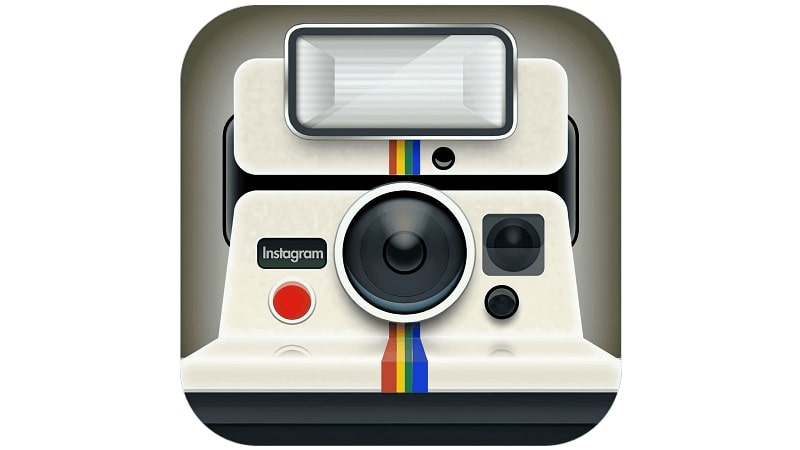
Later in 2010, Kevin Systrom hired the services of professional designer and photographer Cole Rise to help redesign Instagram’s logo.
Rise retained the badge’s colors and focused on its other aspects. He intensified the shades on the camera body, making the logo more noticeable while maintaining its simplistic design.
A vertically oriented rainbow appeared on the upper left corner of the camera. Under the rainbow was the inscription “INST,” set in UPPERCASE and in a sans-serif typeface.
Lastly, while Cole Rise retained the camera appearance, he was mainly inspired by the vintage Bell & Howell camera model from the mid-1950s. He reportedly designed the new logo in just 45 minutes.
2011

The 2011 version of the Instagram logo made its debut on Instagram v2.0. The new design stood out for its rich, leathery texture. Lens appearance also changed dramatically. The lens adopted more depth and flare, making it natural and realistic.
The “INST” wordmark disappeared and was replaced by the bold serif “Instant.” Lastly, the designers added a blue hue to the lenses.
2013 – 2015

The wordmark is the only aspect of the Instagram logo that changed in 2013. The logotype appeared in a different font and color palette. It sported a calm sea-blue color and straightened-up cursive lettering.
Besides, the inscription “Insta” appeared in bolder lines. All the letters, besides the capital “I,” are connected to each other.
2016 – Present
The current Instagram logo was unveiled in 2016. Although the designers retained most of the details in the previous logos, the elements became more minimalistic.
It’s also in 2016 that Instagram officially adopted white as the color for the geometric shapes and purple, pink, and yellow as the background colors for its logo.
Instagram is a relatively new platform, having been in existence for just over a decade. However, the company has continually reinvented itself by undertaking multiple upgrades to its logo.

