Last Updated on September 28, 2023
Honda Motor Company Ltd., commonly simply known as Honda, is a Japanese multinational conglomerate best known for manufacturing automobiles, motorcycles, and power equipment.
Honda was founded in October 1946 by Soichiro Honda and Takeo Fujisawa, and incorporated on September 24, 1948. The company is headquartered in Minato, Tokyo, Japan. However, its automobiles and equipment are available worldwide.
Honda has been ranked the largest motorcycle manufacturer since 1959. As of December 2019, the company had produced over 400 million motorcycles since its inception. The automaker also holds the title for the largest manufacturer of internal combustion engines, with an annual output of 14 million.
Like most successful automakers, Honda credits its achievements partly to aggressive marketing. And a great deal of Honda’s marketing success can be attributed to the company’s remarkable logo.
Honda Logo Appearance
Logo Shape
![]()
The Honda logo features a stylized letter “H.” The logo is bold and set in Roman style.
However, Honda utilizes several logos for its various departments. For instance, the logo used for the company’s automobile department is fairly distinct from that the company uses on its motorcycles. That said, all Honda products have one basic feature – the stylized letter “H.”
Another noteworthy element of the Honda logo is the company’s wordmark. The wordmark appears below the “H” sign. It’s typically set in a bold, black color. However, the lettering may also come in several colors, such as bright red.
Logo Color
Liver-grey, bright red, and black are the predominant Honda colors.
Liver-grey is the color Honda uses on the graphic image that includes the “H” symbol, whereas black is mainly used for the lettering. Bright red commonly appears as the background color. In some cases, the color may be used for the company’s lettering.
Logo Font
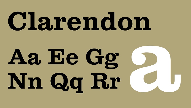
Honda uses a bold serif typeface for its word mark. The font stands out for its thick lines and stunning contours. Honda’s typeface is a custom font and isn’t based on any existing typefaces. However, it looks very similar to Clarendon Bold and Colt Family fonts.
Symbolism of Honda Logo
The “H” Sign and the “HONDA” Wordmark

The most straightforward meaning of the “H” symbol on Honda logos is that it’s an initial of the second name of the company’s co-founder, Soichiro Honda. Honda adopted the symbol as a way of associating the company with its founder. And that’s the same role played by the wordmark appearing underneath the emblem.
The use of the bold Roman style for the “H” sign makes the Honda logo instantly recognizable. Lastly, the grey metallic tone adds an extra layer of radiance to Honda’s logo design. It makes the logo look simple yet stylish and elegant.
Symbolism of the Colors

All Honda colors – liver-grey, bright red, and black – connote royalty, power, and prestige. Perhaps the company utilized these colors as a message that its automobiles are not only powerful but also represent a mark of royalty.
In fact, Honda adopted the slogan “Yume No Chikara” in the 1940s, which translates to “Power of Dreams” in English. So, designing powerful automobiles is a dream Honda founders envisaged long before the company became the giant automaker we know today.
Red is also the color of passion, whereas liver-grey resonates with simplicity and elegance.
Honda Logo’s History
Evolution of Honda Car Logo
The original logo for Honda cars featured a burgundy rectangular badge designed with a stylized capital letter “H” on the upper part of the logo. The “H” icon had vertical bars and beneath the letter was the wordmark “HONDA” written in a delicate serif typeface.
Honda used this logo from 1961 to 1969 and then embarked on its first logo redesign.
1969 – 1981

Honda released the first redesigned edition of its original logo in 1969. The new logo stood out for its vertically-set black rectangle. Inside the rectangle was a black background and against it was a white, narrow, and tall letter “H.” The overall color palette changed from blue and burgundy to monochrome.
1981 – 2000

Honda unveiled yet another logo in 1981. The new logo adopted a reverse color palette as the previous one, with the “H” symbol now set in black on a white background.
The contours of the “H” sign also looked cleaner and more refined. Rounded angles along the logo’s thick framing made it appear more square than rectangular.
Lastly, the black, massive wordmark appeared underneath the emblem. The wordmark was executed in a solid serif typeface with thick geometric contours.
2000 – Present
The next and final upgrade to the Honda car logo (as of today) happened in 2000. The designers focused on the logo’s size, color, and overall visual appeal.
First, the “H” symbol was stretched to touch the square frame. However, the letter size reduced significantly, making the logo look neater and cleaner.
In terms of color modifications, the emblem switched from monochrome to metallic grey, black, and bright red.
Evolution of Honda Motorcycle Logo
The original emblem used on Honda motorcycles featured the word “Honda Motor” set in white on a blue background. The graphic image sported gold and white outlines, and the white wordmark was also outlined in yellow.
A stylized wing-like element appeared on the left part of the logo, adding to its overall appeal. Honda used this logo from 1947 until 1948.
1948 – 1953

Honda performed the first upgrade to its motorcycle logo in 1948 by enlarging the blue badge. The company also changed the white cursive lettering to Ted UPPERCASE sans-serif, complete with white outlines.
Honda also introduced a golden silhouette of a human racing to the right of the logo’s golden framing. The human figure was set along the emblem’s right border.
Also, the designers placed the golden stylized wide geometric wing behind the figure, such that it covered the word “Honda” in the lettering and added a sense of motion to the logo.
1953 – 1968
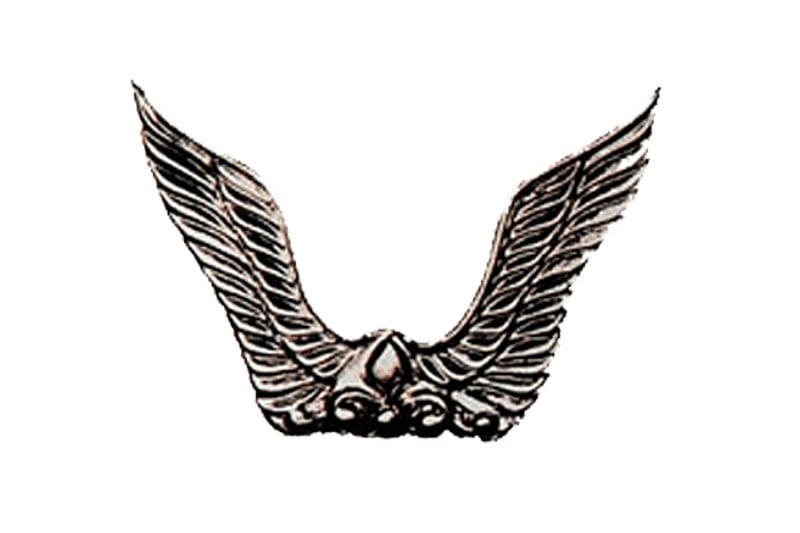
The new Honda badge featured two metallic wings emerging upwards and turning slightly to the sides. This new logo lacked the company’s lettering found in the previous logo.
1968
Honda’s 1968 logo was a horizontal oval with the inscription “HM” set inside and the thick outlines “Honda” lettering arched underneath it.
A massive wing emerged from the left section of the oval frame and spread up-right. Also, the new badge featured a monochromatic color palette, except for the nameplate that was outlined in thick red.
1968 – 1973
Honda decided to simplify its 1968 logo by removing the red oval outline and replacing it with a double monochrome one. The arched “Honda” wordmark also disappeared, leaving the “HM” inscription as the brand’s only signifier.
1973 – 1985
Honda’s motorcycle logo changed its color palette again from monochrome to gold and black. The wing also got a tweak, adopting more emboldened and cleaned contours. Lastly, the oval badge disappeared.
1985 – 1988
1985 marked the change of Honda motorcycle’s color palette from gold and black to white and black for the wordmark, and white, black, blue, and red for the wing.
1988 – Present
In 1988, Honda’s motorcycle logo began to look more contemporary. The wing was redrawn using thick red lines and rounded angles, and the wordmark featured no outlines.
Honda adopted red and white as the main color palette for its motorcycle emblem. This is pretty much the logo Honda motorcycles appear in today.
Honda’s logos (both for its cars and motorcycles) have gone through dramatic changes. However, one element has largely remained the same since the company’s inception – the “H” symbol. This speaks volumes about Honda’s consistency in producing powerful and stylish automobiles.

