Last Updated on July 4, 2023
One of the most widely-used fonts of the last decade, Gotham can be seen just about anywhere. Find out why this font is such a huge hit.
Gotham Beginnings
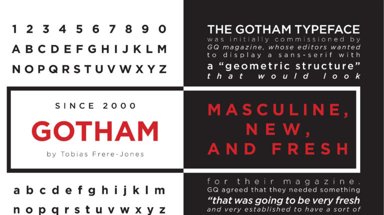
The typeface was initially commissioned by GQ Magazine. They wanted a “masculine, fresh, and new look” using a geometrically-structured sans-serif. Made for professional use, Gotham is a large family with four widths, eight weights, and separate designs for screenplay and a rounded version.
The publisher Hoefler & Co. quoted that the font should be something “that was going to be very fresh and very established to have some sort of credible voice to it”. Type designer Tobias Frere-Jones’ inspiration came from the lettering seen on older buildings, after taking a walk around Manhattan.
Frere-Jones felt that there was a need to preserve “old pieces of New York that could be wiped out before they’re appreciated”. Gotham’s simplicity reflected much like the 1920s, where the preferred type during the Depression was a look that kept the bare essentials, “rid of undesirable, local, or ethnic elements”.
Gotham Traits and Uses

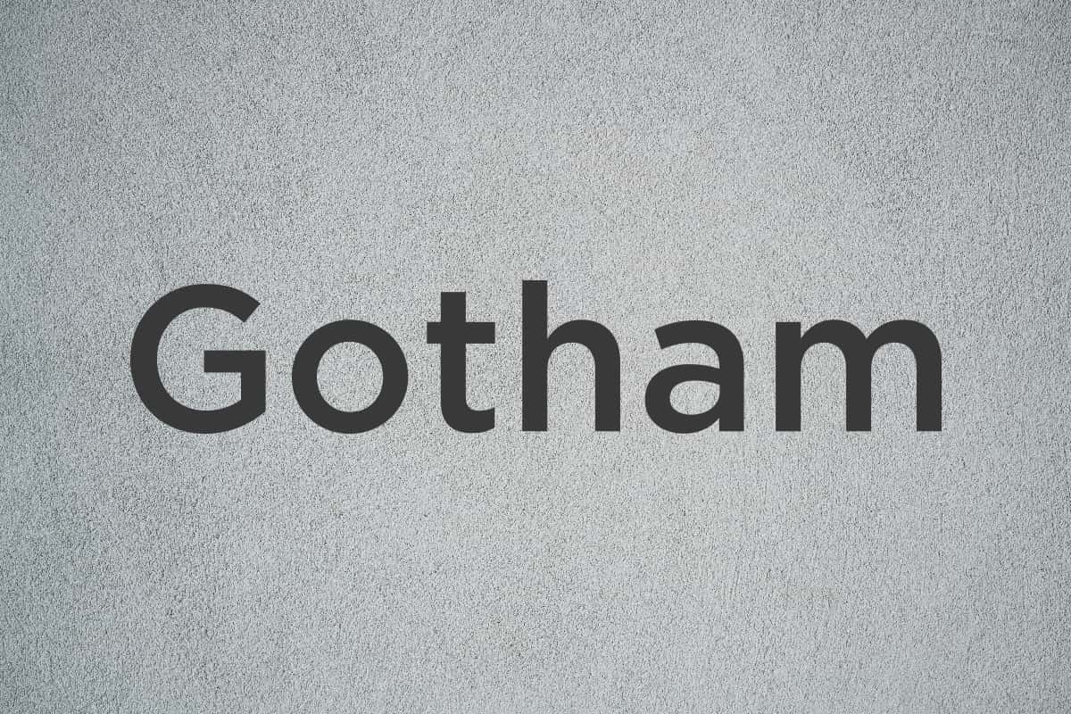
This sans-serif typeface is well-known for its uniformity and low thick–thin contrasts. It has also has near-circular curves, with an x-height almost at the exact middle of the ascenders and descenders. These characteristics attest to its versatility. And it looks more natural compared to other geometric typefaces like Futura or Avenir.
Since its release in 2000, Gotham has seen a lot of use. Some of its known applications included Barack Obama’s 2008 presidential campaign, the Michigan State University branding, and the Australian Labor Party’s 2016 federal election campaign. This font is also used presently by Discovery, Inc., Taco Bell, and Golf Galaxy for their logos.
If you haven’t yet, make sure you get this typeface for your toolkit. Download Gotham family bundles from Hoefler&Co, or settle for the free versions on Free Fonts Family.

