Last Updated on May 11, 2023
Google Maps remains popular to this day thanks to its search engine capabilities as well as real-time location access. All you need is your mobile and an internet connection and you can find anything, anywhere. A massive reason behind Google Maps’ success is its promotion.
Accessibility is highly important when it comes to similar apps. Hence, Google Maps relies on clean, clear typography that anybody can read, regardless of device.
On that note, let’s take a look at what font Google has been using for the past years for their Maps product, and perhaps we can understand why it has been so successful.
What is Google Maps?
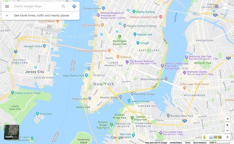
Unless you live under a rock, you probably know what Google Maps is. Google Maps is a web mapping service developed by Google and launched in 2005. Maps provide its users with satellite imagery, aerial photography, 360-degree views of streets, route planning, and real-time traffic conditions.
What Font Does Google Maps Use?

The font used on the Maps logo is known as Product Sans. This is a geometric sans-serif that is perfect for branding. It has been used since 2015 and is what gives the Maps logo its trademark look.
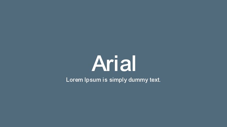
When it comes to the font inside of the app itself, the primary font used is Arial, however, it is outlined deliberately in parts to make it stand out. The font is super-easy to read and is just the right size.
Where To Download Google Fonts
Product Sans and Arial are pretty common fonts. However, they are NOT free. Product Sans is the proprietary of Google and cannot be downloaded for free from Google Fonts. Arial on the other hand, is the proprietary of Monotype Imaging.
But don’t despair: we’ve provided legit links for you to download the said fonts. Use them for personal purposes only. For commercial projects, contact the copyright owners for proper licensing.
Download Product Sans from BeFonts, Free Fonts Family, and Font Meme. Download Arial from Free Fonts Family, Cufon Fonts, and Free Fonts Vault.