Last Updated on July 11, 2023
Giorgio Armani S.p.A, more commonly known simply as Armani, is an Italian luxury fashion powerhouse established in 1975 by Giorgio Armani and Sergio Galeotti.
Armani is a globally renowned designer, manufacturer, and distributor of luxury ready-to-wear apparel, haute couture, and leather goods. The company also designs and supplies high-end fashion accessories like shoes, watches, jewelry, eyewear, and cosmetics, as well as home interiors.
Armani has grown over the years to become one of the world’s most successful luxury fashion houses. The company is presently considered Italy’s second-largest fashion group, coming only behind Prada.
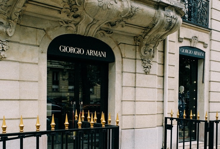
Photo by Mathias P.R. Reding on Unsplash
Although originally founded as a fashion design and manufacturing company, Giorgio Armani hasn’t shied away from venturing into other industries. The luxury fashion manufacturer is currently partnering with the real estate giant Emaar Properties.
This deal will see the two entities establish a chain of luxury hotels and resorts in major cities like Milan, Paris, London, New York City, Los Angeles, Tokyo, Hong Kong, Dubai, Shanghai, and Seoul.
Over the years, Giorgio Armani has also endeavored to distinguish itself from rival fashion designers. The brand not only stands out for its high-quality apparel and accessories but also for its chic and elegant logo. The shape of Armani’s logo is frequently a subject of discussion among many fashion enthusiasts.
Hopefully, this article settles the debate on the actual shape, meaning and design history of the Giorgio Armani logo.
Armani Logo Appearance
Logo Shape
Is it an eagle or an upturned right angle?
This is one of the frequently asked questions with regard to the Giorgio Armani logo. But what’s the logo’s correct description?
![]()
First off, it’s worth pointing out that Armani’s logo might change slightly depending on the company’s product lines. However, the luxury fashion powerhouse generally uses two visual identities.
The first, and most recognizable logo, is that of an eagle insignia. Yes, this is the logo that looks like an inverted right angle.
In this design, the eagle appears to have been modeled from six horizontal lines. The horizontal lines taper as you move towards the base, creating the image of an inverted right angle or pyramid.
An eagle’s beak emerges at the top center of the first two horizontal lines. The beak seems to be pointing right. The eagle’s beak is so skillfully crafted that the rest of the top two horizontal lines from whence the design emerges look like a bird’s wings.
The third horizontal line is slightly arched on either side of the eagle’s head. These arches resemble the sections where the bird’s neck joins the rest of its body.
Near the bottom of the pyramid are the initials ‘GA,’ which unmistakably stand for Giorgio Armani. The initials mainly occupy the center of the second-lowest horizontal line, with their ascenders and descenders touching the adjacent lines.
![]()
In some versions, Armani’s logo comes with the fashion brand’s complete wordmark. The lettering is normally set underneath the graphic image.
The entire eagle insignia often comes in white executed on a black background. But as with most logos, Armani’s emblem might change color depending on the context and media surface it appears in.
In addition to the eagle symbol, Giorgio Armani also uses an elegant monogram-based logo. The monogram comprises the letters ‘GA,’ skillfully crafted to resemble a circle.
Just like the eagle insignia, Armani’s monogram-based logo usually appears in black and white but the color can change occasionally depending on the context.
Logo Color
Armani has maintained a monochromatic logo from its inception. Black is commonly used for the background color while white is used for the eagle insignia or the ‘GA’ monogram. White is also the color for the company’s wordmark in logo versions where the lettering appears in full.
Logo Font
Armani uses a font called Didot LT. This font is commonly used for the ‘GA’ portion of the logo as well as the brand’s full wordmark.
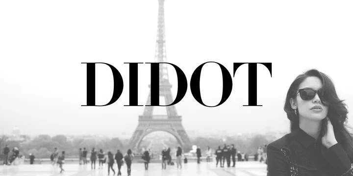
Didot is a name for a group of typefaces designed from around the 1780s. The most popular Didot fonts were created between 1784 and 1811 by French font designer Firmin Didot.
Another group was designed by Adrian Frutiger for the Linotype Didot Font Foundry. Numerous designers and font foundries have continually expanded Didot typefaces into different weights, some of which do not necessarily go by the name ‘Didot.’
Armani Logo Symbolism
The Eagle Insignia
![]()
The eagle is widely considered the king of the birds. This powerful and courageous bird sits right at the apex of the food chain. Armani might have used the eagle emblem on its logo to underscore its mission of becoming a global leader in the design and supply of high-end fashion apparel and related accessories.
The eagle also stands for regal, style, and pride. Armani undoubtedly takes pride in its design of stylish and regal attire.
You’ll also realize that the eagle on Armani’s insignia points to the right. This symbolizes motion and speed. It portrays Armani as an ambitious brand that’s ready to embrace new technologies in fashion design to improve its products’ quality.
The right-pointing eagle’s head also conveys Armani’s sense of urgency in fulfilling its clients’ orders. Freedom, inspiration, and victory are other attributes associated with the eagle.
![]()
Armani’s monogram-based logo also has a distinct meaning. The design stands for style and elegance, which aptly capture the brand’s essence.
The letters in the monogram are crafted to resemble a circle. This circular design signifies balance and helps evoke a sense of community. Well, we’ll all agree that Armani’s fashion accessories are still out of reach of the lower income-earners. But the brand is relentlessly working to make its high-end products available to all and sundry.
Symbolism of the Colors

Photo by Nicola D’Anna on Unsplash
Black is the color of wealth, power, grace, glamor, and sophistication. Armani intended for its fashion accessories to evoke an aura of class and elegance, instantly shifting the spotlight to the wearer.
On the other hand, white symbolizes purity and neutrality. Again, these are major attributes Armani products possess.
The Wordmark
![]()
Both Armani’s eagle insignia and the monogram-based logo feature the company’s initials – GA. Some logo versions also come with the brand’s full wordmark. The wordmark mainly serves to enhance the company’s visual appeal.
Armani Logo History

Credits to Dirty Gogo via Ladygaga.Fandom
‘Fashion comes and goes. But style remains forever.’
Armani has not undertaken any major redesigns to its logo since the company’s inception. That’s probably because the brand’s graphic image boasts all the four major qualities any serious logo should possess –relevancy, simplicity, memorability, and timelessness.
It appears that Giorgio Armani lives by this famous fashion quote, which explains why the company is yet to conduct any major design changes to its original logo.