Last Updated on August 21, 2023
FedEx Corporation is an American multinational conglomerate holding company founded on May 5, 1971, by Frederick W. Smith, and headquartered in Memphis, Tennessee.
The company focuses on transportation, services, and e-commerce. It was previously known as Federal Express Corporation before changing its name to FDX Corporation and eventually to FedEx Corporation.
FedEx is most famous for its air delivery service, FedEx Express. However, the company offers several other services, including FedEx Ground, FedEx Office, FedEx Freight, FedEx Supply Chain, to mention but a few.
In this post, we narrow down our focus to FedEx’s official logo. We’ll try to explore the logo’s appearance, meaning, and its history since the company’s inception.
FedEx Logo Design
Logo Shape

The FedEx logo is distinguishable by its creative usage of optical illusion. If you examine the icon closely, you will spot a white arrow in the space between the letters “E” and “X.”
The arrow slightly sticks out and points to the right. This ingenious utilization of negative spaces is a design technique that you’ll only find in a handful of logos.
Logo Colors
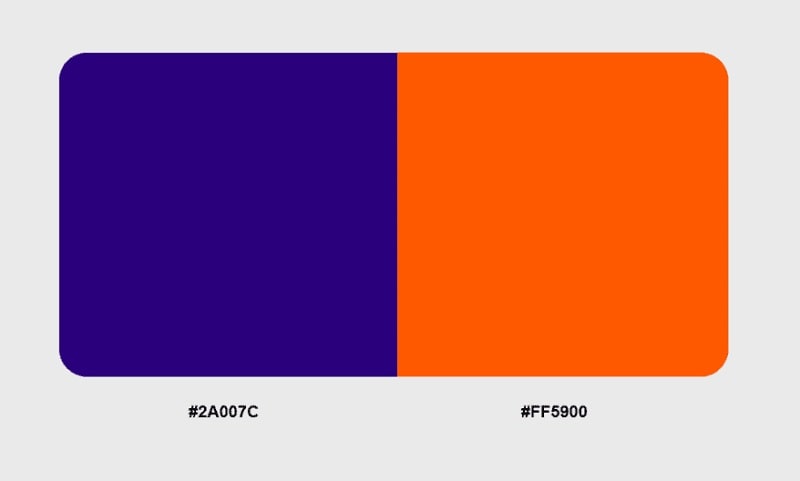
Purple and bright orange are the predominant colors of the FedEx logo. Purple is commonly used for the “Fed” part and orange for the “Ex” bit.
However, FedEx utilizes several color palettes across different displays. The logo may look differently on the company’s website than on its print materials, such as press release departments.
It’s also generally observed that the “Ex” section of the logo tends to change its color more than the “Fed” part.
Logo Font
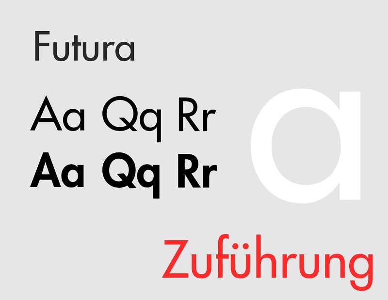
The font used for the FedEx logo is Futura Bold. Futura Bold is a bold style of the popular Futura typeface.
Futura is a geometric sans-serif typeface created by Paul Renner, with subsequent contributions from Edwin W. Shaar and Tommy Thompson. The font was initially released in 1927.
Paul Renner developed Futura as part of his contributions to the New Frankfurt-project. Renner took much of his inspiration from geometric typefaces that resemble the Bauhaus designs which were famous during the 1920s. However, he implemented a raft of design elements that gave the font both a contemporary and futuristic appeal.
Although Renner came up with Futura’s concept, the font was developed into an official typeface by Bauer Type Foundry. And besides the bold version that appears on the FedEx logo, the Futura font family includes several other styles and weights. They include Regular, Italic, Condensed, etc.
Symbolism in the FedEx Logo

The “FedEx” Wordmark
FedEx is simply a syllabic abbreviation of Federal Express. The wordmark serves the crucial purpose of enhancing the company’s brand image and visual identity. Note that Federal Express is also the name the company used for its original air division. The name was used between 1973 and 2000.
Federal Express eventually changed to FedEx. The primary motivation behind this name change is that the term “Federal” sounded a bit scary as it resonates with illegal or unconventional outfits.
The mention of the word conjures up images of outfits like the Federal Republic of Germany and Federalists in Latin America. Therefore, keeping the name would scare away FedEx customers and prospective clients.
But what inspired Frederick Smith to settle for Federal Express even before changing his company’s name to FedEx?
Apparently, Smith wanted to target the Federal Reserve Bank as one of its customers. Besides, the usage of the name “Federal” gave the company a professional touch. It portrayed Federal Express as a patriotic brand with a deep commitment to contribute to the country’s economy.
The Arrow Design

The white arrow nestled between the letters “E” and “X” on the FedEx logo symbolizes speed and accuracy. Not only is FedEx focused on fast and efficient delivery of goods and services to its clients. The company also ensures its products arrive in crisp condition.
The arrow also symbolizes motion and progress. It portrays FedEx as a company that constantly strives for perfection, and one that remains resilient in the pursuit of its goals.
More interestingly, FedEx logo’s designer Lindon Leader implemented a blank space as a clever depiction that the qualities represented by the arrow cannot be achieved overnight. Perhaps the blank space will become more noticeable in the logo’s future iterations when FedEx finally accomplishes its core objectives.
Lastly, the white arrow also indicates that many FedEx customers are yet to experience the company’s full scope and capabilities.
Symbolism of the Colors
The combination of bright purple and orange symbolizes energy and aggression.
Another thing worth noting about FedEx color combinations is that the “Ex” part uses several colors for the company’s different departments. Orange is commonly used for FedEx Express, red for FedEx Freight, and green for FedEx Ground.
History of the FedEx Logo

Unlike many renowned brands who’ve undertaken tons of upgrades to their logos, the FedEx logo has undergone just three major redesigns throughout the company’s history.
The original FedEx logo was designed in 1973. The icon utilized the company’s original name – Federal Express. It was a simple rectangular shape partitioned into two by a diagonal line. The rectangle’s upper partition was purple, whereas the lower field was orange. The brand’s name was executed along the diagonal line.
FedEx’s original logo utilized a combination of white, purple, and orange. The word “Federal” was set in white over a purple background, whereas “Express” appeared in orange over a white background.
Also, this logo changed its color palette depending on the context. For instance, some versions featured darker shades of purple combined with vibrant orange shades.
FedEx used this logo until 1991.
1991 – 1994
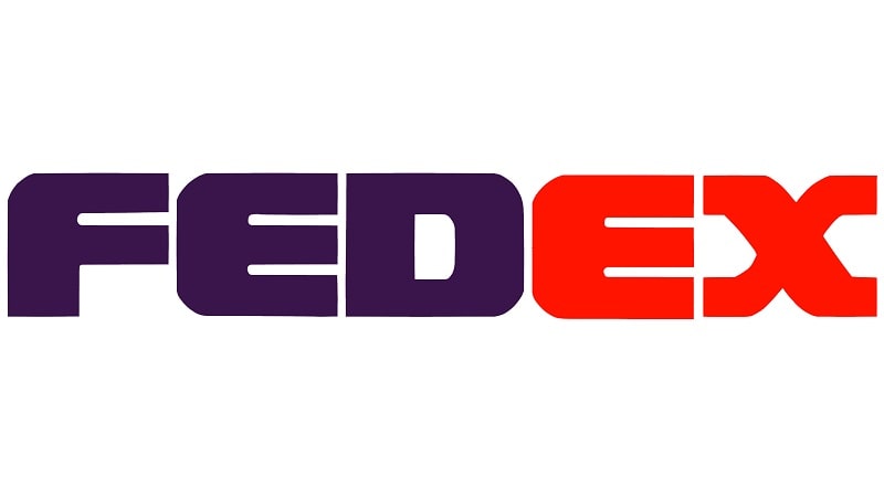
The FedEx logo underwent a transitional period between 1991 and 1994. During this period, the brand experimented with multiple designs.
One noticeable change was replacing “Federal Express” with “FedEx.” The rectangular design and diagonal theme in the previous versions also disappeared. However, the designers kept the purple-orange color palette.
1994 – Present
FedEx’s iconic logo was designed in 1994 by Lindon Leader. This year marked the introduction of the legendary white arrow.
Lindon also came up with several color options for the “Ex” part of the FedEx logo for the company’s various departments.
It’s important to point out that Lindon’s crafty arrow design didn’t come without its fair share of criticism. The designer had to endure criticism for keeping such a huge amount of space white. However, he told off his critics, citing the average client’s lack of appreciation of empty spaces. According to him, the secret white arrow was a tactical marketing maneuver.
The FedEx icon is one of the only few logos that utilize an optical illusion in the form of a white arrow. This quirky design element adds an extra layer of visual appeal to FedEx’s logo, making the emblem beautiful and memorable.

