Last Updated on August 21, 2023
Euphoria is an American teen drama television series created by Sam Levinson for HBO and directed by Augustine Frizzell, Jennifer Morrison, Sam Levinson, and Pippa Bianco. The 48 – 65 minutes series was originally released on June 16, 2019, and has been running since then.
It’s based on the homonymous Israeli series, created by Ron Leshem and Daphna Levin and released in 2012. The series stars Zendaya Coleman, Maude Apatow, Angus Cloud, Eric Dane, Alexa Demie, and a host of other actors.
Euphoria follows a group of teenagers dealing with typical teenage challenges, including abuse, trauma, identity crisis, love, and friendships. The series was released to critical acclaim. It has since received a Primetime Emmy Award nomination and won the star, Zendaya Coleman, two Primetime Emmy Awards and one Satellite Award.
The Euphoria Logo
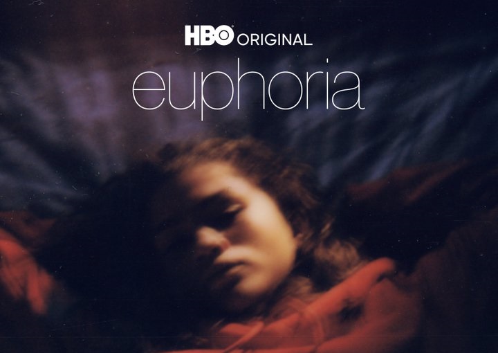
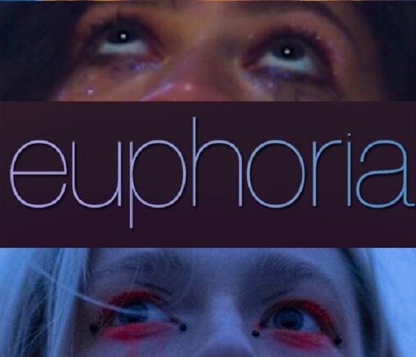
Like most television series, Euphoria uses a simple wordmark for its logo. The logotype is executed in ALL-CAPS and set against a dark rectangular frame.
All the individual letters in the “EUPHORIA” wordmark appear to have been rendered in the same font style. The letters are also fairly saturated in color. However, there are significant variances in terms of color distribution. If examined up close, you’ll realize that the wordmark sports palettes of blue and purple, with yellow and green undertones.
The implementation of different color shades was by design rather than accident. And so was the choice of purple/blue and yellow/green palette. These contrasting colors speak to the constantly-changing moods in the scintillating HBO series.
The Euphoria Font
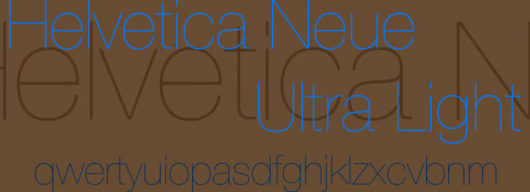
Many people initially thought that Euphoria’s logo was designed in Century Gothic. However, a recent Twitter thread clarified that the television series actually uses Helvetica Ultra-Light.
About Helvetica Ultra-Light
Helvetica Ultra-Light is the ultra-light variant of Helvetica. Also known as Neue Haas Grotesk, Helvetica is a highly popular neo-grotesque, sans-serif typeface designed in 1957 by Max Miedinger and Eduard Hoffmann. The font was originally published by Haas Type Foundry but later reissued by Mergenthaler Linotype Company.
Max Miedinger and Eduard Hoffmann created Helvetica based on famous German and Swiss designs that were popular in the 1890s, such as Akzidenz-Grotesk. The font was generally well-received shortly after its release. It went on to become one of the most popular typefaces of the mid-20th century.
Helvetica Features
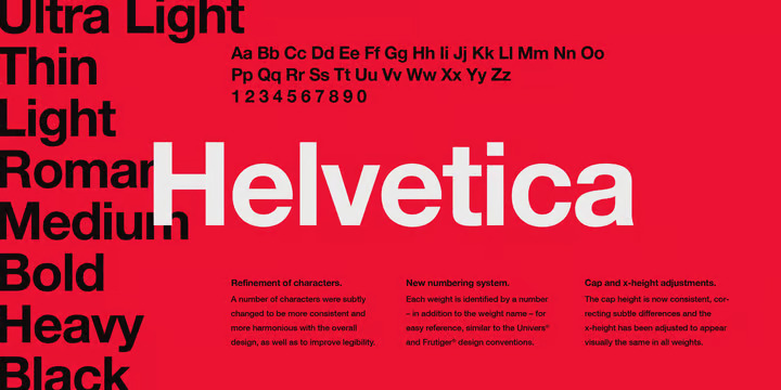
Helvetica stands out for its rather tall x-height and small kerning (spacing between letters). These features combine to make designs and words executed in the typeface incredibly legible from a distance.
Letters rendered in Helvetica also generally appear in an oblique rather than italic style. This is a common feature that Miedinger borrowed from the grotesque and neo-grotesque typefaces that inspired his creation of Helvetica.
UPPERCASE letters set in Helvetica typically sport wide capitals of near-uniform width. That’s especially evidenced in the letters ‘E’ and ‘F.’
Also, the small letter ‘a’ is usually two-storied and features curves on its bowl and stem. Again, this is another hallmark of earlier neo-grotesque typefaces.
Other noteworthy features of Helvetica include;
• Single-story small letter ‘g’
• Rounded-off square of the CAPITAL letter ‘R’
• Square-shaped small letter ‘s’
• Bracketed top flag of the number ‘1’
• Concave curved stem of the number ‘7’
Like most typefaces, Helvetica was originally available only in the Regular weight and Normal format. However, the font has since been released in many other variants.
Helvetica Applications
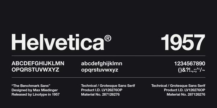
Helvetica can support a wide range of graphic designs. The font’s clean texture and solid appearance makes it especially suited for official designs, such as company logos and business cards. You can also use it for store signage, road signage, and apparel branding. Helvetica would also be an excellent choice for titling books and comic strips, newspapers and magazines, movies and television series, and video games.
Still on Helvetica‘s versatility, it would interest you to know that you can use this font both for document titling and body text. The typeface will also look just stunning on digital graphics as it would on physical ones.
However, note that Helvetica sports narrow apertures. The typeface also lacks visible differences between the ‘UPPERCASE ‘i’ and lowercase ‘l.’ So, it’s prudent to consider using it in large sizes for enhanced readability. That’s especially if using the font on digital platforms.
Where to Download Helvetica Ultra-Light
Being one of the most popular fonts, it’s not surprising that there are numerous places where you can download Helvetica Ultra-Light and other Helvetica variants.
You can find Helvetica Ultra-Light on Fonts3.com, Fonts.com, and Blog Fonts. Other popular download platforms include Fonts Geek, Candy Fonts, and My Fonts.
Is Helvetica Ultra-Light Free?
Helvetica fonts are generally free for personal use. That includes Helvetica Ultra-Light.
You can use Helvetica Ultra-Light on just about any design project that has no monetary gains attached. Helvetica isn’t free for commercial use. The typeface is trademarked and a commercial license is required to use it for business purposes.
Many operating systems include Helvetica Ultra-Light in their bundles. This grants you free access to the font after making a one-time payment for downloading the system.
Perhaps it’s why many people wrongly believe they can apply the typeface on just about any graphic. However, note that you’ll still need the right license type before using Helvetica Ultra-Light commercially.

