Last Updated on October 9, 2023
It’s a drink that unites us all. Everyone’s tastebuds have savored the flavor of this chilled, refreshing, carbonated beverage. Meals seem bland without it. Yes, we’re talking about Coca-Cola!
Have you ever wondered how Coca-Cola got its logo? Or, more specifically, who designed it? When did it start gaining popularity anyways? We’re here to answer all your questions.
This blog post will provide you with an in-depth perspective of the history of the Coca-Cola logo (which is very intriguing, by the way), its meaning, and the people on the creative front.
How Coca-Cola Began
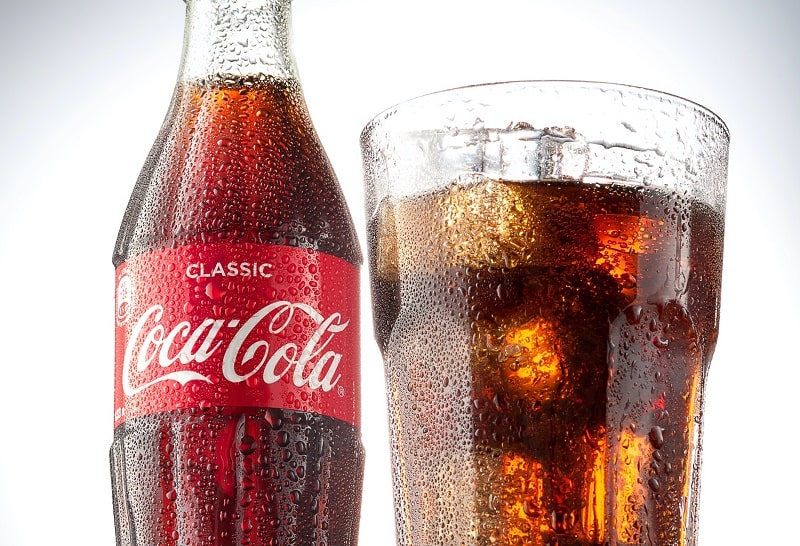
Photo by Andrey Ilkevich on Unsplash
John Stith Pemberton is the guy behind the history of the Coca-Cola logo. It all began in 1886 at the good old New York Harbor. Who knew that the world’s most popular drink would brew within the confinements of a small backyard!
The mastermind behind Coca-Cola, John Pemberton, was an American pharmacist and an army veteran. His relationship with pharmaceuticals appears to be rather uncanny, doesn’t it? Maybe that explains why it is so addictive!
But why did a pharmacist decide to create a carbonated drink?
Mr. Pemberton was at the undisputed nadir of his career. Let’s just say that his pharmaceutical concoctions proved to be rather useless since nobody wanted to buy them. He knew he had to do something different, and that’s when he decided to venture into the foreign but somewhat gleaming food & beverage industry.
Pemberton allied with his bookkeeper, Frank M. Robinson, who employed his remarkable penmanship skills to brand this refreshing beverage in the wider market.
The black effervescent liquid refreshment we see before us in frosted glasses oozing with ice is a secret blend of syrup, carbonated water, coca bush leaves, and cola nuts.
How Coca-Cola became the world’s most popular beverage

Photo by Jonathan Borba on Unsplash
After Pemberton perfected the formula, he presented it to the people to try, and of course, they loved it. His business partner, Frank, decided to name it Coca-Cola. Frank suggested that the two Cs in the name would prove to be a clever marketing tactic (and very rightly so).
Soon, Coca-Cola became the beverage of choice for table talk.
‘Let’s have a chit-chat over a glass of coke’ became the vibe of the hour.
However, despite nailing the formula, John only managed to sell 9 glasses of Coca-Cola per day. When he was nearing the end of his life, he sold his secret elixir recipe to the renowned Atlanta-based business tycoon of the time, Asa Griggs Candler.
Candler purchased the recipe for approximately 2300$ and skyrocketed it to a booming multibillion-dollar monopoly.
What does the Coca-Cola logo mean?
Photo by Slashio Photography on Unsplash
Frank chose the black and white logo with a professional font to represent elements of professionalism, class, and competitiveness in the industry.
However, Coca-Cola adopted a merrier approach to their branding over the years. The infusion of red and white colors in the logo are set out to express youth, vigor, victory, happiness, and love.
The idea behind the shift in logo designs was to make this beverage more consumer-friendly and relatable. The sort that evokes feelings and allows the consumer to taste the feeling.
Coca-Cola Logo History
Let’s go through a brief history in time through the transitions of the Coca-Cola logo. The journey between 1886-2007 has been transformative for the logo. The signature symbol we see on the bottles today was nothing like the one penned in 1886!
1886
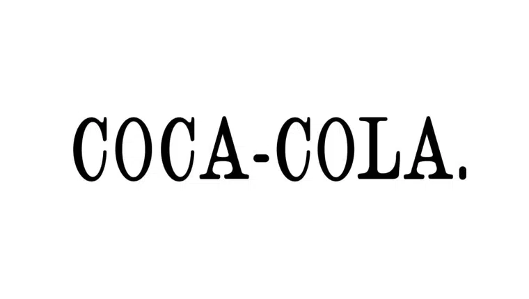
Pemberton’s business partner and former accountant, Frank Robinson, first penned down the black and white Coca-Cola logo in an idiosyncratic, Spencerian fashion. At this point, Frank was just targeting a small consumer market and needed something flashy to put forth.
1890
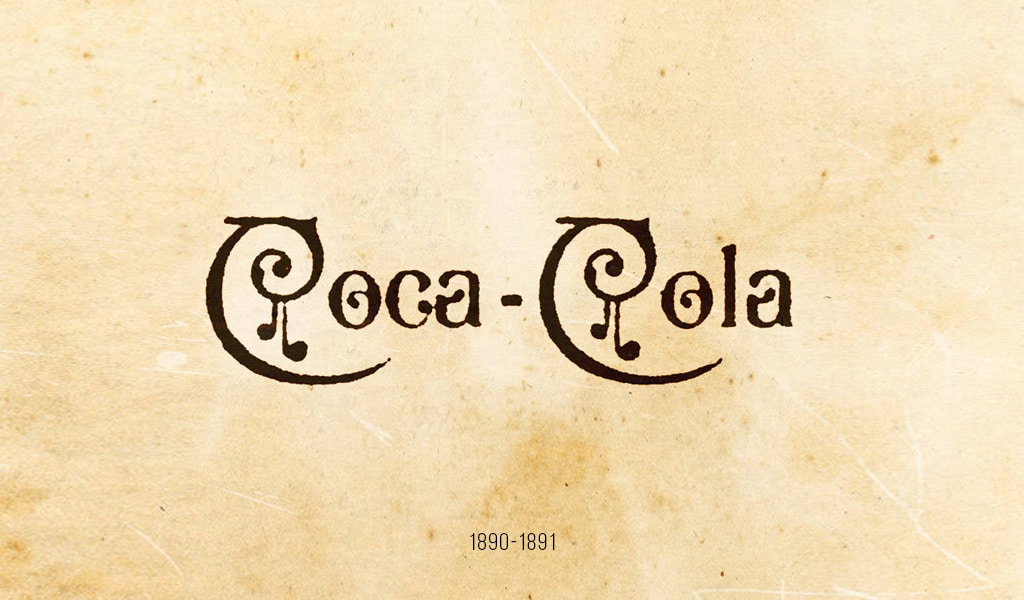
A few swirls were added to the Coca-Cola logo to give it a unique touch. However, this design lasted for no more than a year. In 1893, it earned trademark rights; the trademark symbol was inserted in the tail of one the ‘C’s.
1900
The blueprint for the everlasting Coca-Cola logo perhaps took birth in 1900. This logo is an unmodified version of the Coca-Cola logo we see today.
1905

5 years later, a very much necessary modification of the previous logo was made. The logo became relatively more polished and sleek.
1940
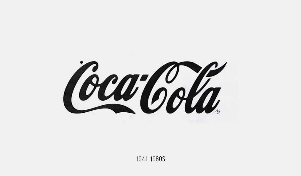
The edges of the thickened writing of the Coca-Cola logo were refined to give it a more appealing look.
1950
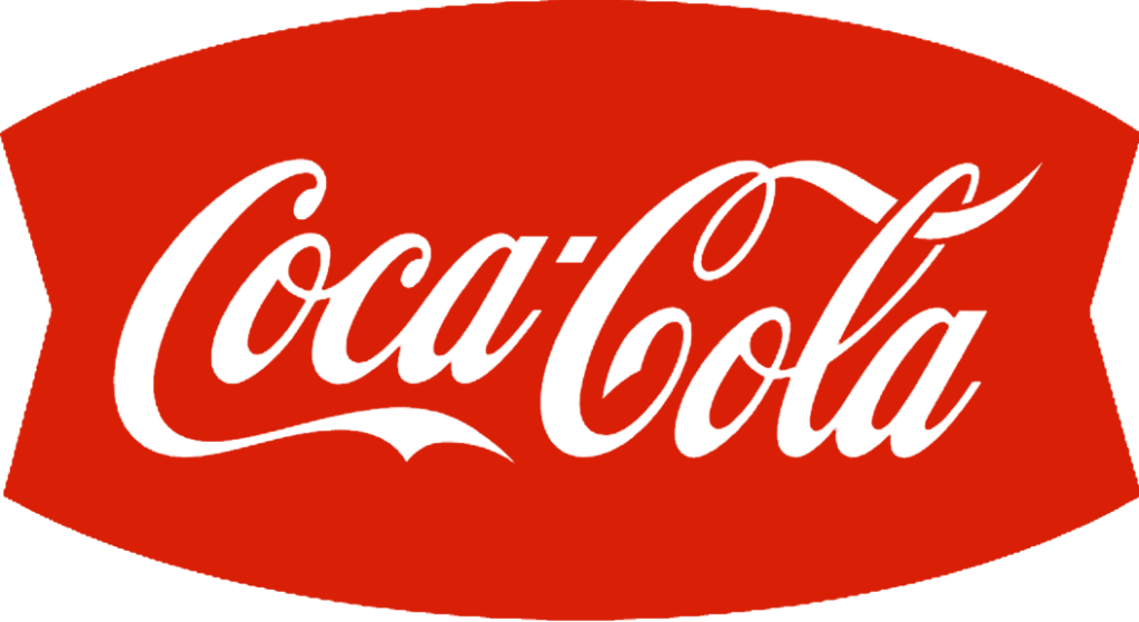
A red disc/fishtail design was added to the background of the logo. This was a smart move since it gave the logo the perfect shape to conform to signs, billboards, and outdoor hanging signage.
1969
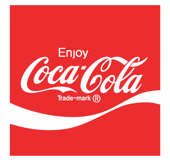
A white wave or ribbon became an additional part of the Coca-Cola logo. The white wave is here to stay; we see it on many of the Coca-Cola bottles and cans we chug. The supplementary ‘enjoy’ in the logo was also incorporated. If you’re not enjoying Coca-Cola, is it even Coca-Cola?
1987
Coke it is!
1993
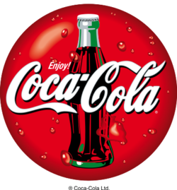
The classic coke bottle was used as the background for the logo in 1993. This was probably created to visually entice the consumer so that he would become provoked to purchase an icy, refreshing bottle of coke.
2003
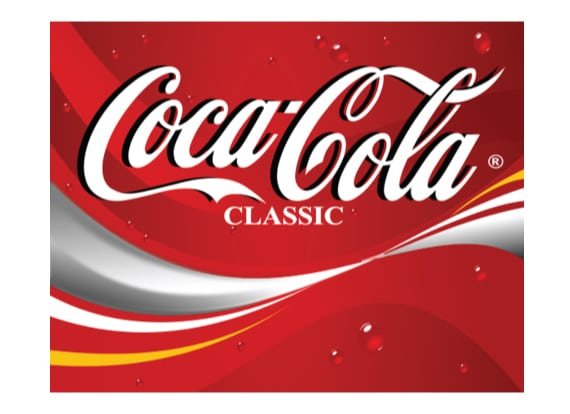
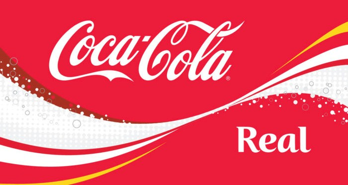
There are two versions of the logo that were circulating at the time. One in which the Coca-Cola logo received ‘classic’ as a meta-title and the other one with ‘real’ to back their keep it real campaign.
2007
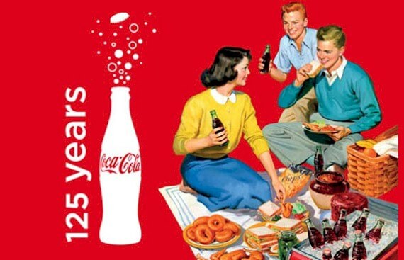
This is where the journey ends. Well, not entirely because the logo was still subject to minor changes.
2007-Present
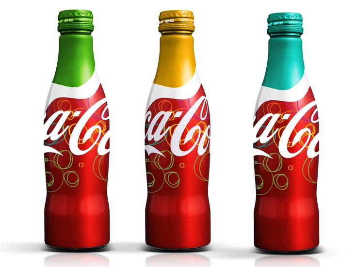
A little logo re-vamping still kept surfacing to comply with various Coca-Cola campaigns. 125 years of joy, share a coke, open happiness, and taste the feeling are a few to name.

