The Chicago Bears is a Chicago-based professional football team that competes in the National Football League (NFL) as a member of NFL’s National Football Conference (NFC) North division.
The Chicago Bears was established in Decatur, Illinois, on September 20, 1919, but later moved to Chicago in 1921. The franchise has won nine NFL Championships and holds the NFL record for the most victories.
Chicago Bears Font
![]()
Chicago Bears uses a unique font that was likely customized specifically for the football team. However, the typeface seems to be a modified version of numerous designs, including Filmotype Ford and Antique Olive Nord fonts.
Note that the Chicago Bears’ logo comprises two basic elements – a stylized capital letter “C” and the word “BEARS.” Our focus here is on the font used for the wordmark and not the stylized letter ‘C.’
a) Filmotype Ford
Filmotype Ford is a font family designed in 2011 by Stuart Sandler and officially published by Filmotype Font Foundry.
Although Filmotype Ford appeared much later, the typeface was developed throughout the early-to-mid 1950s and was likely inspired by designs popularized by Lettering, Inc. It was intended for designers looking for heavy-duty sans-serif styles that come with a 1940s sensibility.
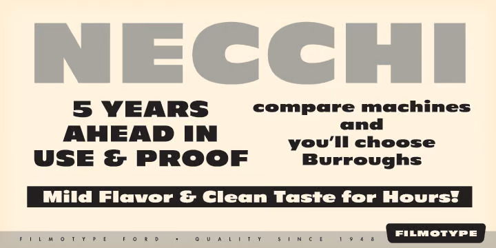 Filmotype Ford features ultra-wide elements. The font also lets you experiment with a broad range of character sets, including letters, letter-like symbols, currency symbols, integers, basic punctuations, and mathematical operators.
Despite its ultra-wide design, characters executed in Filmotype Ford remain incredibly legible despite their size and case. The font also supports over 70 languages.
You can download Filmotype Ford from My Fonts, Linotype, and Fonts In Use. The font comes with all license types, allowing you to use it for both personal and commercial projects.
b) Antique Olive Nord
Antique Olive Nord is an ultra-bold version of Antique Olive, a humanist sans-serif typeface designed by Roger Excoffon and published by Fonderie Olive. The typeface was initially released between 1962 and 1966. It was created based on Gill Sans styles that were fairly popular around the same period.
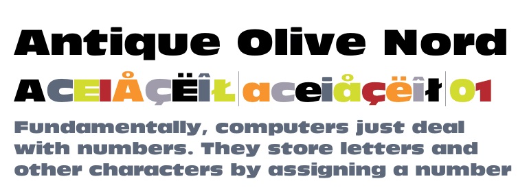 Antique Olive derives its name mainly from the shape of the letter O, which looks like an olive. The typeface also stands out for its vintage design.
Excoffon’s original version of Antique Olive was only available in the basic weight. However, continued development over the years spawned additional styles and weights. They include;
• Antique Olive Condensed
• Antique Olive Condensed Bold
• Antique Olive Extra Bold (also known as Antique Olive Compact)
• Antique Olive Ultra Bold (which is the Nord version that resembles the original font used on Chicago Bears logo)
There have also been numerous independent designs developed based on Antique Olive. Examples include LL Moderne by a type designer known as Robert Huber and Utile by Kontour Type.
You can download Antique Olive Nord from My Fonts, Font Palace, Fonts Geek, among many other websites. The typeface is licensed as free for personal and commercial usage. However, commercial application may come with some limitations.