Some hues like Sienna are named after the regions where their natural pigments were originally mined on a large scale. Others like lavender get their names from plants that bear blossoms of the same appearance. There’s also a group of colors named after famous beverages. Think Burgundy, Bordeaux, and of course, Champagne.
This article looks at champagne, a color inspired by the refreshing effects of a bubbly wine of the same name. Read below to find out what this color means and how you can blend it with other pigments to create stunning results.
Introducing Champagne
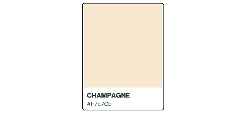
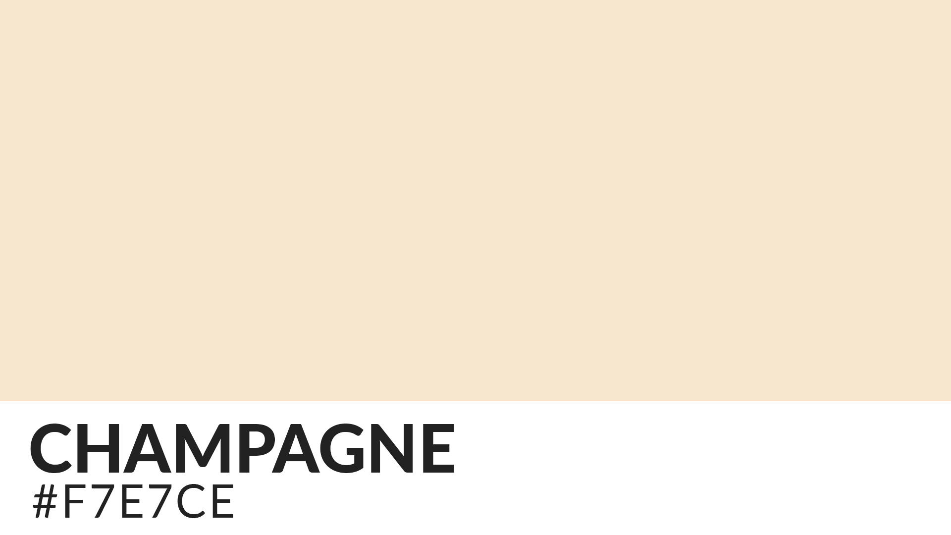
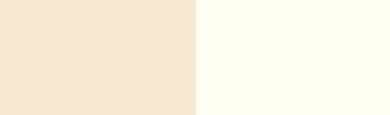
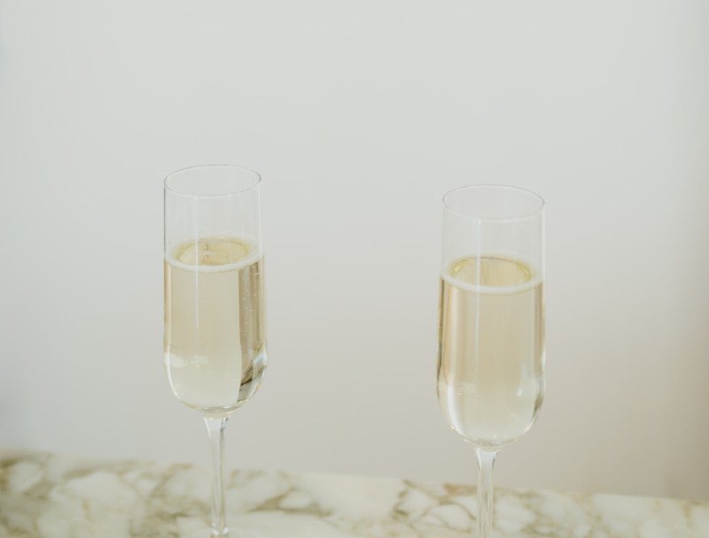
Champagne is a yellowish-orange color that differs from similar shades in its very pale tint. The color is more closely related to beige. It has the hex code #F7E7CE.
The word ‘Champagne’ may also be applied broadly to denote various pale yellowish-orange tints. This means there’s no standard measure on the degree of paleness a yellowish-orange color should have to be considered as true champagne.
What Constitutes the Champagne Color?
Based on its description, champagne is the result of mixing yellow and orange. So, these two are pretty much the dominant hues in champagne.
Note that orange is the product of combining red with yellow. So, there’s also a decent amount of red in champagne despite the fact that most people will generally see yellow and orange hues.
Is Champagne a Primary Or Secondary Color?
The Champagne hue is a tertiary color. That’s because it’s the result of mixing a primary color (yellow) with a secondary color (orange).
Is Champagne a Warm or Cool Color?
Both yellow and orange are considered warm colors. That consequently makes champagne a warm color. Like other warm colors, champagne is a great choice if you want to infuse bubbliness into an otherwise dull setting. The color can uplift the moods while also stimulating positive vibes in its surroundings.
Champagne’s muted appearance makes it somewhat less vibrant than many warm colors. But that’s actually a blessing in disguise for artists, as it ensures the color won’t create overly showy effects.
It also means you can easily use it alongside other brilliant tones as it would then diminish the effects of potentially overpowering shades.
Is Champagne On The Color Wheel?
It may not be immediately visible on the traditional color wheel, but the fact that this hue is a shade of two colors means it also has a place there. Champagne occupies the inner, paler portion between yellow and orange on the color wheel.
Comparing Champagne against Similar Colors
Champagne vs. Beige

Beige is the closest color in appearance to champagne. The two pigments are so similar that some artists gladly use them interchangeably.
The main difference between champagne and beige is that the former has warmer undertones. While both colors are considered warm, beige skews more towards the cooler end of the spectrum than champagne.
Champagne vs. Ivory
Ivory is another color commonly confused for champagne. But while champagne is a shade of yellow and orange, ivory is a white undertone. The ivory color stands out for its sunny, creamy tone compared to champagne that’s more brown and earthy.
Origin of the Champagne Name
The champagne color is unmistakably named after the famous alcoholic beverage. The first recorded use of the word “champagne” as a color name in the English language was in 1915.
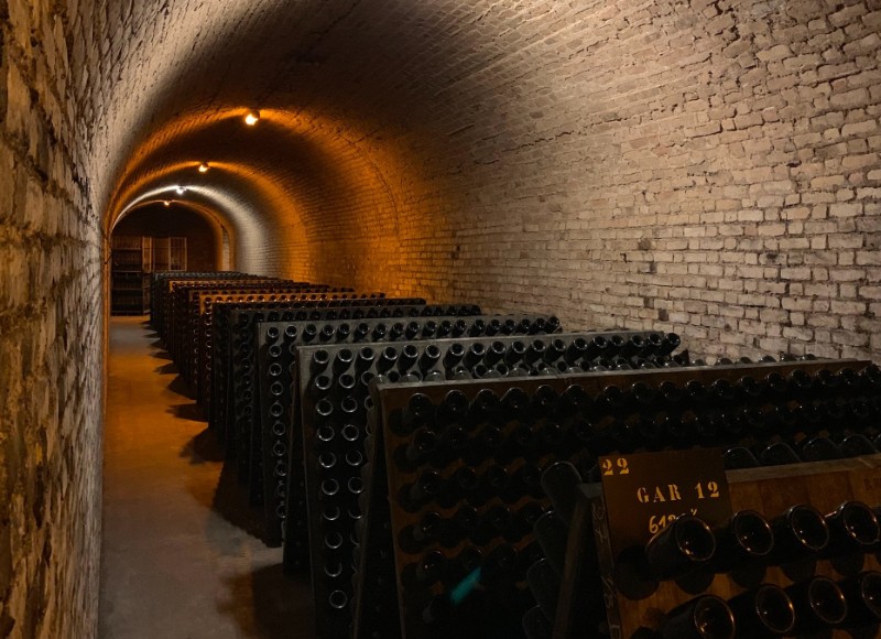
Champagne (the drink) is a sparkling wine produced in the province of Champagne in the northeast region of France. The drink is produced from three main grapes, namely Pinot noir, Pinot meunier, and Chardonnay.
Fun Fact: Did you know that the word “champagne” has been duly registered with the French Interindustry Champagne Committee (CIVC)?
That consequently means champagne isn’t an official color name. So, while you can use the color in a variety of projects, you cannot officially label your creations ‘Champagne.’ The same rule applies to other wine-inspired color names like Bordeaux or Burgundy.
History of the Champagne Color
The drink that lent its name to the champagne color and has been consumed for thousands of years. The wine rose to prominence before the medieval times when the Romans began planting vineyards around the north-east region of France.
Evidence of widespread champagne production dates as far back as the 5th century. The wine was originally associated with power and status. This was a successful marketing hack by leading manufacturers then. By associating the beverage with royalty and nobility, it would invariably attract higher returns.
However, champagne became a favorite drink of the middle class after the 19th century. The wine is now a common sight in bars, restaurants, and corporate events worldwide.
But while the popularity of the champagne drink is well-documented, there’s little information on when the champagne color first became a hit. The color is fairly recent and must have been created by artists who were simply experimenting with different shades of yellow and orange.
Meaning of Champagne
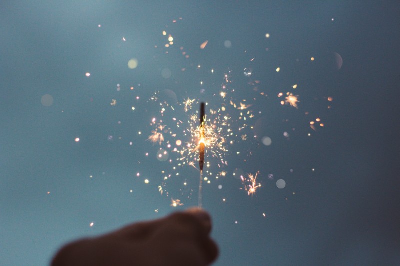
The pigment derives its meaning partly from the qualities associated with the champagne drink and partly from the color’s own uniqueness. Since this color is inspired by a bubbly drink, it’s commonly associated with happiness and can aptly suit fun outdoor events.
Champagne also resonates with friendliness. That’s understandable considering that the wine where this color gets its name from has a way of bringing friends together.
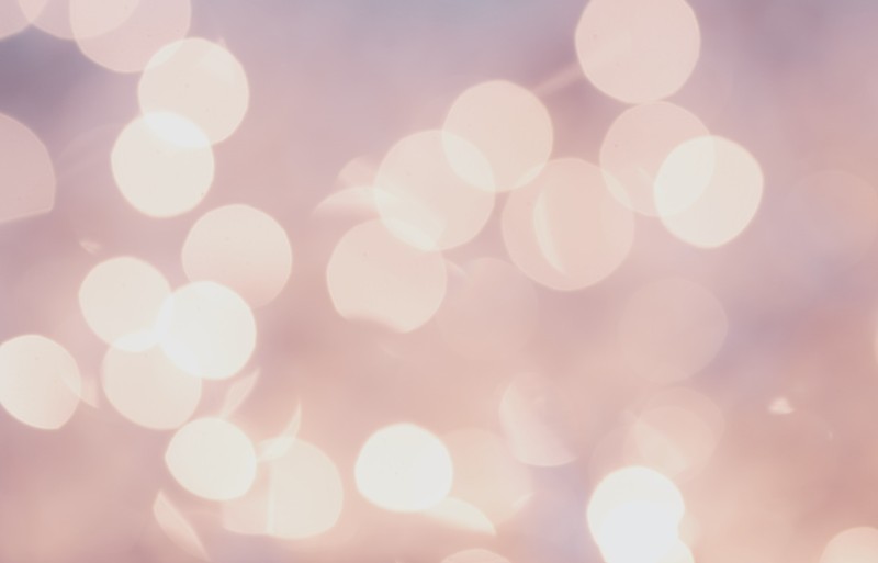
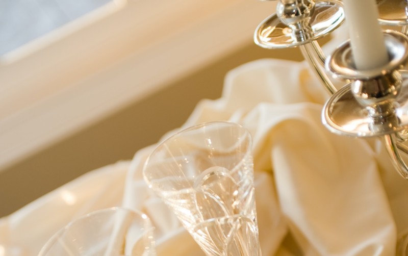
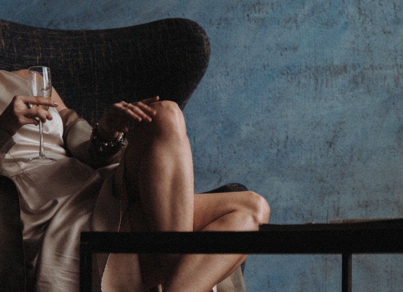
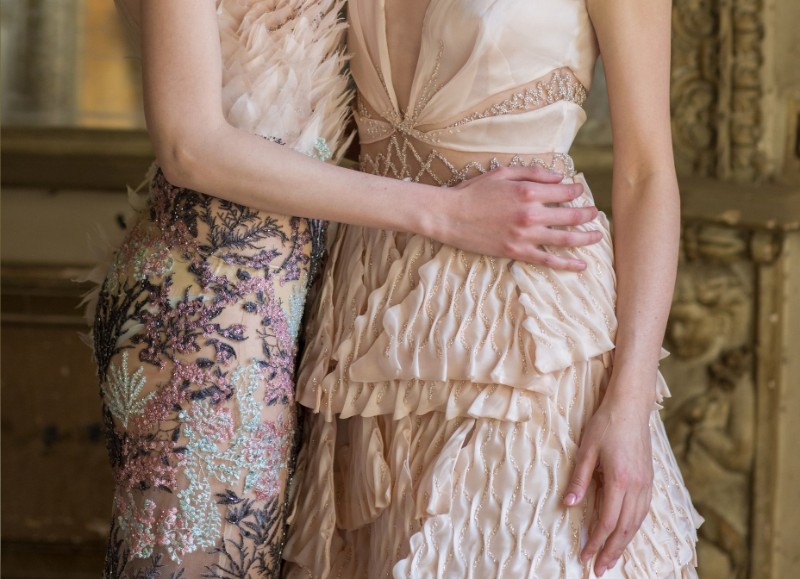
The champagne color also stands for glamor. The color’s sparkling appearance is the reason behind its association with flamboyance. As such, champagne hues would look great on glitzy designs like ballerina outfits. The color would also go well with your other theme colors for chic occasions like weddings, bachelorette dinners, and New Year’s Eve parties.
Because champagne was once a drink of the elite, the champagne color might equally symbolize luxury. The pigment can invoke a sense of sophistication and make the simplest crafts appear incredibly stylish.
But while champagne resonates with class and demands adoration, the color is surprisingly modest. This shade of yellow-orange will unlikely create overwhelming effects regardless of where you use it.
Champagne, along with other colors like white and rosé, have strong feminine attributes. In fact, multiple gastronomical studies have found that meat is male, champagne (the drink) is female, while cheese is unisex.
As a feminine color, champagne would look more gorgeous on designs and settings with a feminine theme. You could think along the lines of makeup and lingerie.
Champagne may also symbolize romance. The color derives its romantic connotations from the fact that the champagne drink has been a favorite choice of love birds for many years. It’s undeniably true that shades of red would better suit romantic themes. But using hints of champagne can help you take the experience a notch higher.
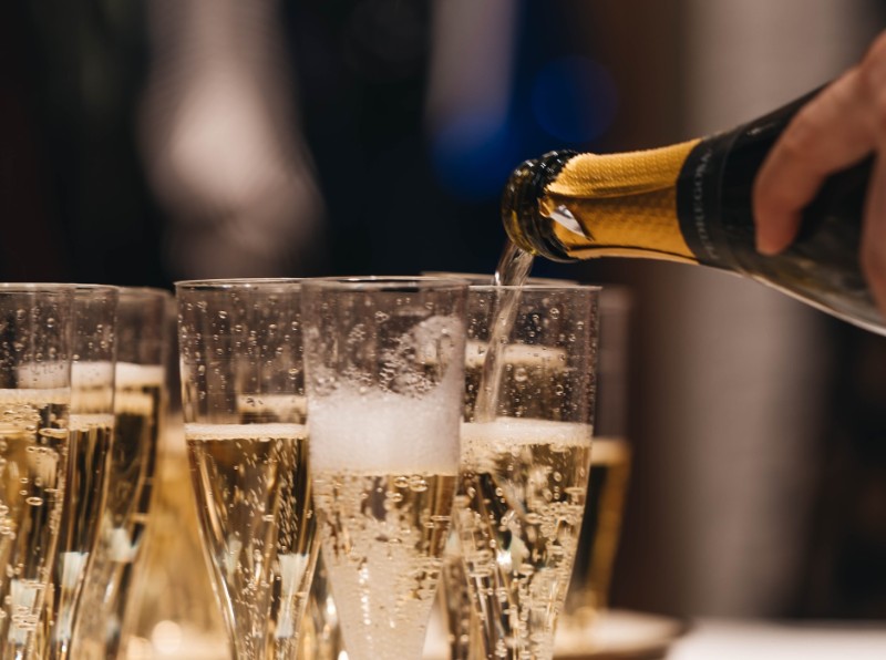
The champagne color stands for success or prosperity. Suffice it to say that this is another quality the color borrows from the champagne wine. Popping champagne is a long-held tradition in many corporate quarters.
It marks the accomplishment of certain milestones while also ushering in a celebratory mood into the occasion. Now, imagine popping the sparkling champagne wine on a venue that is also bathed in the beautiful champagne color!
On the other end of the spectrum, champagne can be too bold and misleading. The color may also appear intimidating if overdone. It can pretty much induce similar intoxicating effects associated with the champagne wine.
So, moderation is paramount while working with champagne. The best way to suppress the color’s potentially overpowering effects is by blending it with paler or cooler tones.
Common Usage of Champagne Color
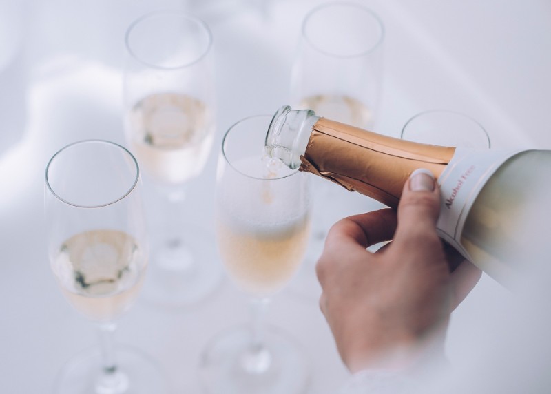
The champagne wine is probably the most noticeable thing that appears in the champagne color. But besides this bubbly, sparkling drink, you can also find champagne on a variety of common objects.
Certain gemstones like topaz and quartz may appear in champagne hues. The color is also used to describe the coat of some horse breeds. The term “champagne gene” actually has an equestrian origin, where it describes horses that sport a chestnut or golden-brown color.
Champagne is also a popular term in the automobile industry. It refers to a glossy finish often added to a motor vehicle to give it an extra touch of elegance.
The champagne color has penetrated the fashion industry too. It’s not unusual to find the word being used as part of the product descriptions of apparel, jewelry, and other accessories. The color is especially common in lingerie and evening gowns.
How to Make and Blend Champagne
Champagne is a shade of yellow and orange. Therefore, the quickest way to prepare the color is using yellow and orange paints.
Alternatively you could begin from scratch by preparing yellow and orange colors, and then mixing the two to obtain champagne. Below is how to go about the process;
i. Mix equal parts of red and green paint in a color palette and stir gently to obtain yellow.
ii. Transfer half of the yellow color obtained to a different palette and mix equal amounts of red into it, then stir to obtain orange.
iii. Transfer the other half of yellow paint to a separate bowl and add equal amounts of orange.
iv. Stir to obtain champagne.
v. Make any additional tweaks, using a color chart as your reference.
Adding more red to the yellow-orange combination will make the resultant champagne color warmer while green will give it a cooler hue.
The next most important thing after making champagne is to determine the specific colors to pair it with. Although it’s a warm color, champagne has neutral undertones that makes it blend well with most colors.
You can use champagne to highlight other brighter shades of orange and yellow. The color would also go well with natural metallics like silver, copper, and bronze. You might also blend champagne with other neutrals like ivories and whites to create a vintage look.
Another crucial tip is to consider the actual shade of champagne when determining the right color to blend it with. The popular champagne undertones include;
• Deep Champagne – appears warmer than true champagne due to its higher saturation of orange.
• Medium Champagne – has more yellow than orange.
• Dark Champagne – appears darker than regular champagne.
Summary
Champagne is a color whose effects are intertwined with the drink it’s named after. The sparkling color exudes a range of warm qualities, including love, happiness, and elegance. It’s certainly a top recommendation for artists who are into yellow and orange.