Last Updated on August 17, 2023
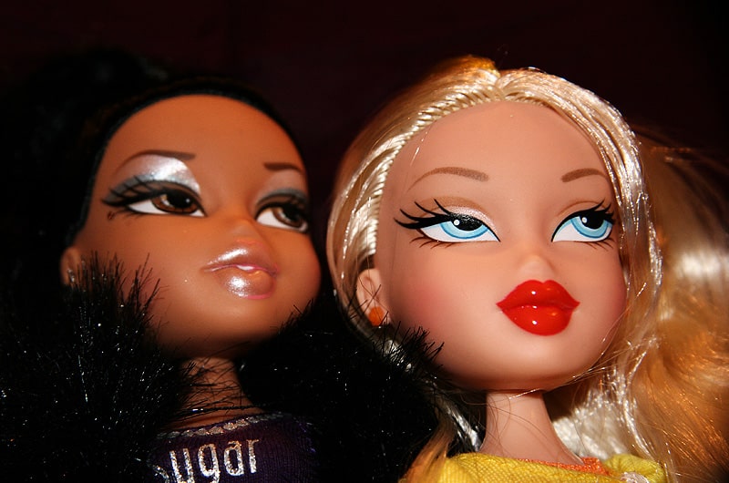
Bratz is an American collection of popular fashion dolls designed by Carter Bryant and manufactured by MGA Entertainment. The first four dolls under the product line – Yasmin, Jade, Cloe, and Sasha – were released on May 21, 2001.
Bratz dolls are targeted at girls from 7 to 12 years. The dolls are available on major supermarket chains within and outside the United States, including Target and Walmart.
Bratz Font and Logo Evolution
The Bratz logo has undergone a tremendous evolution since the company’s inception in 2001. The logo has experienced at least five major upgrades.
Now, the original version of the Bratz logo featured pink lettering of the brand’s name printed in ALL-CAPS. The lettering stood out for its bouncing characters. Above the letter “R” was a golden halo. Small 5-pointed stars glittered around the company’s name.
All the letters in the logo had subtle outlines. The letters also assumed a unique gradient that made the logo particularly appealing to children. Bratz used this logo from 2001 to 2009.
In 2010, Bratz undertook the first major upgrade of its first logo. The new logo lacked the characteristic gradient evidenced in the original design. Instead, the company’s in-house designers introduced a thin black outline. Another notable change was the removal of the stars surrounding the edge of the brand name and only leaving three on top.
Bratz undertook yet another upgrade on its wordmark in 2013. This logo stood out for its minimalistic design. The brand name appeared in white. Unlike previous logos where the lettering was in ALL-CAPS, the new logo featured lowercase letters except for the letter “B.” Designers also incorporated a gray gradient shadow behind the word “Bratz,” apparently to enhance the logo’s black outline.
In 2015, Bratz decided to replace their minimalistic logo with a more glamorous one. The lettering appeared in blue for the first time, and the letters were once again reverted to UPPERCASE. Also, the golden halo on top of “R” descended directly to the letter, and the bottom of “T” was covered using a small sticker designed with pink lips.
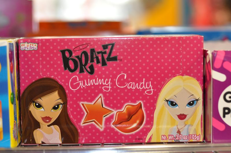
In 2018, Bratz returned to its original logo. The company’s designers performed subtle changes to the wordmark with a view to appealing to children’s psychology. For instance, the stars and convex letters disappeared, leaving the lettering brighter and more visible.
Although the Bratz wordmark has undergone numerous upgrades, the logo’s font has largely remained unchanged. Bratz’s font is very similar to the House of Fun font.
House of Fun is a gorgeous paper display font designed in 1999 by Leigh Taylor for Flava Fonts. The font is based on the Bratz logo and was likely influenced by Art Deco. But unlike most Art Deco-inspired fonts, House of Fun sports a bolder and more aggressive appearance.
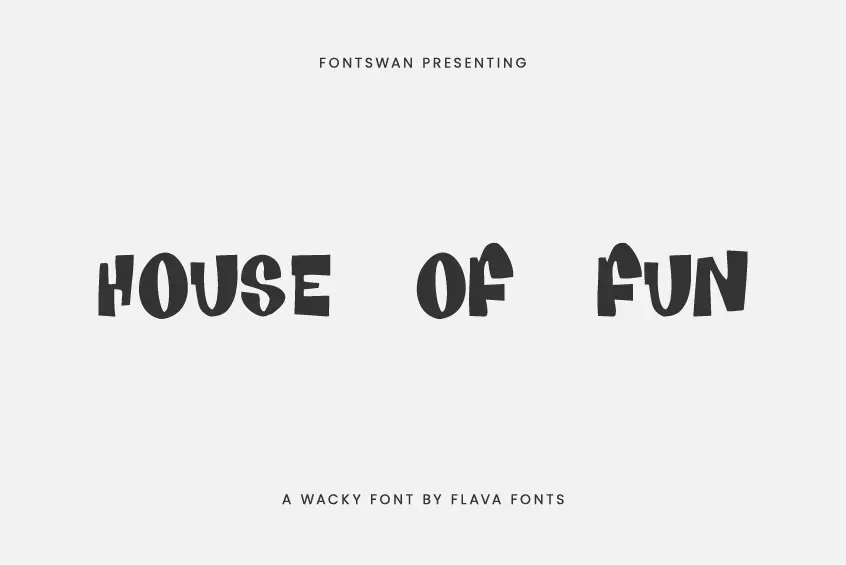
That makes it the go-to font for any design project where attention-grabbing is the primary objective, such as website design and product branding.
Where to Download the House of Fun Font
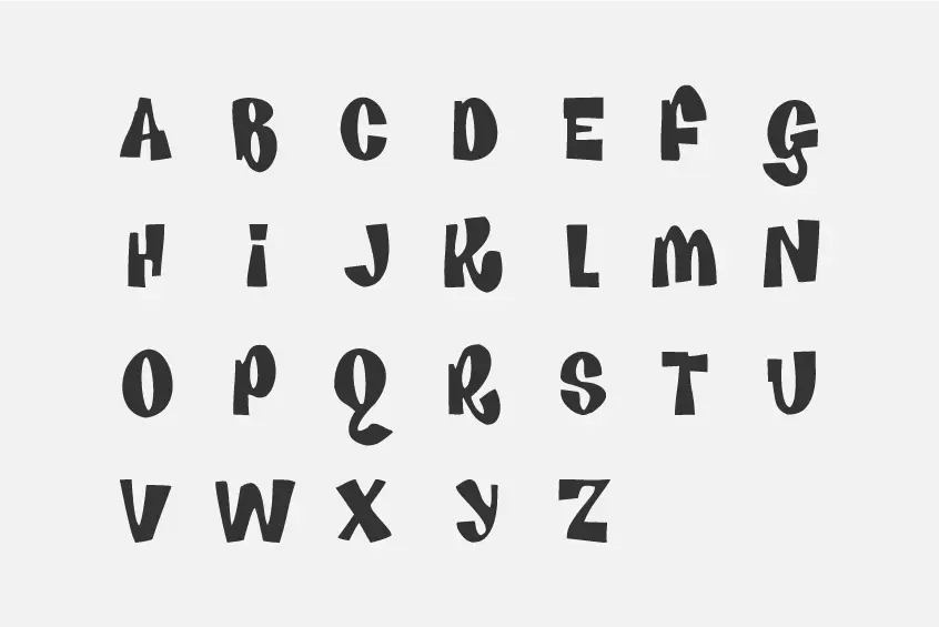
You can download the House of Fun from the FontSwan website.
The font is free for personal and commercial use. However, you may need to contact Flava Fonts before applying House of Fun on commercial projects.
Font Space and Urban Fonts are other great places to download House of Fun font as well.

