Last Updated on August 7, 2023
A good logo is one that’s here to stay, no matter what. That was the inspiration for the Audi logo; the Audi team quotes the famous typographer Kurt Weidemann who once said, ‘A good logo is one that can be scratched in the sand with your big toe’.
Today, we’re going to take a trip down memory lane to probe into the transformation history of the Audi logo. We will also briefly cover the big guns behind the success of this noble automobile company.
Excited? So are we!
How Audi Got Its Start

Photo by Arvid Skywalker on Unsplash
Audi is no ordinary German car manufacturer. It has a rich history and harbors perhaps the most fruitful coalition of vehicle experts. The origins of this automobile company date back to 1885 when the Wanderer Company took birth and later streamed into the umbrella of Audi.
In 1915, this company went by the name ‘Audiwerke AG Zwickau’. It was in 1910 when Audi produced its first-ever product; the Audi Type A Sport-Phaeton. Type A was soon succeeded by a Type B version.
When World War II broke out, Audi shapeshifted from a regular automobile manufacturer to an Armoured car manufacturer to fulfill German war interests. They even lost their manufacturing plant due to the devastating effects of the war.
However, this wasn’t the end for this luxury automobile company. The company started gaining traction during the late 1940s and focused on the reassembly of its manufacturing plant.
After strenuous efforts, Audi gave birth to Trabant, an illustrious symbol of East Germany. The Trabant was perhaps the most desirable car of the time; Audi had produced approximately three million units of this noisy car in Zwickau.
In 1964, Volkswagen gained 50% of Audi’s shares and later extended its hold by purchasing a brand new factory to produce Audis and Volkswagen Beetles. With the release of the Audi V8, the company became a force to be reckoned with. Audi was now directly competing with Mercedes Benz and BMW.
The Audi we know today has a massive and loyal customer base. Audi went through countless hurdles and only came out stronger! This German automobile manufacturer no joke; it’s synonymous with pure elegance and power.
What do The 4 Rings in The Audi Logo Mean?

Photo by Wassim Chouak on Unsplash
The Audi logo is said to have taken inspiration from the Olympic Rings. The timing was quite ironic because the Summer Olympics was taking place in 1936, and it was this time around that Audi came up with its iconic four-ring logo.
The slogan for Audi is ‘Vorsprung durch Technik’, which translates to ‘lead by technology’. BBH founder Sir John Hegarty suggested this slogan after he visited the Audi manufacturing plant in 1982.
Audi’s logo comprises four interlocking rings, but these are no ordinary rings; they form the bespoke identity for four unique brands. The Audi logo tells us about the story of four companies that became one under the roof of Audi Union AG.

Photo by Eduardo Flores on Unsplash
Audi, DKW, Horch, and Wanderer are the companies that formed Audi. The brand took birth when August Horch, a 19th-century mechanical engineer, founded this company known as ‘August Horch & Cie’. However, due to his clashes with the rest of the board members of Audi, he abandoned the coalition to embark on a fresh journey on his own.
He couldn’t use the name Horch anymore, so he decided to go with the word ‘Audi’. Audi garnered quite a remarkable reputation during its tenure in the industry, so much that it has dominated the modern-day, high-tier automotive industry of the 21st century.
History of the Audi Logo
The Audi logo wasn’t always as posh and refined as we see it today. It underwent a large plethora of transitions and changes. Let’s have a look at this iconic 4-ring logo’s transformation journey.
1909 (pre-launch)
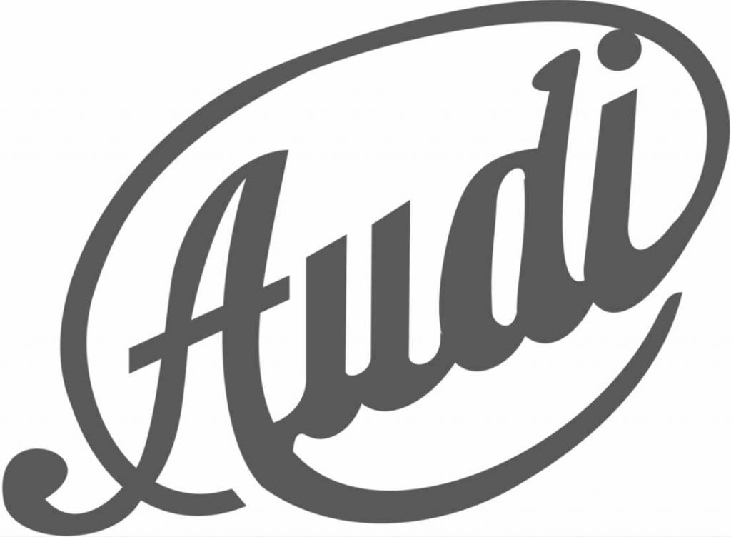
This was the pre-launch logo for Audi and is totally opposite to the version we witness today. It comprised a faded-grey diagonal logo with cursive lettering, which was surrounded by an oval outline.
1909
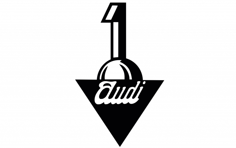
The board deemed the former logo unfit for their branding strategy and opted for a modernized version instead. This logo showcased an upended triangle with a bold ‘1’ placed at the hemisphere’s top.
1909-1932
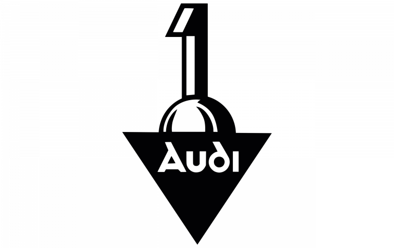
Even though the framework and design of the logo remained the same, Audi’s creative team replaced the narrowed cursive font from the previous logo with a more geometric and sleek lettering font. This version of the logo was retained till the formation of the Auto Union in 1932.
1932-1949
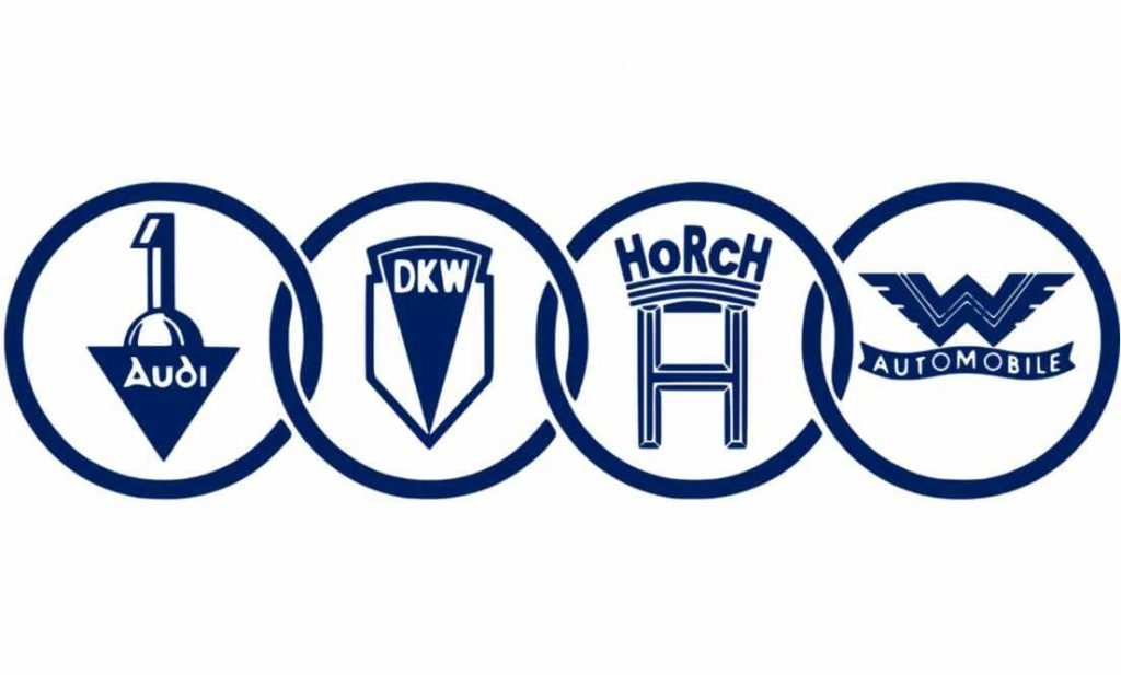
This was the first time Audi decided to feature the iconic four rings for its logo. But this is still far from the version we see today. The four rings represented the merging of four companies to form an Auto Union of the respective brands.
1949-1969
The logo received modifications to make it look confident, neat, and bold. Individual logos of each brand in the rings were replaced to showcase the title ‘Auto Union’. This was done to represent strength, teamwork, and unity between the four brands.
1969
The 4 rings went missing in action and the Audi lettering was accompanied by NSU lettered in a sans-serif typeface.
1969-1995
During this period, the Audi logo underwent three significant changes that are shown below. The ‘Auto Union’ lettering was eliminated because the brand wanted to make an impact to represent their teamwork and strength as one brand instead of four.
2009
A futuristic 4-ring emblem was incorporated into the logo. The iconic symbol took onto a silver, three-dimensional shade with the Audi emblem at the bottom.
2016
The design of the rings was refined and enhanced to give it a mirror-like effect. This logo was much sleeker than the previous one and had an X factor that attracted consumers to their brand.
Today
Audi no longer needs a subtitle to make itself known. The iconic 4-ring symbol speaks for itself after having catered to a massive consumer base over the years. A bold, monochrome black now replaces the reflective silver color scheme to exhibit virtues of confidence and personality.
Apart from providing its loyal consumer base with premium quality vehicles, Audi has emerged as a contender in the field of marketing. They managed to entice a large plethora of people – and the four merged circles in their logo have left everyone in awe ever since.

