The American Express Company (AmEx) is a multinational corporation that deals in payment card services.
Founded on March 18, 1850, in Buffalo, New York, United States, AmEx currently has its headquarters at 200 Vesey Street in Lower Manhattan, New York City. Some of its core products and services include credit cards, charge cards, traveler’s cheques, corporate banking, finance, travel, and insurance.
American Express is currently considered one of the world’s most valuable brands. The company registered an impressive revenue of USD 36.09 billion in 2020.
American Express Logo and Font

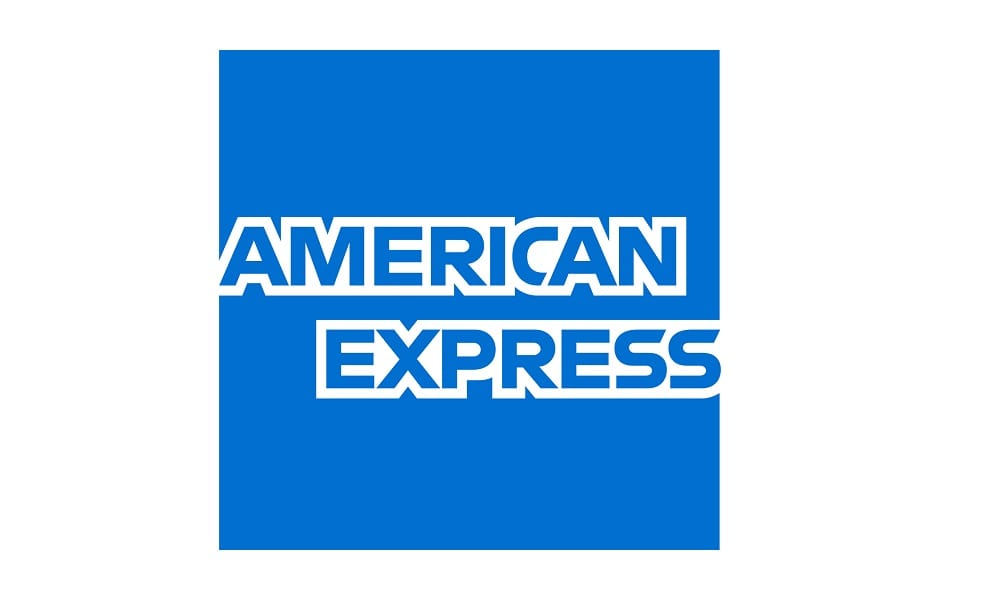
The American Express logo features the corporation’s lettering written in ALL-CAPS on a blue background. The company’s name is also in blue. However, the logo’s designer incorporated white outlines to make the lettering stand out from the blue background it’s printed on.
It’s also worth noting that American Express uses a gladiator or centurion on its logo. The image is common on the company’s charge cards, credit cards, and traveler’s cheques.
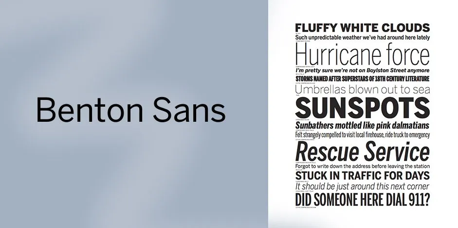
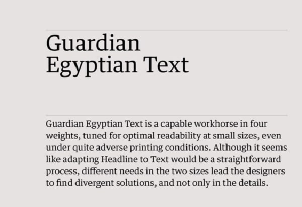
The American Express Uses two types of fonts – Benton Sans and Guardian Egyptian.
About Benton Sans

Benton Sans is a digital typeface with a fairly long design history. The font family was first created in 1995 by Tobias Frere-Jones. It was subsequently expanded by Cyrus Highsmith of the Font Bureau.
Benton Sans is modeled after earlier sans-serif typefaces developed for American Type Founders by renowned designer Morris Fuller Benton. The font was a reworked variant of Benton Gothic, a variation in the Benton fonts family developed with corporate clients in mind, and under the guidance of Frere-Jones.
Unlike most typefaces that were readily available for public use upon their release, Benton Sans started out as a proprietary type. Initially titled MSL Gothic, the typeface was commissioned by the Martha Stewart Living magazine. It was also widely used in the Martha Stewart Living Omnimedia website.
Just like its predecessor, Benton Gothic, Benton Sans is available in several weights, including;
• Benton Sans Bold
• Benton Sans Bold Italic
• Benton Sans Black
• Benton Sans Book
• Benton Sans Light
• Benton Sans Medium
• Benton Sans Thin
Besides The American Express, other popular brands that use or have utilized the Benton Sans before include The Walt Disney Company, MySpace, Lonely Planet, and The University of Texas at Austin.
About Guardian Egyptian

The Guardian Egyptian may be less popular than Benton Sans. But the font is no less amazing, which explains its preference among big brands like American Express.
Guardian Egyptian is a work of two designers, namely Paul Barnes and Christian Schwartz. It was created between 2004 and 2005, and subsequently published by the duo’s company Commercial Type. The font was commissioned by Mark Porter for the famous UK newspaper, The Guardian, from where it gets its name.
The Guardian Egyptian font became a crucial force behind the newspaper‘s move to the Berliner format. And although the typeface was eventually replaced as The Guardian’s masthead font in 2018, it remains one of the most iconic fonts ever to have been used by the UK’s publishing giant.
Other fonts in the Guardian family besides the Guardian Egyptian include;
• Guardian Sans
• Guardian Text Egyptian
• Guardian Text Sans
• Guardian Agate
Where to Download the American Express Fonts
Benton Sans is free for download from the DaFont and Fonts Geek websites. You can also check the Fonts Free website if you’d prefer Guardian Egyptian, another popular font used by the American Express.
Both fonts are free for personal use. However, you may need to purchase a paid version before you can use them on commercial design projects.

