Last Updated on March 28, 2023
Amazon.com, Inc. is an American multinational technological company that’s probably best known for its e-commerce products. However, the company also deals in cloud computing, artificial intelligence, and digital streaming.
Amazon is ranked alongside Google, Facebook, and Microsoft among the world’s biggest technological brands. The company was founded on July 5, 1994 by Jeff Bezos. It’s presently headquartered in Seattle, Washington.
Amazon Font
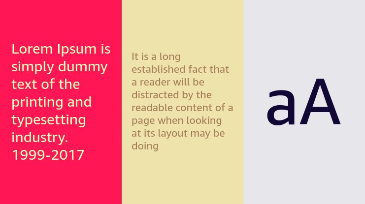
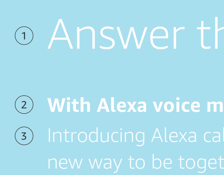
Amazon uses Amazon Ember Regular and Amazon Ember Italic as the main fonts for all the written texts on the company’s shopping website and applications.
Amazon Ember is a sans-serif font that was designed by font foundry Dalton Maag.

As the name implies, this font was created specifically for the online retail giant. The font first showed up on Kindle Oasis. It went on to become the face of many other Amazon products and subsidiaries, including Kindle 8th Generation.
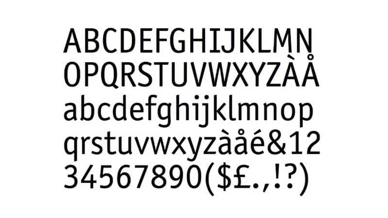
Ember has been the main font used by the Amazon brand for years. However, the company’s logo is actually based on the Officina Sans font, designed by Erik Spiekermann and Ole Schäfer.
Amazon’s logo has undergone numerous changes over the years. And so has the logo’s font.
The first Amazon logo was a simple “A” with the image of a river inside. The letter and image were most likely inspired by the iconic Amazon River. This particular logo was designed by Turner Duckworth. It remained Amazon’s official logo from 1994 to 1998.
In 1998, two more designs replaced the original Amazon logo. These designs were subsequently replaced by a second prototype which mainly featured a yellow line curving upwards.
This logo featured two fonts. The word “Amazon” was in Officina Sans Bold while “.com” was in Officina Sans Book. The new logo lasted about two years before the company embarked on yet another branding campaign.

In 2000, Turner Duckworth decided to tweak Amazon’s logo to give it a more playful and friendly touch. The designer did away with the initial yellow line underlining the entire word “Amazon.” Instead, the line now curved upwards from letters “a” to “z” in a manner that achieved two major branding objectives.
First, the curve resembles the image of a smile, which is one way the company spreads positive vibes across the world. Secondly, the curve has a pointed end. And the fact that it stretches from “a” to “z” is a subtle way of saying that the company deals in everything “from A to Z.”
Another notable rebranding was the dropping of the words “.com.” However, the Officina Sans Bold font remained for the word “Amazon”.
Another thing worth noting is that not all Amazon subsidiaries have always used the Officina Sans font on their logo or the Amazon Ember for the text on their websites.

For instance, Amazon acquired Twitch in 2014 but maintained the subsidiary’s font. The company also acquired Whole Foods Market and Goodreads but did not seem to bother about altering the fonts used by these brands.
Where to Download Amazon Fonts
You can download Amazon’s Ember font for FREE by pressing the “Download” link on CuFonts. If you’d rather download the Officina Sans font, you can find it for a premium fee from MyFonts, or for FREE from FreeFontsVault.

