Last Updated on March 28, 2023
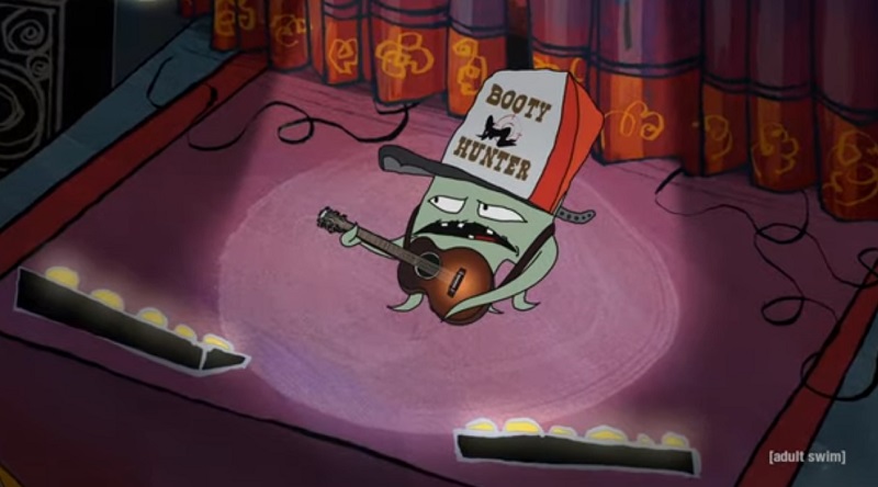
Adult Swim, commonly stylized as [adult swim] and abbreviated as [as], is an American adult-themed nighttime programming block based on the basic cable network Cartoon Network.
The block is programed by its very own in-house production studio, Williams Street. It features tons of adult-oriented shows, including adult animation features, sketch comedy, mockumentaries, and pilots.
As the adult version of Cartoon Network, Adult Swim content is noted for its sexual themes, strong language, open sexual discussions, and graphic violence.

The block debuted on September 2, 2001, and has since amassed a huge viewership. Programming is mainly done in the English and Spanish languages.
Adult Swim Font
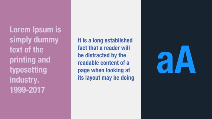
The Adult Swim logo is designed in a font called Helvetica® Neue Condensed Bold.
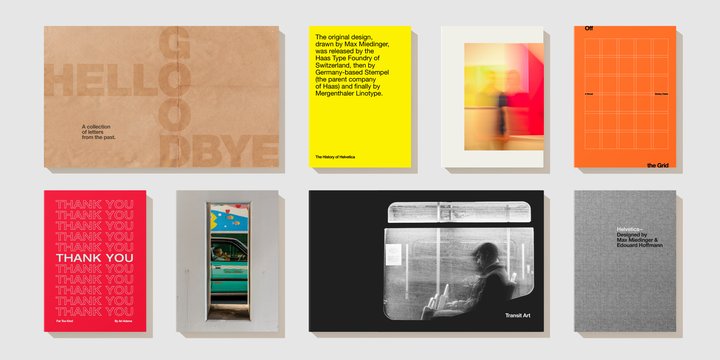
Helvetica, also known as Neue Haas Grotesk, is a widely used neo-grotesque sans serif typeface. The font has been around for over half a century. It was created in 1957 by renowned Swiss typeface designer Max Miedinger, with considerable input from Eduard Hoffmann.
Helvetica was influenced by the renowned 19th-century typeface Akzidenz-Grotesk, among other German and Swiss designs. It has been published by Linotype font foundry since 1957. Over the years, the font has spawned numerous variations. The variants differ from the original font in aspects like width, weight, and size.

Adult Swim logo features the company’s name written in lower case and enclosed in square brackets. The logo has always been text-based and in the same Helvetica lettering. However, it has undergone a tremendous evolution over the years.
The original Adult Swim logo was designed in 2001 and used until 2002. It consisted of UPPERCASE lettering which appeared in a sans serif typeface, inscribed in red. Sometimes, the inscription would be spelled backward in what the company thought was an ingenious way of appealing to its clients.
Between 2002 and 2003, Adult Swim replaced the red color on its logo with black. Another major modification was changing the lettering from UPPERCASE to lowercase. This made the logo appear friendlier and more legible. In some cases during the same period, the logo could be enclosed in a black circle.
The current version of the Adult Swim logo was designed in 2003. It features the same Helvetica lettering used over the years. However, the company introduced square brackets to the inscription as a way of further enhancing the logo’s stylishness and legibility.

Besides the Adult Swim logo, Helvetica typeface has been used in the logos of several brands, products, album covers, movie covers, etc. Examples include the American outdoor recreation products company North Face, the debut studio album by indie-rock band Cold War Kids titled ‘Robbers & Cowards,’ and the award-winning Iranian film A Separation.
Other brands that have used the Helvetica font include automobile manufacturers BMW and Jeep, the electronic and electrical company Panasonic, and the telecommunications software Skype.
Where to Download the Helvetica Font
You can download Helvetica from The Fonts Magazine. The font is also available on My Fonts website. For all versions of the Helvetica font, go to My Fonts.
Note that some sites allow you to download Helvetica free for personal and commercial use. However, other websites may require you to purchase a license before using this font on commercial projects.

