Last Updated on March 28, 2023
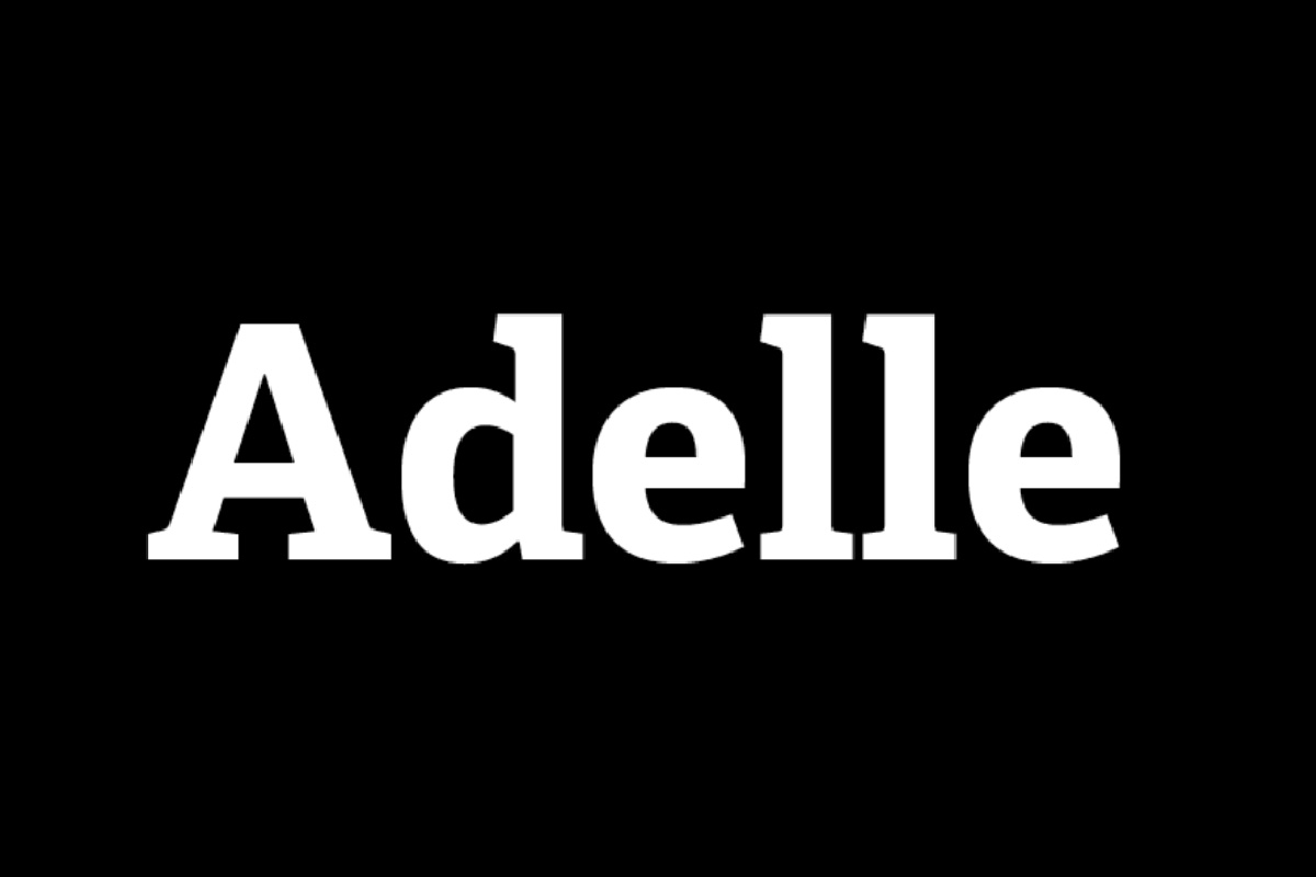
Of course, plenty of typefaces have been considered to be ‘beautiful’. But perhaps not as beautiful as the slab serif named Adelle. Carefully crafted to be unobtrusive and legible despite unforgiving environs, this typeface has won many awards with its charm. Here’s why.
Origins of Adelle
Designed by Veronika Burian and José Scaglione and released in 2009 through TypeTogether (an independent type foundry), Adelle has since become a font favorite by typographers the world over. Its intermediate weights deliver a neutral look, making it perfect for both print and digital works.
Featuring weights in Thin, Light, Regular, Semibold, Bold, Extrabold and Heavy, with matching italics, it’s versatile and authoritative. The Cyrillic characters were added by Russian designer Alexandra Korolkova, and the Greek script by expert Irene Vlachou. There’s also a condensed version to make sure you can fit as much text as you want into a work without losing legibility.
Adelle Pairings and Uses
With its modest appearance and superb texture, there’s nothing Adelle can’t excel at. While it’s recommended that you use it for its intended purpose – that is for editorials or long copy – it still looks smashing on various digital projects like websites, logos, headlines, and branding. It works well on print products such as brochures, business cards, posters, and menus, too.
If you’re wondering what to pair it with, the obvious choice would be Adelle Sans. But for other combinations you can try Clarendon, Verlag, Helvetica Neue, Proxima Nova, or Whitney. With 14 styles to choose from, you can play it up by simply mixing and matching the different weights of the same font. That’s guaranteed to produce an eye-catching effect.
Beautiful Adelle Font

Buy the typeface directly from TypeTogether along with its complement, Adelle Sans, and start creating wonderful pieces. You can also find it at Adobe Fonts and My Fonts. For the free version, head on over to Free Fonts Family.

